
Previously I wrote a tutorial on how to make a mobile navigation for responsive design, now I’ve discovered a new technique to produce a responsive menu without having to use Javascript. It uses clean and semantic HTML5 markup. The menu can be aligned left, center or right. Unlike the previous tutorial where it is clicked to toggle, this menu toggles on hover which is more user friendly. It also has an indicator to show the active/current menu item. It works on all mobile and desktop browsers including Internet Explorer!
Mobile design is rapidly changing, and so the techniques also evolve. Checkout my newer tutorial on Responsive menus for 2017 and onward here.
The Purpose
The purpose of this tutorial is to show you how turn a regular list menu into a dropdown menu on smaller display.
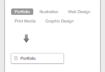
This trick is more useful on navigation with a lot of links like the screenshot below. You can condense all the buttons into an elegant dropdown.
Nav HTML Markup
Here is the markup for the navigation. The <nav> tag is required to create the dropdown with the css property absolute position. I will explain this later in the tutorial. The .current class indicates the active/current menu link.
<nav class="nav">
	<ul>
		<li class="current"><a href="#">Portfolio</a></li>
		<li><a href="#">Illustration</a></li>
		<li><a href="#">Web Design</a></li>
		<li><a href="#">Print Media</a></li>
		<li><a href="#">Graphic Design</a></li>
	</ul>
</nav>
CSS
The CSS for the navigation (desktop view) is pretty straight forward, so I’m not going to get into the details. Note that I specified display:inline-block instead of float:left for the nav <li> element. This allows the menu buttons to be able to align left, center or right by specifying text-align on the <ul> element.
/* nav */
.nav {
	position: relative;
	margin: 20px 0;
}
.nav ul {
	margin: 0;
	padding: 0;
}
.nav li {
	margin: 0 5px 10px 0;
	padding: 0;
	list-style: none;
	display: inline-block;
}
.nav a {
	padding: 3px 12px;
	text-decoration: none;
	color: #999;
	line-height: 100%;
}
.nav a:hover {
	color: #000;
}
.nav .current a {
	background: #999;
	color: #fff;
	border-radius: 5px;
}
Center and Right Alignment
As mentioned above, you can change the alignment of the buttons by using text-align property.
/* right nav */
.nav.right ul {
	text-align: right;
}

/* center nav */
.nav.center ul {
	text-align: center;
}
Internet Explorer Support
HTML5 <nav> tag and media query is not supported by Internet Explorer 8 or older. Include css3-mediaqueries.js (or respond.js) and html5shim.js to provide fallback support. If you don’t want to add html5shim.js, replace the <nav> tag with a <div> tag.
<!--[if lt IE 9]>
	<script src="http://css3-mediaqueries-js.googlecode.com/files/css3-mediaqueries.js"></script>
	<script src="http://html5shim.googlecode.com/svn/trunk/html5.js"></script>
<![endif]-->
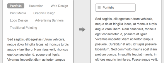
Responsive
Now here comes the fun part – making the menu responsive with media query! Read my previous articles on responsive design and media query if you are not familar with responsive design.
On 600px breakpoint, I set the nav element to relative position so I can place the <ul> menu list on top with absolute position. I hide all <li> elements by specifying display:none, but keep the .current <li> displaying as block. Then on the nav hover, I set all <li> back to display:block (this will produce the dropdown list result). I added a check icon graphic on the .current element to indicate it is the active item. For the center and right alignment menu, use left and right property to position the <ul> list. View the demo to see the final result.
@media screen and (max-width: 600px) {
	.nav {
		position: relative;
		min-height: 40px;
	}
	.nav ul {
		width: 180px;
		padding: 5px 0;
		position: absolute;
		top: 0;
		left: 0;
		border: solid 1px #aaa;
		background: #fff url(images/icon-menu.png) no-repeat 10px 11px;
		border-radius: 5px;
		box-shadow: 0 1px 2px rgba(0,0,0,.3);
	}
	.nav li {
		display: none; /* hide all <li> items */
		margin: 0;
	}
	.nav .current {
		display: block; /* show only current <li> item */
	}
	.nav a {
		display: block;
		padding: 5px 5px 5px 32px;
		text-align: left;
	}
	.nav .current a {
		background: none;
		color: #666;
	}

	/* on nav hover */
	.nav ul:hover {
		background-image: none;
	}
	.nav ul:hover li {
		display: block;
		margin: 0 0 5px;
	}
	.nav ul:hover .current {
		background: url(images/icon-check.png) no-repeat 10px 7px;
	}

	/* right nav */
	.nav.right ul {
		left: auto;
		right: 0;
	}

	/* center nav */
	.nav.center ul {
		left: 50%;
		margin-left: -90px;
	}

}
46 Comments
Comments are closed.
axiu
So cool. I’ll try it later
SWD
Great tutorial. Simple and easy to follow.
Paul Frost
I’ve just tested this on my iPhone and a problem is that it seems to rely on the hover state which doesn’t really exist on a touch screen. The dropdown reveals on a tap but then can’t be dismissed, it stays open. So if you tap the menu button to see what’s on offer but decide to stay on the page you are stuck with it blocking out content.
Alex
I experienced the same thing when I went through this tutorial. Also, on my iPhone it won’t load the mobile nav when the max-width is 600px for the the @media screen. It needs to be greater than 960px I do believe, I set mine to 1000px. Also, I don’t think you included the code to change the current state of the active links. So the first link always has the different background color even when you navigate to a different page. If I’m mistaken or you have the tweak, let me know. How can this be improved for mobile devices? So maybe no hover, but a click on a ‘Go To..’ to open the navigation. The hover never closes on my iPhone. Let’s improve this, bro.
Andrew Flatters
I also found this to be a problem with Chrome on Android Chrome browser so isn’t just Iphones that encounter this bug
Isiah
I think it would be better if the collapsed menu button said ‘Menu’ or ‘Go To’ or something rather than ‘Portfolio’ – then it would be more obvious that items can be accessed via the dropdown.
Cheers
I
Isiah
Just to say yes I realise ‘Portfolio’ is the first menu option :)
Mark Thomson
You legend! That’s a really nice way to tackle menus. I’ll be trying this out asap!
Rachel Reveley
It doesn’t work on Android either. As soon as you click on the navigation it jumps to that page. What you really need is either a placeholder line that expands the menu on click without being a link or to disable the current link.
Thomas Sjögren
It’s nice but it lacks basic accessibility. If you try it on an iPhone with VoiceOver you notice how little help you get from the markup to be able to navigate the menu correctly.
Arnz
You’re right. I’ll also add that it’s not usable via keyboard navigation (Tab) which, today, is a minimum requirement for production use.
Not sure the ‘extra work’ required for it to be fully usable (with the other bugs mentioned here) is worth the no-JS hassle.
Erick Arbe
I agree with Paul Frost – the hover state does not exist on touch devices! It’s only simulated. Hover properties are only simulated. Using a click event is much more reliable for touch devices – which is presumably what we’re building responsive websites for, right?
Kevin May
I’d have to agree with Rachel, you might think the hover is user friendly, but you’re making the menu unusable on smart phones. Phones don’t have cursors, you need a click state which will drop the menu down.
Adam
I guess I’m not the first to say… The hover state doesn’t exist on mobile. Very nice tutorial and clean code. I also like that this menu can easily be right-, left-, or center-aligned.
Pete
Is there any way to make it work on iphone and Android without using Javascript and JQuery ? I really like the drop down menu.
Lars
Works fine on my iphone – you can see it here in the wild: http://www.secondstep.dk
Doesn’t work on winmo8, and I haven’t been able to test it on android yet.
Lawrence
Love the idea but doesn’t work on mobile which kind of defeats the point. Going to try to rework it this weekend with either an target or input tag. Failing that a simple vanilla javascript toggle function should do the trick.
Danilux
This menu could use the checkbox hack to emulate a click event, but I don’t have data on mobile device support for that, so JS dependent click event seems like the only option.
Vitor Azevedo
Just a small side note, use:
Vitor Azevedo
i just posted some code … and it is hidden for some reason :(
Karl
Can you share a link to it instead?
kartofelek
You can simple change this to :checkbox trick. Create checkbox, style their label, hide checkbox, and thed style “after” content by use ~ selector
http://tympanus.net/codrops/2012/12/17/css-click-events/
Leo
wondering – can you just add :focus to the hover state and use a placeholder that’s not a link for the Menu button ?
chad
It work on my Android GS3 just fine. Nice job Nick. I was looking for a Nav without JS
Suchita g.
Nice!!
Top 10 Lists
This navigation menu works on Android and iOS and I appreciate that it also works fine on IE9 and Firefox. That’s very good discovery and innovative use of Html 5 markup.
javad
Nice
Roye Okupe
Great resource, thanks for sharing. Do you have samples of this working with any WordPress themes?
Robert
Very nice tutorial, thank you!!
However, can you post or suggest a source for icon-menu.png and icon-check.png?
Thanks !!
david
Doesn’t seem to work at all on an Android phone with Opera.
Kenth Hagström
Really good tutorial, thank you! :)
Surrey Web Design
Simple and easy navigation is a very important factor of responsive web design. Here in this blog you have shared the best CSS navigation menu that will help designers a lot.
Cloudburst Web Design
This is a great article demonstrating a nice approach to tackling mobile nav. There are a bunch of different ways to Well done!
Amish Sharma
Looks Nice, I’ll give it a go on Redesigning for MY company site !!!
Caleb
I’ve been planning to integrate something like this on my site using Bootstrap or Foundation’s top bar but found it overkill. This is just perfect! Are there any drawbacks for not using JavaScript?
Lars
Thanks! It looks great and works on ios – but I can’t get it to work on WinMo 8.
Lars
Thanks! It looks great and works on ios – but I can’t get it to work on WinMo 8.
Opiek Pulau Tidung
Great share… I will try it on my website
Thank you
Katrina Isabelle
Thank you for the great tutorial.
I have one issue with this implementation and that is that once one of the links is clicked, the menu does not disappear. I find it looks really awkward in my implementation, and on my mobile phone it makes for a very bad UI, since the whole screen is taken up by the dropdown menu.
Marz
Hi,
This is a great tutorial. Is it possible to get a sub menu working in this design? I cant figure it out. Any help would be fantastic.
Nate
The only problem is hover-off doesn’t work on mobile devices, so once you open it on a mobile device, it stays open.
Bootstrap’s menubar allows you to click and re-close the menu, yours does not.
Why not add that functionality? I will look into it myself. Thanks.
Kyle @Brandcouver
Interesting article and CSS but what are your thoughts on hamburger menus? I’ve read quite a number of articles now on studies that show that the hamburger menu is actually a detriment to navigation. Even in spite of the World being quite used to mobile, so many people still don’t really ‘get’ the hamburger menu concept.
Vail Joy
Hi Kyle!
I know when Nick originally wrote this tutorial, the hamburger menu was just beginning to be used widely in mobile UX. Nowadays it is everywhere even on desktop designs. I think there is definitely some merit in minimal UI for navigation, but don’t specialize in UX so can’t say for sure if it is good or bad. I do know that on mobile, it is pretty much standard and better understood by mobile users. so in the context of this tutorial it works in that you’re converting an expanded, semantic menu into a condensed toggle for mobiles only.
Azhar
Really very helpfull…..