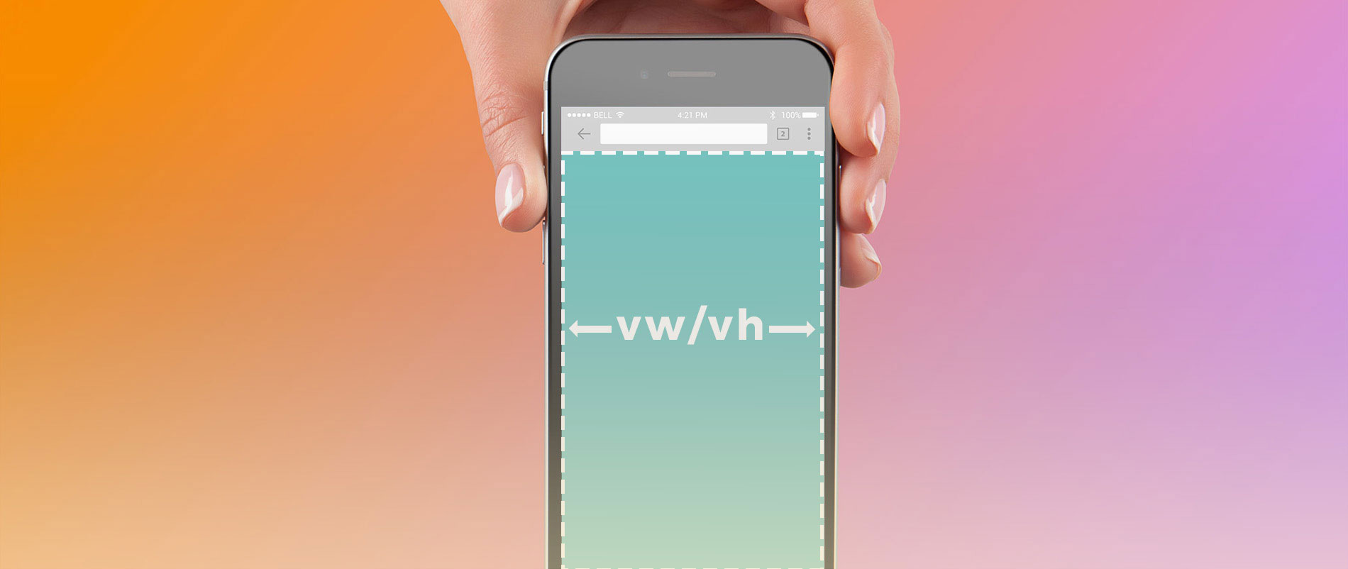
There are many Javascript fixes for the viewport height units bug in iOS 7 (iPhone & iPad), this article will cover how to resolve this bug with CSS. This particular bug affects the rendering of viewport height units, for example: if you try to make a full viewport height container with height:100vh, it will display a very tall empty gap. Although this bug was fixed in iOS 8, but many old iPhone and iPad users are still using the old iOS 7. The vh-unit buggyfill is one of the popular Javascript workarounds, but if you don’t want to rely on Javascript here is a quick CSS fix using media queries.
CSS Fix
The fix is very simple. For the elements where you need to apply 100vh, just match the element height with the device height using media queries that targets the older versions of iPhone and iPad resolution. I learned this CSS trick from coding Themify themes and Flow; and the device breakpoints are referenced from this site.
/* fix iOS bug not displaying 100vh correctly */
/* ipad */
@media only screen and (min-device-width : 768px) and (max-device-width : 1024px) and (orientation : landscape) {
	.fullheight {
		height: 768px;
	}
}
@media only screen and (min-device-width : 768px) and (max-device-width : 1024px) and (orientation : portrait) {
	.fullheight {
		height: 1024px;
	}
}
/* iphone5 */
@media only screen and (min-device-width: 320px) and (max-device-height: 568px) and (orientation : landscape) and (-webkit-device-pixel-ratio: 2) {
	.fullheight {
		height: 320px;
	}
}
@media only screen and (min-device-width: 320px) and (max-device-height: 568px) and (orientation : portrait) and (-webkit-device-pixel-ratio: 2) {
	.fullheight {
		height: 568px;
	}
}
/* iPhone 4 */
@media only screen and (min-device-width : 320px) and (max-device-width : 480px) and (orientation : landscape) and (-webkit-min-device-pixel-ratio : 2) {
	.fullheight {
		height: 320px;
	}
}
@media only screen and (min-device-width : 320px) and (max-device-width : 480px) and (orientation : portrait) and (-webkit-min-device-pixel-ratio : 2) {
	.fullheight {
		height: 480px;
	}
}
Sarang
Thanks! This one is a nice and handy fix. Obviously, it will work on all iOS devices because it is CSS based… But if anyone relies more on JavaScript for this, will it pose any unseen disadvantages?
Evonence
Thanx for sharing such a content. Bug is really a big problem. The most important part in it is any programmer can use this code.
Theo
Great fix, thanks a ton for sharing!
JiDai
On a iphone 5 on portrait mode I pass in this MQ :
@media only screen and (min-device-width: 320px) and (max-device-height: 568px) and (orientation : portrait) and (-webkit-device-pixel-ratio: 2) {
.fullheight {
height: 568px;
}
}
then override by :
@media only screen and (min-device-width : 320px) and (max-device-width : 480px) and (orientation : portrait) and (-webkit-min-device-pixel-ratio : 2) {
.fullheight {
height: 480px;
}
}
Gary Smith
All the points are explained very clearly, Great source of information. Thanks for en-lighting us with your knowledge, it is helpful for many of us.
Graphicorn
I was just looking similar to this problem..thank you
Bootstrap
Thanks for the Code!!
abdul kader
Great post … thanks for sharing with us
Distuned
Will it work on other IOS’s too? Say older IOS versions?
Elaine
Thanks for this fix. We’ve been having issues with CSS in older Apple iPhone and iPad models e.g. iPad 2 when designing sites so we are always on the look out for articles like this.
Josh
Nice information, I have learned a lots of good things from this post.
Thanks for sharing.
Aura
Thanks!
This one is a nice and handy fix. Obviously, it will work on all iOS devices.
Graphicorn
Thanks for the fix
branding
thank you very much, I’m having this problem, I’ll use it to our website
Brian Califano
The CSS fix for such a bug may come as a major relief for Apple owners who are still running their device on iOS 7. The new iPhone model will be optimized to iOS 9, which renders this bug invalid, since the solution will already be integrated into the operating system. However, older users often seem to be bogged down by the pace of innovation, since this bug can be persistent in older versions. The CSS fix will not only eliminate this bug for older devices, it is a simple and straightforward process that can be done by anyone by closely following the steps in the tutorial.
Hammur IT
Thanks for this.
Calipus
Great CSS fix to all device size (ios) and very easy to learn. Thanks a ton for sharing.
mitsubishi klima
Thanks! This one is a nice and handy fix
James W
Thanks for this. I’ve added iPhone 6/6s/7, iPhone 6 plus/6s plus/7 plus, and iPad Pro to mine: https://gist.github.com/uxjw/f5b833eaede49ad203bce6ed653d027e
Vail Joy
Awesome, thanks for sharing your gist!
Zeno Lahaye
I’ve had a problem with the Ipad Pro mediaquery, the fixed height was overwriting the “100vh” for smaller desktop screens. I found a method to isolate the media query for the Ipad Pro. Anyone with the same problem should take a look. https://gist.github.com/zenolahaye/aed0ac3fc3c8c5dc934c79004a6d782c
Husain
Good Post
willi
Ive had a problem with the Ipad Pro mediaquery, the fixed height was overwriting the 100vh for smaller desktop screens. I found a method to isolate the media query for the Ipad Pro. Anyone with the same problem should take a look