Are you tired of your typical columned and boxed layout? It is time to learn how to break out of the box and do something creative. In this post, I’ve collected some of the best examples that are designed out of the box. I’ve also provided some quick CSS tips with demo files on how to break out of the box by creatively using background images and the CSS position property.
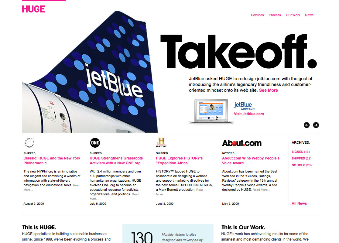
Example 1: Huge Inc
What really captured my attention on the Huge site is the header design. Notice how the design elements are extended out of the box.

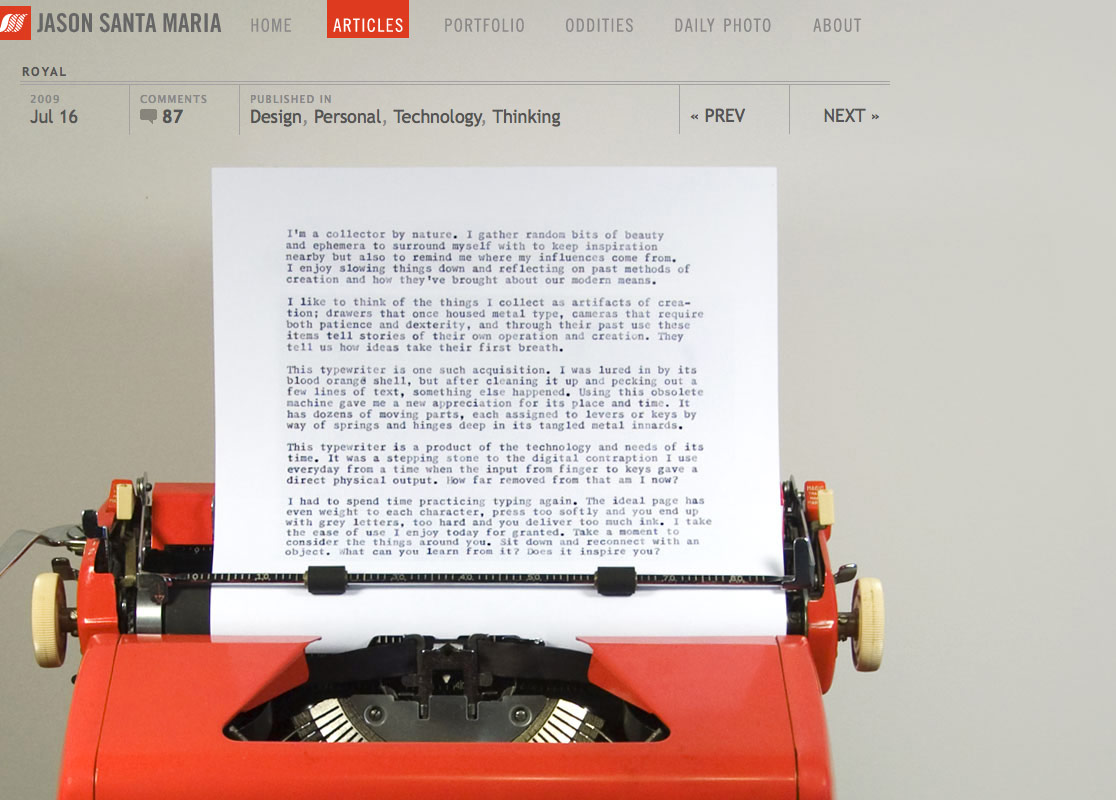
Example 2: Jason Santa Maria
With the amount of effort and details that Jason input on his site, no doubt it is one of the best designer sites around. Click through the posts, you will find that almost each post is unique and has a different stylesheet. Some visual images are within the grid, some are out of the box.
Example 3: A Brief Message
Similar to Jason Santa Maria’s website, each post on ABriefMessage.com features a different image and CSS stylesheet. Unlike the other typical blog sites, the text on the site is perfectly layouted, so it runs around the image (it is like reading a print design).

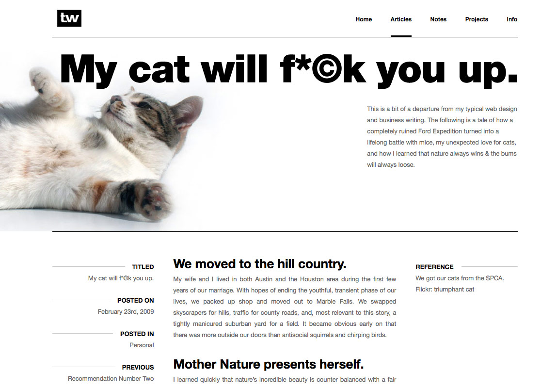
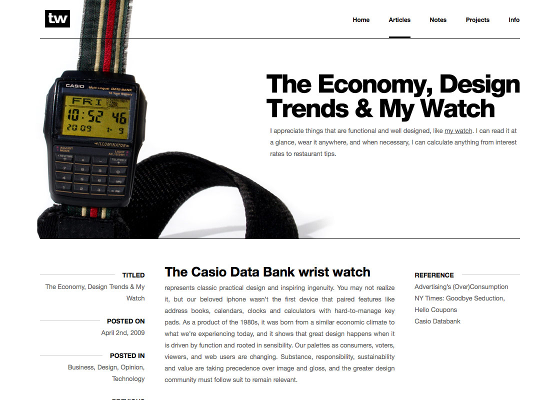
Example 4: Trent Walton
TrentWalton.com puts the focus on the header, where each post displays a different background image and typesetting.

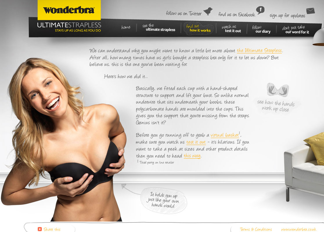
Example 5: Wonderbra Ultimate Strapless
Although there are some accessibility issues with the Wonderbra site (eg. the font is not scalable), but it is a lovely design. The content and images are nicely put together. At the first glance, I thought it was a Flash site. Then, I checked the source code and found it is done by CSS and a Javascript text replacement, cufon.

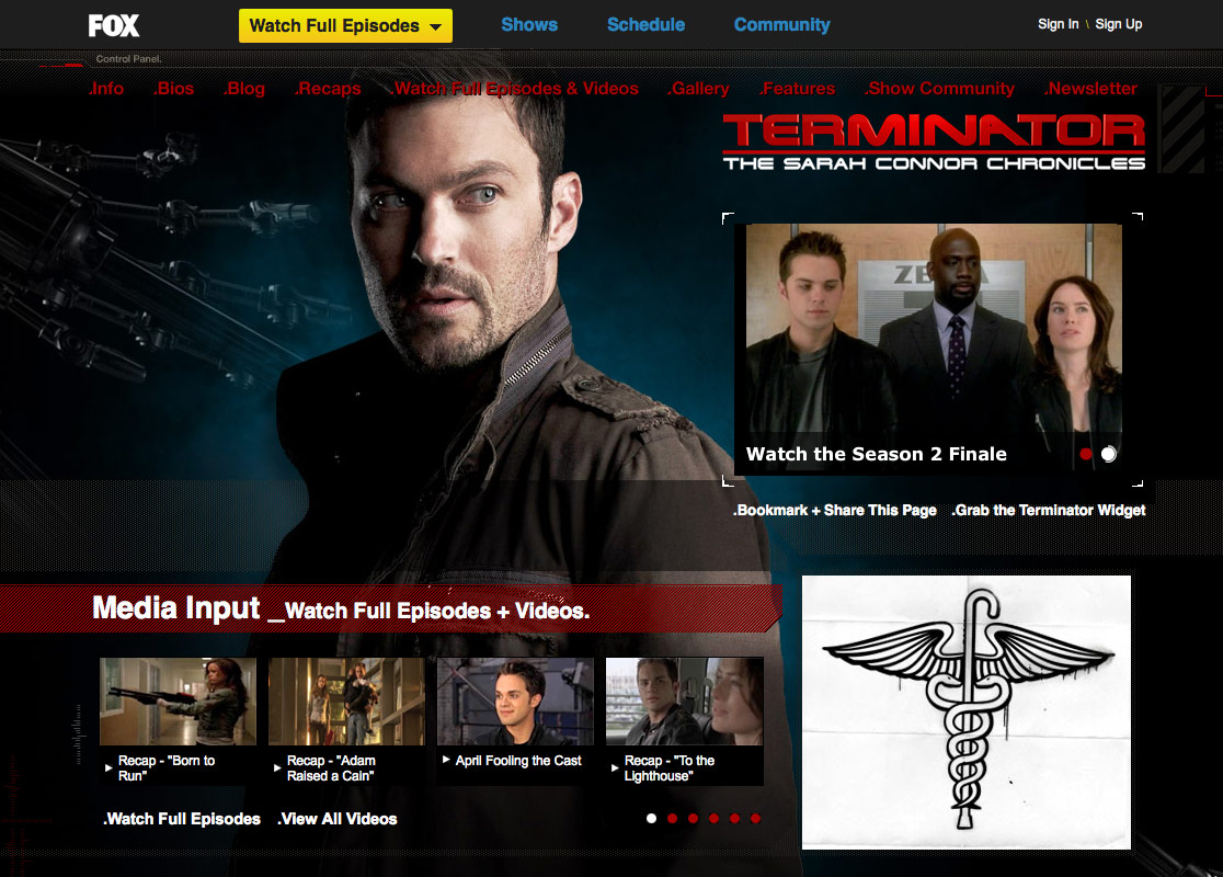
Example 6: Fox
Fox – Fringe web site broke the boring boxed layout by using spectacular background images that blend from top to bottom. Also, the slant cuts in between the boxes make it look more interesting. Don’t forget to check the other Fox TV show sites.

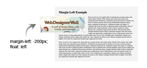
Example 7: Mezzoblue
Mezzoblue made the image extend off the grid. This can be easily achieved by using the margin-left property with negative value.

Quick CSS Tutorials
Using CSS Absolute Position (view demo)
The following tutorial imitate the result as seen on the Huge website using the position property. Use position:absolute to place each element. Then set higher z-index for the logo, nav, and content area (so they are placed above the image box).

Using background image (view demo)
In this example, the logo and the text are embed in the background image. To make the logo text clickable, first specify the H1 to absolute position, then use text-indent to hide the text in the H1 a.
For the Click Here button, use absolute position to place it in exact location. Specify a background image to it and use text-indent to hide the text. On the hover, change the background position to bottom.

Using margin-left (view demo)
This one is extremely simple. Just specify the image with negative margin-left and float:left.
148 Comments
Comments are closed.
zayıflama
Great works.
Thanks
WebDevVote.com
You are voted!
Track back from WebDevVote.com
Xiawa
I love example 3 :D
company logo design
Nice and informative about header design
complex41
And then he handed you the thirty-five 45
div
Awesome………..Kewl……………
MJ
Yay you are my favorite tutor! I’ve been looking for such a thing last week
Oliver
Some nice looking sites and good tips which I could use for my next web site. I tend to stick to one type of layout but I will use these examples to try other layouts. Thanks for sharing.
Noel Wiggins
Main these are some refreshing designs!
Seems like the internet was becoming one huge example of “invasion of the body snatchers”
Very Inspiring Blog Post Now lets reface this place!
—
Thanks & Regards
Noel from nopun.com
a professional graphic design studio
Ronja
The web design’s inspire me! :D
imrose @ discount web design
these are really coooooooooooooooool.
DokorThomas
Very nice. CSS is wonderful altho’ bit challenging at times. I love to see how others have worked styles I have only dreamed about. Bookmarked your blog for regular reading… three thumbs up!
ben
Loving the examples here some truly inspirational stuff thanks for this!, still getting to grips with CSS trying to teach myself really. Consider this site bookmarked retweeted and various other socially acceptable thingies
Chris Howard
Love these, loving seeing folks push the boundaries. Very inspirational.
And if I may add my own contribution, albeit not in the same league as any of those, Idyl Book Cafe
If anyone wants to know how I did any of its tricks, feel free to ask. Hopefully I’ll remember!
Rob
Nice sites. Thinking (designing) outside the box.
Cyprian Gwóźdź
Thanks, Trent Walton is smth new.
Web Developer Ottawa
Thought the “Huge Inc” project was a perfect example of out of the box.
Jack
Cool and nice, Nick you truly provided useful infomation. Thanks.
John Lascurettes
What’s a “z-inex” (in the first tutorial illustration)? ;p
mg12
Thanks for your great work.
This article was translated to Chinese and reposted on the following page (keep the link of original article):
http://www.neoease.com/css-design-out-of-the-box/
Calvin Tennant
I like this a lot. The idea doing a web design in the fashion of a magazine has crossed my mind multiple times.
Jerome
As usual a very interesting post. Thanks for sharing this!
Nick La
@John Lascurettes – z-index is like layers (greater value is always in front).
Amber Weinberg
These are great! Will definitely take some of this inspiration to my own work.
beyondesign
Great stuff and thank you for the inspiration! Only (small) caveat: You may end up needing a fix for IE6’s poor rendering of floated elements with negative margin. Here’s one that has worked for me in the past: <!–[if lt IE 7]> <style type=”text/css”>#your_selector {zoom:1; position:absolute;}</style> <![endif]–>
Linda
Cool and nice
ajiz
Nice.I want learn more………….
acinam
thanks :D
AtiKuSDesign
This is a massive ‘gimmick’ that I see being used a lot at the moment. i think this design technique will have to be included in any 2009 design trend lists
Adam Akers
Another great post
MrAmor
it’s hard facing the browser compatibility ! …but it’s possible if you drink a lot of coffee ;-)
Elizabeth K. Barone
It’s so hard to break out of the box. I think some of the examples even tread on the line of being grid designs. I think I might play with this a little over the weekend if I get a chance! (:
Jim
Thank you Elizabeth!
Marc
I’ve hit a roadblock these past couple of weeks looking for just this sort of thing. It’s articles like this that lead me to having kept this site on my list of RSS Subscriptions. Thanks, Nick.
sabithpocker
looking forward to more background based sites like fox, boxes looks boring :(
Sklep zoologiczny
Wonderbra is amazing. At least some original website!
The Frosty
Love those cool little CSS tricks that “break” the style.
cawlin
errr…you missed the “d” in z-index in your diagram.
Good list of site though!
BebopDesigner
Brilliant post! This is very inspiring and handy.
Keith D
CSS positioning is brilliant… it’s the browsers that make it fall apart.
I’ve created a few sites with overlaping images but had to spend hours making it work in internet explorer 6…
And now of course we have IE 8!
Having said all that, I’ll still try a few of your techniques.
Phoebe
this is awesome. thanks!
Louis
Nice example, thanks for sharing.
lance
I bet you must be really busy this days nick, WDW got a very few updates for the past few months. :(
Goodluck!
Kris de Jong
Some really nice examples. Definitely gonna use it during my brainstorm sessions :) Thanks
affordable web design
Nice and informative just great keep it up
张筱雨人体艺术
这个主题很好看,www.zhangxiaoyu114 .cn向您致意
Matthew James Taylor
Now, f only I could put my comment out of this box! =)
Andrew
On my company’s new website we made a lot of use of this same type of style – plenty of “outside of the box” design elements and a lot of implied borders without actually having a visible border. Check out all of the various interesting positioning on this overview page for example: http://www.graphicallyspeaking.ca/web-design-development/ I still love the “tin can phone” graphic at the lower left. ;)
Nick N
brilliant stuff, it definetely helps to break out of the box. thank you for compiling all this information, explaining it and sharing.
Nicolas Ménard
Those tricks are quite clever! It answers many questions I always had about those kind of overlaping elements, thanks!
Lynn
Really great, thanks so much for sharing this information!
BORABORA
Great post!
Exactly what I was searchig for 5 Minutes ago :)
Thanks!
Best wishes
Timothy Jones
Wow, remarkably high quality content as always. Also, since this is the first time that I’ve used the comment box, I want to remark that it is freaking cool as well. Web designers everywhere thank you :)
Alex Peterson
The wonders you can do with a few negative margins!
Kaplang
really nice post, thanks :)
Julia
Great examples! I’ll definitely consider some of the ideas in the post.
Eden Denevan
added to my favorites. will definitely review again for inspiration. thanks!
Cyrus
Great , CSS: Design Out Of The Box
Great article. CSS saved webdesign
Cyrus
Visit http://www.psdtoxhtmlcoder.com
Attitude Design | Graphic Design Portfolio
Some brilliant designs here – thanks for the post.
Ali
Great tutorial… a great lesson indeed to be learned.
-Ali (yumz.net)
Squiders
Great tutorial and some great examples, thank you! (www.squiders.com)
Cyrus
Great , CSS: Design Out Of The Box
Great article. CSS saved web design
Cyrus
Visit http://www.psdtoxhtmlcoder.com
Web Design Australia
wonderbra site looks very different and I too thought it to be flash! CSS when used well can give away a really design for a website. But in some companies, table like layouts alone can give a professional feel to the site.
I liked the way huge inc site is structured too.
ass
hi aaaaaaa
SiteArt
I really like the ‘Huge’ website the extensions out of the box are nice.. but it’s the typography that makes it really shine
Juul
Great examples. Bravo!
Guy Labbé
Kewl, thanks for these great examples, this powered up my creativity in this sad hangover morning. I’m tired making too standard-looking webdesign, I shall try something new soon.
Webdesign
Great CSS Tutorial………….
Its very helpful to us understand Web Design
engin
Great CSS Tutorial………….
Its very helpful to us understand Web Design
liko
so excellent!!!
will get inspiration from these great works…
Dennis
Just a little question…does -(minus) values validate properly?
Froilan
gotta love the fox fringe website. awesome post.
SilkLink
Great article. Wondering where the word ‘layouted’ originates from, but soon got sidetracked by the wonderbra ;D
Kim
Great post, and I certainly thing CSS is the next big thing, or even already is. If the web browsers could just all get along, things would be perfect.
Michael
Just wanted to say that the background-position trick for the button is GENIUS, I feel so dumb for not thinking of that. Thanks!
Jason - Web Designer
I always get nervous using negative positioning because of browser compatibility but I love the way the designs look. I want to try it on the next site i design.
Shane
Cool post, so much inspiration.
Thanks for sharing.
BASINPIPES
Cool reminder about the z-index…tend to forget about that CSS ability…sometimes end up with way to many divs and classes to work around the layers.
http://www.basinpipes.com
Mckaty
Thank you!
It usable for me very much.
Dan
Can’t get the last example to work in IE6, the margin left, float left.
Carson Shold
Those are some great sites! I love the idea of breaking outside of the lines, and have taken it upon myself to incorporate that into nearly every site I do and will do in the future.
Keep up the inspirational posts,
Carson
Web Design Singapore
was looking for inspiration after running out of creative juices. this sure helps a lot!
Gene
What does “layouted” mean?
And you were just looking at the “design” of the Wonderbra site right?
Bharat
Thanks for this post……
many time we forget about css ability…!.
Francisco
Very nice tutorial. Thanks.
Steven Wiggins
That breakout-image trick is definitely a simple piece of genius. I’m still kicking myself for not seeing it from the start. Good mini-tut, too!
Jim
I like the post a lot. Very inspirational, thanks.
Andrew Gerber
Of course all people are tired of a typical columned and boxed layout. Obviously, these techlologies are already in the past. More effective solutions already exist. Hope that great examples provided in this post will inspire readers and new ideas will appear in the end.
Radoslav Holan
Thanx God for transparent PNG’s and CSS =) Good article and nice samples…
Joefrey Mahusay
The last example seems not working properly in IE6. Is there any way to make it work?
Autonomy
Thanks for some great examples to explore and the brief tutorial!
UK Hosting
Many thanks for good inspiration for web designers. Waiting for CSS2 to come in play.
Check out this great offer’ 50 % special off for web designers
http://www.ukhosting.uk.com/webdesign.htm
You will be assigned a coupon code which you will need to use while purchasing and will be rewarded later on.
Cheers
rx1
I like it Very nice thanks.
rx-1
More effective solutions already exist. Hope that great examples provided in this post will inspire readers and new ideas will appear in the end.
UK Hosting
Sorry guys for wrong link :
Here is the Offer Link :
http://www.ukhosting.uk.com/webdesigner.htm
Bryan Moore
Very, very cool. This has inspired me to redesign my website. The thing about web design is making something that stands out from the rest as there are millions of websites out there. Using these techniques give web pages depth and creativity. The nice thing is that as designers we can create anything to captivate an audience and this is a sure-fire way to do that. This is the next wave in innovative web design.
مركز تحميل
well done
kilo aldırıcı
thanks it is…
shoopak
well done!
cyprus car
Pol11
However, greater emphasis and energy should be devoted to economic recovery. ,
Mr.Carrot55
Any other advices, are welcome. ,
mohamed el metwaly
nithe man
good work
Rob
Got to say I’m not a big fan over using too many postion: absolutes on a page but they do play a very important part in design layout. Nice post
Jan Middleton
I have noticed that some people change their blog designs like others of us change the oil in our cars or more. It is great for them, but for me? Not so much.
dana alves
i would kill to work with you! i pretty much only use CSS and love it. I have so many design ideas that are completely out of the box yet everyone wants me to stick to the common layouts so that it doesn’t confuse people who are not so internet friendly. i think the only way to change this is to have more people have cool designs like you so that people get used to diff. layouts. nothings gonna change in the design world if we have to keep to the web standards of boring sites. god i wish we could design sites together.. they would be sick! i loveee you outlook on web design. awesome!
Jon
This is the next wave in innovative design. There are some great examples here. The big challenge is using innovation without adding too many elements and confusing people who may not be completely Internet savvy.
Jay
Like your posts so much
web designer in egypt
thanks very much it’s best collection I had ever seen
Pedz
WOW!!! I can only dream of what you can do!
Pedz Rodulfo
panel radyatör
great tutorial thanks
ecmuscle
I love your websites design, wonderful!
Excellent ideas to design out of the box, it’s an eye opener :)
Thanks
acai
i think the only way to change this is to have more people have cool designs like you so that people get used to diff.
Ramsey Stoneburner
I’m one of the ones changing my website design regularly (for me that’s like every 2+ years). I find that in an ever evolving industry such as web design, it’s not so much as “keeping up with the Jones’s” but more an exercise in applying one’s newly learned ideas. Thanks for the great post!
fkri
cool beans! http://www.valetmag.com/ has a pretty good layout too. each post is styled differently
submit site bot
When finishing your web. Submit site to search engine to make the best ranking.
Custom Website Design Services
Great article. I love looking at different, unique and stylish website design like that. Gives me some good ideas for my own work.
Thanks.
Graphic, Web, Blog Design | BrandleDesign
Great examples. It’s nice to see these screen shots side by side. Thanks for the post!
Philippines Freelance Designer
wow OUT of the BOX!!! really really great…. As a Philippines Freelance Designer i appreciate all the collection here… two thumbs up!!! nice design and perfect…
vincentdresses
喜欢你们的设计与技术,常来看看
Thorpie
I love all the illustrations on this site ..it’s truly inspiring and even though i’m not artistic and it is a noob question but what program or programs do i have to learn to create such art? I’ve dabbled in Photoshop and i’m super keen to learn .
Thanks
Jamie Billingham
I’m doing work experience with the people that designed the WonderBra site. :P
Really looking forward to it, it’ll be in May.
mohneesh
thanks for the tutorials of jquery they really good.
diş beyazlatma
I find that in an ever evolving industry such as web design thank you
Web Design
wonderfful read…gracias
Progs4u
Thank you so much ..
You are very cool
filesforflash
great examples
Penang Web Design
thanks for sharing….
Jai
Hi,
Currently i am working on a re-design of http://www.games24x7.com's landing page. If any one give me good idea where design say about Rummy.
Thanks
Jai.
apple
very good examples nice work
Edward
Thank you the margin left tut really help me out :)
baagdi designer
hey thanks for margine left example it helps me out
Azad
Wow… I must say that this website looks wonderful.
The posts are very informative, thanks a lot.. :)
willsosdan
I used to think that Cheap uggs outlet UK were the ugliest I had ever seen.
willsosdan
I used to think that Cheap UK were the ugliest uggs outlet I had ever seen.
Henry Peise
Want to make some change to your iphone 4? white iphone 4 Conversion Kit will be your best choice! Come and try on!
Juno Mindoes
White iphone 4 Conversion Kit is now the hottest iphone 4 piece that you should get!
Uçak Bileti
senin şerefine emmoğlu
altın çilek
very good examples nice work
dexx
Different thinking, contains a problem to produce several possible solutions.
complex 41
Complex 41 saç bakım seti, tamamen bitkisel ve doğal içeriği nedeniyle güvenle kullanabileceğiniz bir üründür. complex 41İçeriğindeki bitki özlerine
(55 çeşit bitkinin özü vb.) aşırı hassasiyeti olan kişilerde saç derisinde bir miktarkızarıklık yapması doğaldır. Bu durumda kullanım sıklığını azaltmanız tavsiye edilmektedir.
Asigurari Locuinte
I love the way the patterns move into one another.
Tresor T-mac
I love it
Alhasooob
this is good Thank You
Wordpress Web Designer
I love coming to websites that show out of the box designs that aren’t duplicates of other website postings. Thanks!
Omsoftech
OMG…It’s awesome design… i like it…Thanks for….
Web Designer Philippines
Very inspirational examples and tutorial. Thanks for sharing.
wordpress development company
Last wordpress themes looks is cool dude…
Luke Tao
I’m still learning from you, but I’m trying to reach my goals. I certainly enjoy reading all that is posted on your site.Keep the stories coming. I liked it!