One of the common problems we face when coding with float based layouts is that the wrapper container doesn’t expand to the height of the child floating elements. The typical solution to fix this is by adding an element with clear float after the floating elements or adding a clearfix to the wrapper. But did you know you can also use the overflow property to fix this problem? It’s not a new CSS trick either. It’s been documented before long long ago. Today I would like to revisit the topic along with a few tips.
Demo 1:
The demo below shows the issue with floating child elements where the parent container doesn’t expand. To fix this problem, you can simply add the CSS property overflow:auto (or overflow:hidden) to the wrapper container. This is perhaps the simplest way to clear floats.

.container {
	overflow: auto;
}
Demo 2:
Overflow:auto can also be used to prevent content from wrapping around the floated element. Let’s say you are designing a comment list. You would, most likely, have an avatar floating on the left and the comment to the right. To prevent the comment from wrapping around the avatar just add overflow:hidden to the comment container. The advantage of using overflow here is that I don’t have to set a float or width to the comment container. The container automatically aligns after the floated avatar image.
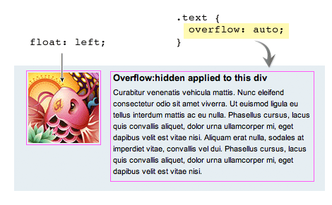
.image {
	float: left;
}

.text {
	overflow: hidden;
}
Drawbacks (see demo)
Although it is a nice trick to clear floats there are some drawbacks:
- Using overflow:auto will cause a scrollbar if your content is extending the boundary of the container. For example, if you have a long unbreaking text (ie. long url text) or a large image that is bigger then the container a scrollbar will show.
- To avoid a scrollbar from showing you should use overflow:hidden. Again, there is a drawback to this method as well. Using overflow:hidden will hide any content that exceeds the boundry of the container.
Word-wrap
To solve the long unbreaking text issue, simply add word-wrap:break-word to the container and it will force the text to wrap onto a new line.
.container img {
	max-width: 100%;
	height: auto;
}
Max-width
To prevent large images from extending the boundar, add max-width:100% and it will resize the image to the max width of the container.
.container {
	word-wrap: break-word;
}
José Eduardo
Very usefull tip. I didn’t know it, ant that cases have always been a pain for me. Thanks a lot for the help :D
Sergei Tatarinov
I used it in a project a few days ago, it’s a good way to clear floats w/o clearfix. And I was getting a scrollbar. :) I’ve spend quite some time to figure everything out, as I’m just starting out and still learning many css topics mostly via trial and error.
On a side note, you should swap the code examples at the end of the article. :)
joshintosh
Thanks for the note, the end examples confused me for a few min too.
ben
Thanks for the tip on the overflow hidden for comment text. Text wrapping around image always bothered me and I always had to come up with workarounds. Your tip will saved me lots of time.
JK
I think there is a mistake:
In the text you are stating to give the text an “overflow:hidden” but the picture says “overflow:auto”. Or am I just confused?
STHLM Web Design
I’ve always used overflow : auto as a means of clearing divs. The scrollbar issues have always been minor and tend to arise when you are working in a confined space, like a header with set height.
I had no idea about the overflow : hidden trick in your second example, that’s going to be put to use sometime soon.
Sam
There is a small mistake at the end: you’ve mixed the code examples of word-wrap and max-width fixes.
Xacto01
What? Huh? This is like a revelation? All this time I’ve been using the guillotine CSS to clear floats. If this is so easy and clean, howcome this hasn’t become mainstream? I’m surprised I never knew about this. Any catches? Browser compatibility?
Andy
Nice little post! You’re right – it’s a common issue with an easy solution that seems to have been forgotten. Very helpful, thanks.
elke
You are right – I burrowed this solution deeply …
On quirksmode I read amending:
width or height required
The use of a width or height declaration is required to make the effect work in Explorer Windows and Opera. If you don’t include it Explorer Windows continues to show the border at the top of the columns, as if there were no overflow. Opera completely hides the content of the container.
A width: 100% is a neat starting point, although more complicated layouts may require other values.
Matthew
Thanks for sharing this tip.
In terms of layout clears, I find this method pretty useful:
http://www.yuiblog.com/blog/2010/09/27/clearfix-reloaded-overflowhidden-demystified/
Cheers.
adikahorvath
Useful, i’ve never heard about that :)
nikola arezina
yes i know this tip it’s useful. it depend of design, whether use clear:both (e.g. footer) or, overflow:hidden. I always keep in mind both if i haven’t solutions i use overflow:hidden.
Andrew
Been using overflow:hidden forever. But I question the design quite a bit on this. Why should we lose height properties of the container element when elements inside use float? That seems very unintuitive.
I Love Web
……. i only know hover
Ricardo
I use { display:table } to expand containers automatically.
Works like a charm, and still use margin, padding, etc…
Brenten Judd
Thanks for this I have been looking for such a solution!
不羡鱼
can not work in IE6.0
Jon Glick
Yeah, this method is incredibly handy. Although at this point when I do client work I generally avoid using overflow:hidden or auto. I can’t count how many times I’ve had to re-work the html/css of a layout to allow some tooltips or other overlay that would’ve been otherwise hidden by the container. Use with caution.
Ali
If you giive overflow:auto it will give more space which again you need to play with the width:
instead why not only give
.container{
background: none repeat scroll 0 0 #E6EEF2;
border: 1px solid #999999;
padding: 10px;
float: left; /*Add this Property*/
width: 94% /*Add this Property*/
}
Now if you check in any browser it will work similar No CSS hacks needed incase if you want to need this Container where there is no Float Needed and then make a class .noFloat with float:none and inherit it in Container.
Problem Solved
Alexander Hetzel
Thanks for this great article. It’s indeed an alternative to using additional clear elements.
But you mixed up the code examples for word-wrap and max-width. ;-)
Alex
Okay this seems to be a revealing. I never knew it was possible to sort of ‘clear’ floats with the overflow auto!
So all those times i’ve been using and extra div for the clear it could and can also be done just by using the overflow auto on the container/wrapper of the floating elements?
I’ve tested it with a simple layout:
enough text
enough text
FOOTER
with the styles
div { margin:0; padding:0; }

.wrap {

margin:auto;

width:900px;

height:auto;

background-color:#9F3;

overflow:auto;

}

.footer {

margin:auto;

width:900px;

height:120px;

background-color:#0CF;

}

.left {

width:400px;

height:auto;

float:left;

background-color:#CC0;

}

.right {

width:400px;

overflow:auto;

background-color:#693;

}
And it works like a charm! not even need to flow the right column and the footer’s nicely pushed away.
I’ve tested this on all browsers except explorer. Could someone aknowledge it also works in explorer?
Great post!
Alex
Oh it seems that in my previous comment the html code won’t show properly.
Niko Lang
I used that too some time ago. But this method has some problems with the page break when printing the website… at least in Firefox.
Using the clearfix instead:
.clearfix:after{content:”.”;display:block;height:0;clear:both;visibility:hidden;}
.clearfix{display:inline-block;}
* html .clearfix{height:1%;}
.clearfix{display:block;}
Works in IE6 but the class is needed in the markup.
Alex
@niko_lang
you mean when actualy printing out the website? Well since a site isn’t for printing it doesn’t realy matter. And if things on a site need to be printed just create an print-friendly page of an article or so to print.
Pragmatic Design
Thanks for the tip. Putting in that extra DIV has always annoyed me.
Pedro
I used to clear floats with overflow: hidden; bur now i prefer using the :after method described in this article : http://perishablepress.com/press/2009/12/06/new-clearfix-hack/
/* new clearfix */

.clearfix:after {

visibility: hidden;

display: block;

font-size: 0;

content: " ";

clear: both;

height: 0;

}

* html .clearfix { zoom: 1; } /* IE6 */

*:first-child+html .clearfix { zoom: 1; } /* IE7 */
Ginchen
Nice reminder – I used to know this, but almost forgot about it … As chance would have it, I have a situation right now where I can use this! ;)
Radu
Very handy technique… helped me a lot recently. Good idea to post it ;)
Boolian
Re: IE6 workaround
I used to always use this technique but tend to use the clearfix technique more now. The overflow technique is still handy though in cases where you don’t want to add an additional class to a div. However, if you need to support IE6, using overflow: hidden alone doesn’t work.
Solution
You need to either add height: 1% or zoom: 1
It seems you can add height:1% to the parent div without it effecting IE7, IE8, Chrome or Firefox. However to be a little more semantic, you should probably set up an IE conditional stylesheet specific to IE6. Alternately, if you aren’t against hacks in your css you could just use *height: 1%, which will only be rendered by IE6 and IE7.
Personally I go with an IE6 conditional stylesheet or zoom:1 (depending how lazy i am).
Unfortunately, at the moment I can only test this with IEtester so it may not be 100% reliable information. Maybe if someone can confirm with an authentic IE6 install.
Give it a go :)
Russell Heimlich
I’ve been using this technique for years. It’s the best way to clear floats with no need to muck up the mark up.
There is a situation where the overflow method will cause problems. If you want to hang an element outside of a container, margin-left:-15px for example, then using overflow will get in your way.
Ian
I’ve found that using “display: table;” can also work. I haven’t used it extensively so I’m not really too sure of any problems it could present. Anyone know anything else about using it and any problems it could bring up?
Jeff Starr
Awesome technique, but watch out for elements styled with box shadows. If the parent container is using overflow:hidden, the drop shadow will be cut off. For such cases, I prefer the float everything method or the new clearfix method.
Alex
@Boolian
Are you for real? Man, forget about IE6!
Haha i ain’t paying attention just for that mistake called IE6 :)
Lathan
This very thing kills me, having to add unwanted div’s and wrappers to my HTML. Thumbs up for this!
Boolian
@Alex
I agree with you completely about IE6 :-) Most projects you can forget about it… However some of us work with corporate environment clients who still run IE6. Alot of these companies have core systems in place that only work in IE6 and are unable to upgrade… some just have lazy IT departments. It’s a sucky situation but what can you do. IE6 isn’t dead yet unfortunately :-(
Hiro
IE6:height:1%;
Other:overflow:hidden;
joga
I made similar before and it works ;)
CuPliz
Nice one Nick! Thanks ;)
Piyush Agarwal
Thanks for this tip. It would come handy, hope there are no cross browser issues with this trick.
Also wanted to point out that there are 2 mistakes in the post:
– The illustration for Comments Block says overflow:auto when it should be overflow:hidden
– Images for ‘Max-Width’ and ‘Word-Wrap’ need to be interchanged.
trambolin
i m looking for like this tip. thank you
Iamshaw
I thought I had read this somewhere!! I use this all the time rather than using a clearfix or similar methods, and I started to question if it was ‘acceptable’ or not. However, I’m glad you mentioned the drawbacks with this. When trying to position child elements outside of the container with overflow:hidden set, that certainly does become an issue.
I’m surprised at the attitude towards IE6 on some of the below. I was surprised to see some stats recently on the percentage of users still using IE6, mainly from large corporate companies.
Thanks Nick
jucallme
love the amount of people who still worry about IE6.
Ben Whitehouse
Wonderful tip! In the years I have been wrestling with CSS been looking for my divs to do just this! Awesome!
Julie
Good article. Its important to remember to design your css just the way you said!
Fred
If you use overflow: auto; to clear the floating, some browsers also need a value for the “width”-property on the container.
Francesco Russo
Nice article! Thank you Nick.
Luke Terry
Great tip :)
Ayo
Nice one. I actually do forget that from time to time.
Dessign
Great article and very nice tip,
Marios
Snoggle News
This is really useful stuff Nick, thanks for keeping the blog updated. Often times web designers just can’t find all the time anymore to keep up and study these new techniques. Roundup posts such as these are an excellent introduction into the topic(s) :)
baobaz
wew.. I dont know this technique..
Thanks you very much for share this info. hehe…
Html Codes Dude
I didn’t know this. I have always used a clearing element below the floated elements. I will be using this from now on. Thank you.
Josiah Sprague
Simple, but great article! You wouldn’t believe how many complex, messy solutions I see for clearing floats every day! These are key concepts to master early on for anyone who is serious about learning CSS.
Federico González Brizzio
Wow! two (big) solutions in one article :)
How is possible that nobody saw it before? Excellent post. Simple and usable
Thank you
kihwa
Thank you!! :)
Gu Shangjie
Excellent, Amazing, so simple so powerful, thanks.
Khalid Majid Ali
Very useful tips, thanks a bunch!
Ramón
Very nice tips, thk…
sipeti
Hello Guys!
Why don’t we use simpe “display:table”? If we use this on our container boxes, the children floating elements will expand the containers.
Ralph
Thank you for this idea. I don’t know of this possibility until now.
Andy
In most cases this is the simplest and most reliable method of float clearing – thanks for explaning so clearly. The code blocks for large images and long lines of text shown above are back to front.
css splash
Thanks for this tip! csssplash.com | Web design Gallery
Richelle Anderson
As always, Well Done. I have used this method a few times and it is one of the most reliable was to clear a float in websites…
Pilot
thanks for this simple but very useful tips :-)
webbuilders
less mark up its rocks!
Dessign
Less code better results, nice Thank you for the tip
Ian
@Jeff Starr
Elements with “overflow: hidden;” will still render box shadows however after some testing I discover that while “display:table” will clear floats, it will stop a box shadow form rendering.
ChayaChitra Photography
Small but powerful tip. Thanks for sharing
comportementaliste ile de france
Thanks guys! This trick is awesome, just bookmarked it ;)
Uçak Bileti
i dont get this over :))
Uçak Bileti
man i dont get it. can u email me again pls?
Itay
Its a nice trick… though I still think that the solution of just adding a div with a clear both rule is the best way to handle these types of problems
Kuba
OMG! I’ve do that about 5 days ago when I was coding my new portfolio ;)
Matt
Learned the overflow trick a few years ago, saves my life every single time!
JohnnyS
awesome tip, thank you, I need to remember this instead of always adding clear floats everywhere
tom
great! i like it~
Akhtar
awesome technique… helped me a lot recently. Good idea to post it ;)
Adam
Really useful tip. Thanks for this tutorial :-)
animasyon film izle
Good topic thank you
program indirme
program indirme thank yo
kilo aldirici
https://webdesignerwall.mystagingwebsite.com/tutorials/css-clearing-floats-with-overflow/
Yuki
Thanks! I like it.
By the way ‘Word-wrap’ and ‘Max-width’ codes are up side down aren’t they?
Berlin
yeahh, good tutorial. i think its better than the clearfixes like them from sonspring.
diş beyazlatma kalemi
All whitening formulation is applied by dentists with quality features, powerful, secure, and very reasonable prices, as well as the missing handbag is a unique product design, fashion styling you will not ..
Vivek Dhande
Really incredible tip, thank you. I need to implement this instead of always adding clear floats while developing.
Robert Greene
I have been learning all this stuff recently, and let me tell you, I have really been learning a lot. This blog is one of my favorites, but if it wasn’t for http://www.onlinedreamweavercourse.com then I would have never been able to code. I am really excited about HTML5 and CSS3 though. I can’t wait to learn that.
Joshua Grigg
Very useful, thanks for sharing!
ltmylinh
Thank you for your sharing. It’s very useful :)
Kristaps Ancāns
Using this method for long time now and still think that this is the best method for clearing floats.
Keith Davis
Floats are great, but oh so many headaches!
Thanks for this little hack to help sort out the problem.
I use “…adding an element with clear float after the floating elements…”
Does the job and no downside.
Gleenk Webdesign
I didn’t know this trick, it’s really useful and works well even on IE7. Unfortunately it doesn’t work on IE6, but I know it’s time to forget about it,isn’it?
emresumer
Overflow:hidden is usable but if you have some content or buttons or images that should out of box it is not suitable. If your design accepts you can give float:left or right to container instead of overflow.
zayıflama
yeahh, good tutorial
Vincent Ammirato
Thank you for revisiting this topic. It may not be new but it is new to me. I have good working knowledge of float and clear but always feel like I’m adding one too many div containers to get what I want sometimes.
Definitely trying this one next.
Shoom
display:inline-block or float:left/right work as well.
@Keith Davis (89)
“I use “…adding an element with clear float after the floating elements…”
Does the job and no downside.”
No Downside? Unneccessary DOM elements? It’s HTML dealing with stuff that’s CSS’ business… At work we call that a pussy div.
renxx
it dosent work in IE6
Benjamin Reid
An old trick that I’d tell everyone that’s new to the field. Use with caution though but 9 times out of 10 I’d use this.
APEXstudio
This is exactly what I was looking for, helps me a lot for someone new to css. Thanks!
Lucy
I LOVE DESIGNER DOODLES.
faraz
Thankx for sharing this,this was becoming severe headache for me these floats.It helps me the best and solves my problem.
Vitor A. Vale
in this case instead of using the ‘div’ a simple ” after the element also addresses… not?
Vitor A. Vale
in this case instead of using the ‘div’ a simple ” after the element also addresses… not?
Vitor A. Vale
in this case instead of using the ‘div’ a simple br w/ clear=”all” after the element also addresses… not?
saqib sarwar
I used overflow:hidden; in most of the cases and really works fine.
thanks for tip about image
.container img {
max-width: 100%;
height: auto;
}
cosmos
very nice tip! thanks!
Khan
Hi I like the comments section portion of your website that is nice and neatly designed. Can you please refer me how can I get this section to embuid in one of my website.
construction project management
It fulfills my need
Pixeno
Top writeup! Floats really annoy me because when you havent floated everything right, it overflows. Thanks for the tip.
Web Designer London
Fantastically displayed. really nice post to read about. Thanks for sharing. Our inhouse web designers would be happy to learn about.
Steve Rydz
I find myself using overflow:hidden frequently as in my opinion it is one of the more robust methods of clearing floats. There are occasions however where it’s not suited. For example on my homepage: http://rydzdesign.co.uk I have three screenshots of recent projects. Each has a subtle box shadow applied to it which if I used overflow:hidden would be clipped so I used clearfix instead. It’s yet again a case of right tool for the right job.
Kishore Jangid
Thanks yaar, solved my problem for which i was searching stuff from the past six months. The thing which was useful for me was and one thing i had a error was i made parent tag relative and child tag position absolute which was the error from those days. I removed the position tag from them and added the clear div. Its working fine now. Thank you.
Melfina
Great, it’s always good to know some tricks to make the page look as it should! Thank you
Peter McKenna
For those of you complaining that this doesn’t work in IE6, you need to trigger hasLayout on the container for it to clear. This can be done in a number of ways, but the easiest way would be to add width: 100%; to the .container class.
If adding a width messes up your design, you could add zoom: 1; instead which will also make it work in IE6.
ferret
woohoo thanks, solved my ie6 problem
Ashish Kumar
Thanks for sharing such a nice article!!!!!!!!!!!!!!!!!
Adham Dannaway
Interesting way to go about solving the clearing float problem. I always used the clearfix method. I guess it’s good to have a few other options. Adding another div to clear floats should definitely be avoided as it adds useless markup.
Martin
Exacly what i was looking for…Great Redesign by the way !
Web design Cambridge
You have showed great perseverance behind the blog. It’s been enriched since the beginning. I love to share to with my friends. I spent almost half an hour daily here. Carry on.
Greg Babula
Great tip I hate using div’s to clear my floats so this will come in useful for sure :-)
Scott Cobban
I tried this method but wasn’t able to continue with it because I had a number of tooltip-type flyouts that appear on hover and need to appear over/outside the border of the overflow:hidden/auto’d element. With this fix, the element showed scrollbars or just hid the popped up content. Any suggestion on how to make that work? Great redesign. Inspiring.
Giuliano
Nice tips. Looks like word-wrap and image width code are mixed up.
Andy Ford
Overflow: hidden will also clip css3 box-shadow as I demonstrated in this blog post http://fordinteractive.com/2009/12/goodbye-overflow-clearing-hack/
Rory
Nice tip, handles the text perfectly
Filipe Valente
Cool stuff what I’m looking for is how two have on left float and one right float having the same height even if one has more content then the other anyone knows how to do that thanks
Marcus Tucker
Nice article! Just one correction needed though – your code snippets for word-wrap and max-width are the wrong way round! ;)
Rolando Murillo
“overflow: hidden;” is the best of them, “auto” can generate scroll-bars in some browsers.
Jared - Stealth Web Designs
I like the overflow auto technique. If I have scroll bar issues I find it easy to fix by throwing in some padding to the container in question.
wbit
I needed this… And as I suspected it came in verry handy. Thanx
IOM Design
Hadn’t really seen this way of clearing floats before. I’ll have to remember this one as it could prove very handy!
Faraz
Very useful tip and explained very well infact the drawbacks you have mention also describring and solving the issue at same time.Thanks for sharing
sumomax
is not easy to put on weight
dan
http://webdesignersbest.com/
online project auction for clients and web designers
or buy services on site. web design, graphics etc.
Nicole
Nice article, just one thing, IE 9 doesn’t render overflow: hidden correctly, it totally removes all content from view.
Mike Sinkula
I’ve noticed that content won’t print properly using this methodology.
Sagar Ranpise
Hey this solution is good but why not use “float:left” instead?
Deb
This is very cool.
I wonder why using a “clear” fix is so popular. This technique is much cleaner, no extra elements.
Any cross browser drawbacks?
Soph
Thanks for this very useful tip.
I think the code for “Max-Width” and “Word-wrap” are in the wrong places…
joshintosh
Why would anyone use “clearfix” if this has been an option all along? This is great, thanks again Web Designer Wall Man!
Daniel Nolan
I am a web designer at Creare Communications and use overflow:hidden in the majority of the websites I have created. One of the main benefits I find it brings is the ability to use the same styles on different pages, as this allows you to use a container which can expand or shrink to fit to the content within it.
Overflow:hidden is also helpful when viewing a website in all browsers. I have found that in IE your text renders differently to Safari or Firefox. This can be an issue if you have a height on your container which can then cause the text to be cut short. By simply taking the height off and replacing it with overflow:hidden it enables the div to expand to the size of the content within it.
Great article.
Pieter
Your code-snippets for max-width and word-wrap are switched.
Nice article!
mhn
oldschool but practical; seriously awesome.
Josh
I think the css code examples need to be swapped. The max width css example is actually for the word wrap. The word wrap css example is actually for the max width.
Alex K.
I actually prefer display:inline-block… works almost the same way…
dexx
Recent surveys, children of depressed mothers’ negative patterns of activity occurring in different brain reveals. This is for children of mothers who take more risks in the future is going to have depression.
zc
“word-wrap:break-word” only suits IE isn’t it ? So how to deal with the problem in other browser ?
zc
… i made a mistake. I know the “word-wrap” should match the setting of “overflow:hidden”.
rajvaghela
really is very useful and very important point of view.
Miriam
really good useful information I usually use clear float which I am not too happy with but will def try this out, btw love the new site, miss the old flowery one though..
towry
i’m new learner . and i’m always confused by the overfloat code . i don’t know where should i coding it , or even when the problem appeased , i don’t know how to deal with it . your post inspirate me . thanks .
Paul
One difference between the overflow:hidden and clearfix methods is that overflow can interfere with horizontal alignment. I had an element centred with {width: 960px; margin: 0 auto;}. Adding overflow:hidden to the element pushed it hard left in Firefox and Opera (it rendered fine in Chrome). I ended up reverting to clearfix as it worked across all three browsers. I also know how it works whereas I never understood why overflow cleared floats.
wasim shahzad
Thanks dear….
this is really an awesome solution. i try it and it works well
Mont Blanc Pen
What is friendship?Mont Blanc PenWhy do we call a person our friend? When do we call someone a very good friend?
Chicken Coops TV
I would just like to say, what a beautiful header and footer you have here Web Designer Wall!
Mont blanc Pens
it is a great post
Jawa
Useful posts…easily understadable about floating div’s. Word wrap and Max width examples swaped.
Brisbane Osteo
Awesome post! Very helpfull! Thanks for sharing!
orhanbt
This is verry good.
elmalak
I enjoyed this great, simple and important article, however, I noticed that there is a small mistake at the end.
It seems that you’ve put the code for word wrap under the max-width title and vice versa.
thanks,
elmalak
john
Nice! That is the good solution. Thanks for sharing it..
Blinds
The information provided by you is very useful for me and thanks for sharing it.
mont blanc pens
a good article!
mont blanc pens
complex41
And then he handed you the thirty-five 45
PlasticCardChick
this is so handy!! as a bit of a CSS novice this is going to make life so much easier
Ron
Great Stuff! Thanks
mybookmart
nice stuff i like it
appsmenow
very nice. thanks
kevin
Great article! Thanks for posting.
Krishna
Absolutely useful … !
mehmet
Very useful information. It is good to learn this. :)
Kirk
Your Word Wrap and Max-Width CSS examples are mixed up. They’re going to the wrong headings.
JeanDavid
I had issues with the first probleme which is the wrapper box which dosn’t fit to the floating box, and comes your article !!!
Magic, thank you !
Wollongong Rentals
This is very informative for those persons who are facing clouts case for long tine. With the help of this post they can remove their tensions.
RootShell
Wouldn’t “display: table;” in the main div solve this issue?
kiran
this is very nice… for beginners this is very use full… some times i face this type of problems…. nice stuff…
—kiran
skype: alokweb_kiran
Julien
Thank you a lot for your solution. It is very helpful for me :)
Dymo L
Excellent post. I think that CSS clearing floats are always better then this.
Thanks
baju batik
thanks
Rahul
This information is very informative, this helped me a lot!
Thankyou very much and keep posting!