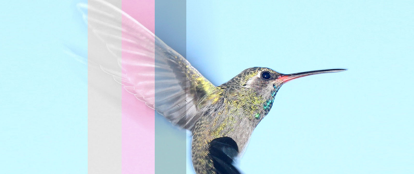
CSS image filters are a quick way to tweak images in the browser without resorting to Photoshop. This simple reference gives you 9 CSS filter shorthands that provide an excellent way to maintain style consistency across visual content on your site, or just add a little fun to image hovers. CSS filters are most commonly used to adjust the display of images images and backgrounds, but can also be applied to other visual elements such as borders and buttons.
CSS filter Property
The CSS filter property applies familiar effects like blurring, inverting, or color shifting a graphical element and is supported in all major modern browsers. It has a really simple syntax that looks like this:
filter: type(value);See the Pen Simple CSS Image Filters by Vail (@vailjoy) on CodePen.27486
Filter List
Let’s take a look at the various filters, what you can do with them and how to write them:
blur
filter: blur( length );This filter applies a Gaussian type blur effect. The length value refers to how many screen pixels blend together, so larger value will create more blur, with 0 being the same as no filter.
.blur{
  filter: blur(5px);
   -webkit-filter: blur(5px);

}
brightness
filter: brightness( number or percent );The brightness filter will make the image lighter or darker. The value is the percentage of brightness you want, formatted as either a percent value or decicmal, where 0% or 0 is black, and 1 or 100% is original.
To make an image darker:
.darken {
    filter: brightness(.5);
    -webkit-filter: brightness(.5);
}
Or make it lighter:
.lighten {
    filter: brightness(120%);
    -webkit-filter: brightness(120%);
}
contrast
filter: contrast( number or percent );Adds more or less contrast to your image – great for fixing faded blacks! The value is the percentage of contrast you want, formatted as either a percent value or decicmal, where 0% or 0 is gray, and 1 or 100% is original.
To increase contrast (numerical value):
.contrast {
    filter: contrast(2);
      -webkit-filter: contrast(2);
}
Or fade it out (percentage):
.contrast {
    filter: contrast(50%);
      -webkit-filter: contrast(50%);
}
grayscale
filter: grayscale( number or percent );The most widely used CSS filter, grayscale simply removes color from your images. The value is the percentage of contrast you want, formatted as either a percent value or decicmal, where 0% or 0 is no change, and 1 or 100% will create a fully grayscale image.
.greyscale{
  filter: grayscale(1);
    -webkit-filter: grayscale(1);
}
hue-rotate
filter: hue-rotate( angle );The hue-rotate filter works similar to the Hue/Saturation Adjustment in Photoshop. Imagine your image placed under a transparent color wheel. The value of angle defines the number of degrees around the color wheel, where 0 is no change, up to a maximum value of 360.
invert
filter: invert( number or percent );This filter takes your image and inverts it, so blacks become white, oranges become blues and so on. The value is how strong an effect you want, formatted as either a percent value or decicmal, where 0% or 0 is no change, and 1 or 100% will create a fully inverted image.
.invert {
    filter: invert(.8);
      -webkit-filter: invert(.8);
}
saturate
filter: saturate( number or percent );Saturate will increase the color value of dull images. The value is how strong an effect you want, formatted as either a percent value or decicmal, where 0% or 0 is no change, and 1 or 100% will dial up the color moderately. You can go over 1 or 100% for super-saturated results. Tip: Need to fade or tone down an image? Use grayscale.
.saturate{
    filter: saturate(1.5);
      -webkit-filter: saturate(1.5);
}
sepia
filter: sepia( number or percent );Sepia applies an aged or “platinum” effect. The value is how strong an effect you want, formatted as either a percent value or decicmal, where 0% or 0 is no change, and 1 or 100% is completely sepia.
.sepia{
  filter: sepia(100%);
    -webkit-filter: sepia(1);
}
opacity
This filter probably has the widest application in design and can be used to blend an image with background colors or patterns, create simple UI effects or make an element appear or disappear. At its most basic, opacity makes an element more or less transparent or “opaque.”
The value is how transparent the element should become, formatted as either a percent value or decicmal, where 0% or 0 is fully transparent, and 1 or 100% is no change. This filter is similar to the more common opacity property, the difference being this opacity filter provides better performance in some browsers. In the below example, see how it is used to create a subtle hover effect on a button:
button:hover{
   filter: opacity(.7);
      -webkit-filter: opacity(.7);
}
Combining Filters
You can use multiple filters in one declaration to create infinite custom effects. The following example creates a subtle vintage effect. Simply separate each filter value with a space:
.all-the-things {
    filter: contrast(1.4) saturate(1.8) sepia(.6);
      -webkit-filter: contrast(1.4) saturate(1.8) sepia(.6);
}
To get a quick idea of what increasing or decreasing the values for each filter type look like, check out Adobe’s nifty filter slider.
Image Filters on Hover
To add a filter on hover with a smooth effect, add a transition to the element being hovered:
.grid li img{
  transition: all .2s ease-in-out;
  -webkit-transition: all .2s ease-in-out;
   -moz-transition: all .2s ease-in-out;
   -o-transition: all .2s ease-in-out;
  transform: translateX(0);
   -webkit-transform: translateX(0);
}
The transform declaration helps prevent the image from jittering or shifting when the effect is applied.
Now add your filter to the element using :hover on the selector:
.grid li img:hover {
    filter: brightness(.5);
    -webkit-filter: brightness(.5);
}
To remove a filter on hover as you see on the demo, set the value of filter to none:
img:hover{
  filter: none;
  -webkit-filter: none;
}

Sarang
Really nice tutorial.
Missing the search bar in the new design, though.
Nick La
Good suggestion. Will add it.
Atul Mandal
Hii this is absolutely great guidance about CSS filter. Those CSS filter properties will help me a lot thanks for sharing.
Alok Halder
You save my lots of time. Thanks for this nice tutorial about image.