Making the design to be responsive is very easy as shown in my Responsive Design in 3 Steps tutorial, but maintaining the elements to look aesthetically balanced on all breakpoint layouts is an art. Today I’m going to share 5 of my commonly used CSS tricks along with sample cases for coding responsive designs. They are simple CSS properties such as min-width, max-width, overflow, and relative value — but these properties play an important part in responsive design.
1. Responsive Video (demo)
This responsive video CSS trick was discovered by tjkdesign.com. I’ve blogged about it before, you may read the details here. It makes the video embed to expand fullwidth to the boundary.
.video {
	position: relative;
	padding-bottom: 56.25%;
	height: 0;
	overflow: hidden;
}

.video iframe,
.video object,
.video embed {
	position: absolute;
	top: 0;
	left: 0;
	width: 100%;
	height: 100%;
}
2. Min & Max Width (demo)
Max-width property allows you to set the max width of the element. The purpose of max-width is to prevent the element from extending the boundary.
Max-Width Container
In the example below, I specify the container to display at 800px if possible, but it should not exceed 90% of the boundary width.
.container {
	width: 800px;
	max-width: 90%;
}
Responsive Image
You can make the image auto resize to the max width of the boundary by using max-width:100% and height:auto.
img {
	max-width: 100%;
	height: auto;
}
The above responsive image CSS works on IE7 and IE9, but doesn’t work on IE8. To fix it, add width:auto. You may apply a conditional CSS specifically for IE8 or use the IE hack below:
@media \0screen {
  img {
  	width: auto; /* for ie 8 */
  }
}
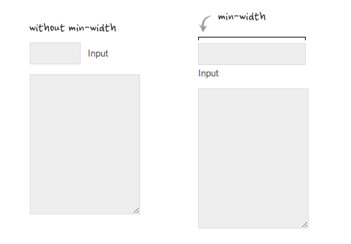
Min-Width
Min-width is opposit to max-width. It sets the minimum width of an element. In the example form below, min-width is used on the input text field to prevent the input from getting very small when scaling down.
3. Relative Values (demo)
In responsive design, knowing when to use relative value can simplify the CSS and maximize the best layout result. Below are some examples.
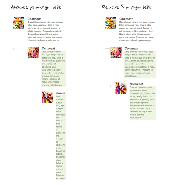
Relative Margin
Below is an example of a commentlist where relative left margin is used to space out the threaded comments. Instead of using fixed pixel value, I used percentage value to space out the sub-lists. As shown on the left side of the screenshot, the content box in the sub-lists gets very small on mobile resolution if pixel left margin was used.
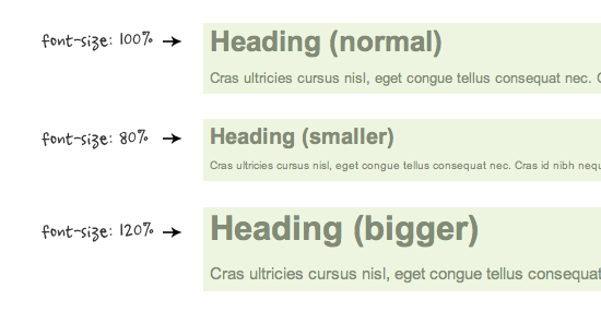
Relative Font Size
With relative value (eg. em or %), the font size, line-height and margin spacing can be inherited. For example, I can change the font size on all descendant elements by simply changing the font-size on the parent element.
Relative Padding
The screenshot below shows it is better to use relative percentage padding as opposed to fixed pixel padding. The box on the left shows an unbalanced padding space if pixel padding was used. The box with percentage padding on the right shows that the content area is maximized.

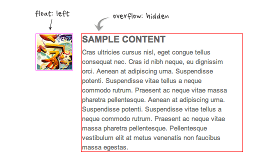
4. Overflow:hidden Trick (demo)
As posted in my previous article, you can clear float with the overflow property. This trick is extremely useful. You can clear the float from the previous element and keep the content running within the container by applying overflow:hidden.
5. Word-break (demo)
I also talked about the word-wrap property before. You can force unbreaking text (eg. long URL text) to wrap instead of running in a single line.
.break-word {
		word-wrap: break-word;
}

131 Comments
Comments are closed.
Talhah
Nice. Thank you. Will be using this in future projects.
FreeQ
Im using this in my project http://adf.ly/4w7eI
Rob
The responsive image technique is fine for aesthetics but doesn’t take into account page performance, you wouldn’t want to load a full size image and then scale it down with CSS on a 3G connection or something similar as it would bog down page load time.
Nicola
Your’re right, but there are a bunch of methods that try to sort it out. Take a look at this round up: http://css-tricks.com/on-responsive-images/
k4len
i kinda think of responsive design as a low level functionality of the site and serving scaled images as another layer, built on top of responsive design. Scaled images without responsive design doesn’t make much sense.
Nick La
I should probably edit the heading to “Resizing Image” instead of responsive image.
Will
Great post!
Im not to sure about the responsive images problem though that you mention.
This is what i use on my images. it keeps them from going wider than their initial size and when the screen size minimizes, they repond perfectly and shrink.
img {
height: auto;
max-height: 100%;
max-width: 100%;
width: auto;
}
(Tested on XP ie7, XP ie8, Win 7 ie8, ie9, and latest firefox, chrome, safari and opera)
I like the overflow: hidden trick – nice one!
Griffin
Agreed Will! I use the same technique you posted here, and I’ve never had any problems. Not sure why you’d only want to target ie8 with ‘width: auto;’
k4len
Love the video tip, will be using this on our site this week. :)
Joseph R. B. Taylor
Well done! I look forward to playing with these techniques!
Sasa
Responsive Video, makes my Chrome crash.
Robert Wollmann
Great article. I will surely be using these techniques in the near future (especially the video technique). Keep up the quality articles.
Kumo
I would call this “the ultimate responsive toolbox”! :-)
I already used your responsive video technique on blogs and it has been really useful!
And I didn’t know about the “overflow: hidden” technique, this is brilliant!
Thanks a lot!
Foxinni
These are very nice. Clears up some basic questions about where to start with responsive design.
Wouter J
You can make the font-size relative to the browser width/height. This is now available in Chrome Canary but it is very nice.
More information: http://css-tricks.com/viewport-sized-typography/
Maneet Puri
Great stuff here especially the Video trick you mentioned! Not many realize the importance of CSS that assist your users in getting a pleasant surfing experience. with the tricks mentioned above issues like resizing, panning, and scrolling are long gone! Thanks a lot and keep up the great work!
Techgyo
Excellent very essential css tricks, the example images you added makes the post very easy to know how it works.
Reno Computer Repairs and Website Development
This is a great article on responsive image techniques! Thanks for sharing!
Andrew
Great article, thank you for sharing with us.
Alex Kuznetsof
Awesome! Thank you for hard work! Responsive and No Pasaran! :-)
Hassan
as a beginner in responsive design i find this very useful
Thank you
FreeQ
Im using this in my project. http://adf.ly/4w7eI thanks
Jasmin
Very useful article. Thanks!
littlesparkvt
Awesome stuff, will definitely use some of these in my future responsive designs.
Thiet ke logo
thanks for sharing, this article details, very useful!
Binky
fjpoblam
I had surely forgotten about word-wrap. ¡Important! (especially with garish Georgia font on one of my client sites for seniors). Lots of long strings in a couple of my (client) sites. Installed yesterday. Thanks.
مرتضی
hey dude tanx for sharing this
Andy Feliciotti
Some nice tips in here, thanks Nick!
Radu
Thanks for grouping all these tricks in one post ;)
Vicky Etherington
Brilliant tips – thanks so much.
Responsive Design is
Great bunch of tips there for everyone. We’ve noticed a lot of people on Stackoverflow are missing the meta viewport tag…
Taufik Nurrohman
@media screenIs that a CSS hack? :\
Taufik Nurrohman
Duh, what hapen with my code:
screenJelmer
Sorry, you are indeed correct. There should be a \ 0 there as well
Jelmer
What you are typing is just a media query. However, in the article @media screen was used as a css hack to target IE8
CUSTOM ICON DESIGN
yes, it’s very good tips in coding the responsive web design. many thanks Nick.
WPTidBits
You did it again. This is a very useful post to all those new in responsive design making. I started my responsive theme design because of your posts. Clearly above the notch, you set the best benchmark in creating tutorials for newbies. Thanks!
طراحی سایت
Great article:)
Gene Locklin
word-wrap isn’t a thing any more.
.element { overflow-wrap: break-word; }From the css3-text-properties page, overflow-wrap:
jolyon
@gene – that may be true but even the latest version of Chrome (19) does not support overflow-wrap, along with most legacy browsers.
Use word-wrap for Best Results (backward compatibility.)
Fatih Arcelik Servisi
useful tips thanks.
arcelik beyaz esya, arcelik servis, fatih arcelik, arcelik servis fatih.
Empregada Doméstica Sorocaba
Wow! Every time I came here I learn news great tricks! I have so much to learn yet…lol. Tks Nick!
Keith McKinney
Some great tips, thanks. I have a feeling some of these will be very useful if I ever get around to designing the responsive wordpress theme I have in mind. Bookmarked for future!
Morne
Really useful css tips. I always struggled getting a logo image to be fluid. I think i will get it working now, thanks for your tips.
Web Design Wolverhampton
Very useful tips, thanks. max-width has proved very useful in the past, especially with a Content Management System website where the customer adds their own images.
Pete
Awesome article. For those interested in having responsive images or videos take a peek at the Responsive Grid framework we just released. It features a bunch of the things everyone is riffing on above.
Braden
This article goes into so much required detail to help in having a responsive design. Incorporating an example of a video was a very good idea. The print-screens and codes are very helpful in explaining the 5 tricks. As stated by other users here, grouping these 5 tricks is awesome, as it caters for all important issues in one article, not having to search bits and pieces from all around the web. I am not much into the coding part of designing themes, but this article has really encouraged me to continue learning about this and experiment in the future. Keep up the fantastic work as your site is really helpful and it deserves all the praise it can get.
Carl-Michael Hughes
oh hoh! That word-break solves so many other issues I was having. Thanks!
Waqas Nawaz
Awesome work…hope to see more articles related to CSS…
Eric
Great Post! I’ve encountered some of those issues with CSS and iphones. Thanks!
dready
Damn! i’m feeling like a child discovering a tresor right now million Thanks!
Mahesh
Recently I have found this website. Greate idea!
Mike
Like it too :)
Bee
So great! I like this tricks! Thanks :)
Brian Jackson
Great tips, definitely bookmarking this.
Rak Minimarket Surabaya
Belanja rak surabaya, where place you find what you need for your minimarket
Wei Zhang
I really love your css tricks
Jonathan Horne
Great article. Will use some of these tricks with our next client!
LeonNet
Great article! A good start for my first responsive project, thx for sharing.
web designer
very nice articles, simple to use this tricks
Dheeraj
can anyone tell me why using -ive sign in CSS considered as bad SEO practices ?
Ranjita
This is really very helpful tricks………
Ranjita
i am using this number 4 trick but this is not helpful in updated version of google chrome above 21
Majalah
Instead of using mobile plugin, I should re-design my site using responsive css design. Neverthough responsive css before ;) thanks for the tricks
Annamalai
nice post !!!
icemaker
Great post, thanks for sharing these useful tips.
Jim
this is exactly what I needed!
Sherwin
Thanks for great responsive CSS tricks
Thomas Barrasso
Thank you so much! I always forget one or two of these and go through such headaches to find a workaround.
hyvaa
Gooood stuff. Thx : )
Anntina
Good CSS Tricks,It’s very helpful for me~
CiNiTriQs
Thank you very much for this article, some neat tricks I didn’t yet know of. (such as the responsive image IE8 hack ;) )
Muchas Gracias
wat
I’m shaking my penor :3
Aydin
Thanks for these informations.
Tony
you’re tutorials are fantastic but I can’t help to wonder why no one really explains or shows a demo in using a css background image while using responsive design? At least I haven’t seen any. Basically I’m wondering if the img element was a css image rather than an html element, how would this work with responsive design? For designing purposes I use css backgrounds and wanted a quick insight on how this is done.
Tony
that was meant for Nick, not you Aydin. sorry.
Creative Engine Room
Great tricks for building responsive websites and a GREAT POST!! Thank you for sharing.
Kenzie
Shrink, Share & Get Paid!
Post your Links on Facebook, Twitter, Blogs & Websites!
Go To http://netfly.com/?r=1 to get paid for your posted links!
I-Design
Nice responsive tutorial,
Edy Pang
Thanks, this is great information. Enhanching some responsive web projects with such simple css tricks, nice
chandhu
It is excellent.
Thanks, this is great information.
web designing
very nice and advance blog, You blog provide useful tutorial about CSS. thanks for sharing this wonderful tutorial.
Regards,
website designing
Web Developing
Really fantastic article. You have cover everything with astonish way. What i enjoy most is that with every written part you had a draw for better undertsaning
Shawn Ang
Useful tutorial. Nice job on posting!
saha
Fantastic sharing. Useful tips for every web developer.
Perth website designer
these tricks are really helpfull and i am gonna use these tricks in my work. BTW thanks to webdesignerwall.com for this wonderfull post.
Perth website designer
Agencja reklamy Bielsko
A very useful trick, thank you!
Scott Weiwu
Nice post!
I also think the h tags cause a lot of troubles when dealing with design, so here a trick to fix it:
http://www.thebestdata.com/zoom.aspx?menutype=1&auto=3906&t=CSS-fixed-header-margin-auto
Mark Creeten
Scott, about the link you posted => with a good reset CSS you don’t need to clear margins on a H2 and even write a post about it ;-)
Scott Weiwu
Mark, Good idea thanks!
What the best way you advice to reset CSS ?
Prasad Sambari
A very useful trick! Thank you very much for this article,
johanso
excellent. Responsive Web Design, very important
FreshBrand
Detailed article, I learned new css, lun reading is done.
thank you much!
Shingo Tamura
Very simple yet useful tricks. For those who are interested, check out my tutorial on responsive design http://shingokko.com/blog-entry/responsively-design-a-blog.html
Linesh Jose
I was searching code for the embed re-sizing. I found it here. thanks dude :)
Corey
I had no idea about the word-wrap: break-word functionality!!! This saved me some grief, I kept having a bunch of headings that has links in them go off the page in mobile view which was becoming really frustrating and this saved me!
Woot woot for –
.break-word {
word-wrap: break-word;
}
Thanks for this wonderful write up :)
Yates en Ibiza
I found it here. thanks dude :)
Zeidan
Great post ! Not often do you hear that something is supported in IE & not chrome. It’s too bad that there’s no pure CSS solution for this just yet that works in most browsers.
The Content Vendor
We’ve been in the field for about 3 years now and we cannot imaging webpages without CSS. CSS3 has lots and lots of great options and features to give wonderful look to your website.
Thanks for a great post.
rickymartin
Thanks for spreading the nice information..
jaydip patel
nice website and thanks for supporting.i can follow this responsive code…
thiet ke logo
I am impressed with this writer’s content. This content is engaging, thought-provoking and motivational. There are many unique ideas shared in this article that I can relate to and understand….
marlon gantalao
I want to know more about the css tricks and the java script. For me to have a honor this opportunity, and makes me complete regarding this information,,For your help I am able to explore the important methods on how does css and java script will improve by applying on this design.
suhail khan
these stuff not enough because i want to know more about the css tricks For your help I am able to explore the important methods on how does css and java script will improve by applying on this design.
seo
as a beginner in responsive design i find this very useful
Thank you
Ali
Good articles. Thanks.
Watt
Great article.
I will surely be using these techniques in the near future
Christy
Hello, after reading this amazing piece of writing i am also
glad to share my familiarity here with colleagues.
Hal
Good tips. I have a question about the responsive image IE8 hack. width: auto seems to work fine, EXCEPT NOT when the image is inside of a container, such as a div, with an already defined width. I can change the div width to auto and it will work, but it breaks the page layout. How to work around this? I have a layout with css/grids/divs and the div containers need to have defined widths. Any ideas? Thanks.
martin yan
Thanks for sharing tips
koen
Great article. What I am curious about is, the main column on this website seems to have a fixed width, and it moves horizontally when resizing the window. How is this accomplished with a flexible grid?
vishnu
That was a superb list of things :-) good one!
James
Hey, great little guide. I created a small plugin to help with design/development of responsive sites which may help others: http://www.cleatsandcode.co.uk/2012/10/20/responsive-css-debugging-tool/?wdw
Sreejesh
How to center an item which is outside the post content.?
Weight Lifting Complete
I just used your width:auto for IE issues and it worked perfectly. The images were being shrunk horizontally and now they appear normally. Very thankful for this as it would have taken me a long time to figure out. Appreciate your help.
Ricardo
Awesome post! Simple and straight to the point. Thank you!
Nick
Very useful tutorials. Thanks for sharing!
Neha Khanna
Thanks for this post. I was searching for somethingn on responsive video player and found solution here on this post. I will give tkjdesign a try.
Viron Media
Some very useful tips and tricks I was unaware of. Great article, thanks :)
Brandon
I love the responsive css much more than having alternate, mobile themes. Having alternate themes or sites for mobile is a pain. Thanks for these tips.
Richard
Great Post! Thanks for sharing..
Erick
Muchísimas gracias!!! gran tutorial y fácil de entender
Sepatu Murah
Found it on here. Well thanks for ‘word-wrap: break-word;’. My mobile web will perfect. :)
ralph lauren polo sale
Hello, just wanted to mention, I enjoyed this post. It was funny. Keep on posting!
Saikumar
Great post
Hans andersen
What a great post. Very clear. I wonder if you could help me out:
I want to be able to fit any-size image within a container in a fully responsive way. My CSS so far:
Container width: 100% and height: 100%. Img CSS: min-width: 300px; object-fit: cover.
This works perfectly on an iphone both in landscape and portrait with any size image. But on Ipad and PC screens, the container height more than doubles and the img vastly overflows.
The issue is seen on my site: http://localnepaltoday.com in widgets eight and nine from the top in the sidebar.
I simply don’t understand how it can work on a mobile but not on bigger screens?
Well, thanks again for your post and just in case you or anybody reading this has a solution – been searching for a fix for quite a while :-)
Hans andersen
I should quickly add:
The CSS also works on Ipad and PC screens but only if the image pixel width is smaller than the width of the sidebar.
If the image pixel width is bigger than the sidebar (bigger than 300px) the image blows out in full pixel size and drags the container with it, it seems.
Thanks a million for any help with this issue.
Vail Joy
Since 2013, CSS has given us a few really cool properties to help with responsive design. One of them is object-fit, which will likely help you out – the real solution is to write @media queries to handle how your site looks and behaves at different screen sizes, which you can learn more about here. WordPress should also be handling your images in a responsive way, so your issue could be with the theme or widget you are using (try the “Image Widget” plugin which will handle your image responsively).
To add some custom CSS with object-fit, you add a class for the image like this:
.textwidget img{width: 100%; -webkit-object-fit: fill;}. Find out more about object-fit here..
AngularJS Training
Informative post., been searching for a post which gives useful and unique points reached here, found the exact which I need. Thank You
Varun Kulkarni
Superb….Helped alot. Thank you.
ASH
LOVED IT. NEEDED MORE LIKE THIS. GRT DOING. PLZ SHARE MORE SUCH EASY AND USEFUL TRICKS ABOUT CSS.