Responsive design all started with this article by Ethan Marcotte. Some people see it as a trend. But it is more than just a trend. It is a new design solution — it helps to resolve the design problems associated with the different resolutions and devices (desktop, laptop, tablet, and mobile). I’m going to share a list of responsive sites that I feel are nicely done. I’ve categorized the list into two categories: Adaptive and Fluid & Responsive.
Adaptive Design
The following sites are examples of adaptive design. The design adapts based on the viewport width.
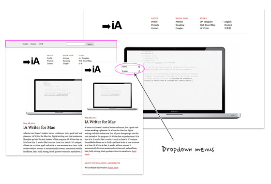
iA
Information Architects is one of my favorite minimal sites. It is simply beautiful. I admire the fact that such a beautiful design only uses two colors (black and red) with just web safe fonts, no texture images, no fancy Javascript effects or custom fonts. Transforming the navigation list menus into dropdown menus on smaller formats is very smart because it conserves a lot of space in the header.
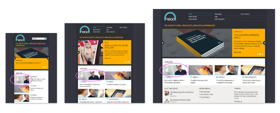
Head London
Although the Head London site is not fluid, but it did a pretty good job on the responsive layouts. The layout is consistently put together on each viewport layout. Most responsive sites use max-width to create fluid images (refer to my Responsive Design tutorial), but the images on Head is masked at full size.
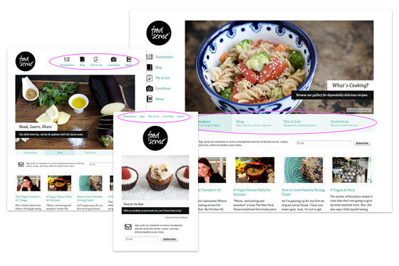
Food Sense
Pay attention to see how the Food Sense site responds. It flows from detailed 2-column layout with sidebar to 1-column layout. As the design gets smaller, it gets more minimal. The slider has 2 line of navigation text at the bottom on the large format, it then changes from two lines of text to one line, the text then disappears on the small format. The navigation menu has icons on the large formats. The menu icons disppear on the smaller formats.
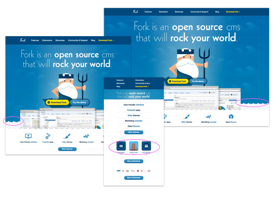
Fork CMS
Go to the Fork CMS site, resize your browser window. Notice the parallax scrolling effect on the water waves? That is fun. However, I don’t agree on hiding the feature icons as it goes smaller because readers with small viewport will lose some of those information.
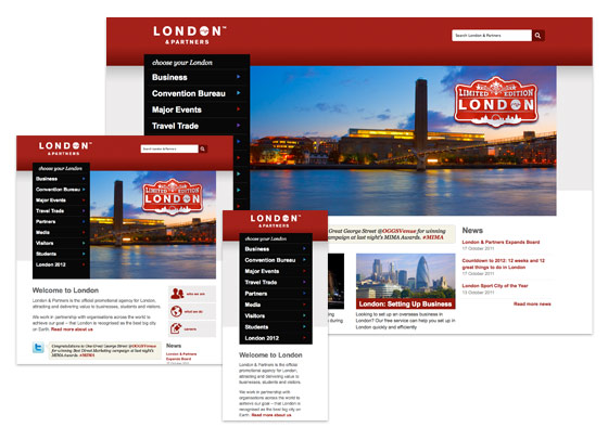
London and Partners
Design wise, I’m not a big fan of this site, London and Partners. But the responsive layouts are very well planned – from a large format 4-column layout to a small 1-column layout. Most responsive sites hide certain content as it goes smaller, but this site keeps it all. It shows that even content-rich site can be responsive.
Fluid & Responsive
Now let’s take a look at the fluid and responsive sites. The following sites not only respond base on the viewport width, but the layouts and its content are fluid/elastic.
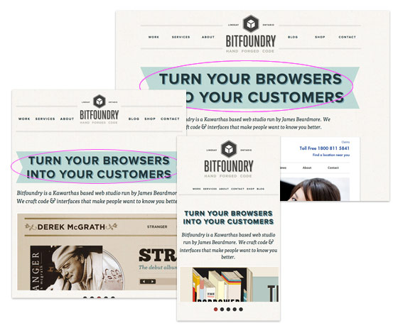
Bitfoundry
What caught my attention with Bitfoundry is the intro text. First I thought the resizable ribbon was a background image using background-size property, but it turned out that is an <img> tag with z-index applied. This is a nice trick to make resizable background image because CCS3 background-size is not cross browser yet.
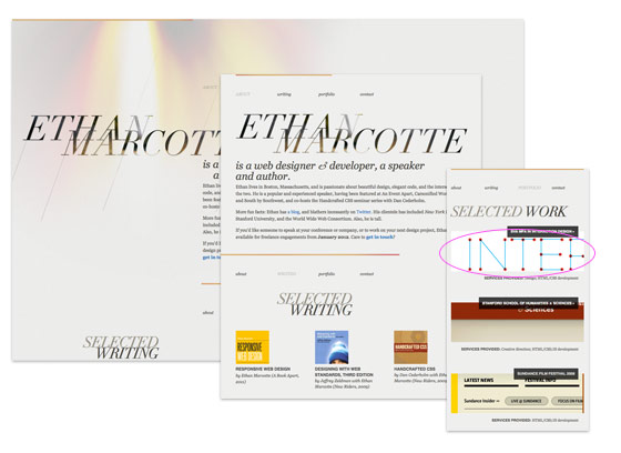
Ethan Marcotte
Ethan Marcotte, being the founder of responsive design and author of Responsive Web Design book, his site of course is responsive. Instead of using max-width to make the images responsive, Ethan uses some CSS tricks to clip the images at original size.
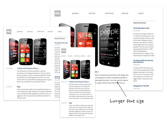
Paul Robert Lloyd
On Paul Robert Lloyd‘s site, not only the layout is responsive, but the font size is also responsive. On larger viewport, the font size is slightly bigger which provides more comfortable reading on large monitors. This is a good usability touch.
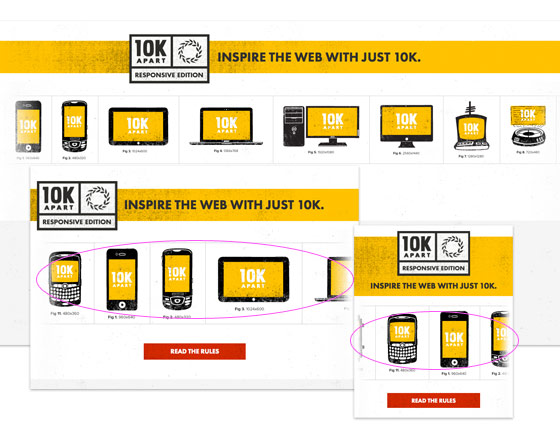
10K Apart
If you have a large display, maximize your browser’s window and check out 10K Apart. Then resize your browser’s window and watch the header images scrolls in opposite direction.
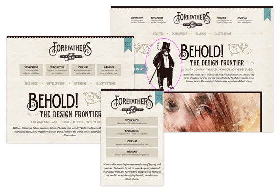
Forefathers Group
The Forefathers Group has great attention to details and it flows nicely across all viewport sizes. The overall design is very graphical. However, on the small version, it seems a lot of graphic elements were removed. It would be nice to preserve some of the graphic elements using background-size property.
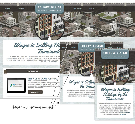
Colbow Design
Unlike the Forefathers Group site shown above, Colbow Design preserves all the graphic details on all viewport layouts. Colbow Design creatively uses tiled background images (header image, city illustration and footer image) to deliver a consistent appearance throughout all resolutions.
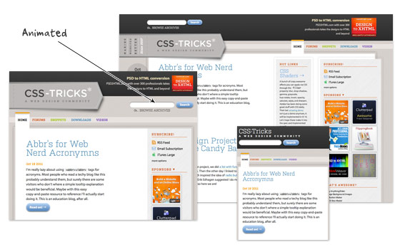
CSS Tricks
Beside of responsive design, CSS Tricks adds some transition effects to make the flow more interesting. Resize your browser window and watch the elements transit from one point to another.
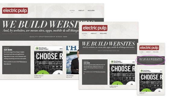
Electric Pulp
I like how Electric Pulp responds from a 3-column layout to 2-column and then a single column. However, the resizable header image doesn’t work that well on smaller versions. The text becomes illegible.
Further Reading
- Mediaqueri.es, a gallery dedicated on responsive sites
- Best Web Gallery – responsive section
- Responsive Design with Media Queries
- Ethan Marcotte’s 20 Favorite Responsive Sites
- Smashing Magazine – Responsive Design Tutorials
- Skeleton – Boilerplate for responsive
- 320px and up – the small screen first boilerplate
- Fitvids.js – jQuery plugin for fluid video embeds (similar to Elastic Videos trick by TJK Design)
102 Comments
Comments are closed.
Rahul
Superb!! Really Inspiring.
But I want to learn how can I implement this in my next project. Is there any tutorial available? Hope you will help.
kalen
see this site’s archives:
https://webdesignerwall.mystagingwebsite.com/tutorials/responsive-design-with-css3-media-queries
Mikey
What a lovely selection of responsive work! You guys might also like to have a look at http://www.lancaster.ac.uk – one of the first University’s in the UK to have a responsive website.
Mikey
Apologies for the shocking misuse of the apostrophe in that last comment. Shame on me!
John
Good stuff Nick. Thanks for sharing.
Alex
Great collection Nick. Thanks for sharing.
Ben Peck
Adaptive design will eventually become a need but at the moment its a forward thinking initiative.
Manuel Martín
Not really, it’s already a need, a lot potential clients and visitors are starting to use tables for reading and common navigation.
Plus, if you do not start to create you webs thinking on this stuff you’ll suffer, believe me, it hurts… We have to begin to use “width : 70%” instead 700 px in a 1000 px layout… Isn’t that hard when you start to think on mobile first.
James Finley
Be sure to check out Echo Design Group’s adaptive (responsive without fluidity) layout at http://echodesigngroup.com . We also have 3 more sites launching with adaptive layouts in the next month.
Jim
Great resource, thanks guys!
You should check out my new HTML5 responsive portfolio site at jim-nielsen.com
CSS Collector
Great collection to get inspiration on webdesign!
Recently I’ve also developed the theme named “Inspiration”, you can take a look at it here: http://bit.ly/niVJik
All the people can buy it only for $15!
Paul
Thanks for including me in this list Nick, I consider it a great honour!
I just wanted point out one issue regarding the terminology you’ve used. Responsive Web Design (according to Ethan’s definition) is the combination of fluid grids, flexible images and media queries. I’ve heard the term ‘adaptive’ used for sites that don’t utilise all three components; therefore all the above sites are adaptive, but only the second set are responsive.
It’s easy to get hung up on these terms, and frankly I’m undecided how much we need to reinforce the distinction, but I thought it was worth noting all the same.
Thanks again,
Paul
Nick La
Agree with you on the term adaptive. Article edited.
Gonzo the Great
.. hmmm, a pity that the same sites come back, .. over and over again!
Looks like these are the only responsive webdesigns there are on the intwerwebs? And if so, .. you missed a classic – also frequently featured – example, the site of Simon Collison ..
BTW: Don’t get me wrong, all sites are beautiful and cool! But there are more responsive webdesigns out there (and some übercool examples too!)
Robert
Nice article. Now I got sufficient knowledge about responsive web design. But can you please tell me some ways to implement this on my websites? Thanks.
kalen
https://webdesignerwall.mystagingwebsite.com/tutorials/responsive-design-with-css3-media-queries
SarahNavigator
ForeFathers Group has been coming up again and again in conversation online recently for design layout, fluidity, typography, etc. Those guys know what’s up!
On another note, I’m looking forward to seeing how designers will tackle responsiveness for mobile web. Designing from mobile out might be a thoughtful strategy for the future.
Cheers,
Sarah Bauer
Navigator Multimedia
kelta
It seems like they are communicating with us and moving when we move
Tammy
Great list! I’d like to see more examples of content heavy sites built responsively. I’ve recently designed quite a large responsive news type and couldn’t find too many examples for inspiration. I really like the Lancaster uni site posted above. Although not a particularly pretty site http://www.bostonglobe.com/ works well too.
Elaine McVicar
I’m loving responsive design as a solution. Just finished working on a project at Equator – http://www.eqtr.com where we implemented it on a hotel website http://www.macdonaldhotels.co.uk/
kalen
Ding! Another reason i love this site.
getdatinfo
http://www.1hunnit.com | #1 Trusted for Webhosting SSL Certificates Reseller and MORE!!
under $2.75 Webhosting (GOOD FOR WORDPRESS!!)
glynn
First of all.. great round up! I’m currently writing a dissertation on responsive design. i was just wondering with the Bitfoundry if anyone knows which image slider they are using as most available ones I’ve come across use background images rather than actual img tags. If anyone could point me in the right direction I’d be grateful… Cheers!
Glynn
Steven
alert(‘loled’)
wptidbits
At the time i am writing this comment, development for HTML5 + CSS3 with media queries is already started. Thanks to all eye opening post related to this. Very useful and helpful.
SEO Chicago
The minimal site threw me for a minute but having the poles helped me as you went on. The subtleties and amount of thought that goes into websites now versus say 5 years ago is astounding. Kudos. Beautiful examples, thank you.
Maneet Puri
Yes, responsive web design is really a solution for accessing a traditional web design in the mobiles or smart phones without any derailment to the page borders. Rather than using media queries, is there any other CSS option to design a responsive website? The adaptive design list is really worth a look!
Mike
Most of what Marcotte talks about in his book, Responsive Web Design, he talks alot about design with em’s…it is an awesome, quick read…
Peter Ohlsson
Check out our site that also is responsive:
http://www.7an.se/
I´ve made it and feel very satisfied with it!
//Peter, 7an.se Örnsköldsvik, SWEDEN
Translation Services
I like the design of these websites but the user experience was a lacking a bit in some of the websites.
Imobiliárias Piracicaba
really great stuff.
jlaeser
http://mediaqueri.es/
Syed Balkhi
Soon we will have a responsive design for WPBeginner as well.
Marius Jokubauskas
I can’t wait till I finish my website’s responsive design. No more zooming on mobile devices!
Non-profit web sites
Very interesting,would I be able to do something like that with my design?I wonder how can I do that.
Neil
Some really decent techniques used on some of those websites. I still strive to create fluid, responsive websites, so I’m always after a bit of inspiration.
Sam
Great post. All very inspiring. Thanks for the help.
Sam
neos
woow… Its great!!…
Thank you.!!
Webbyrå Göteborg
Thx for the techniques will check em out tomorrow!
Tina
It’s surely more than just a trend – I think every designer, who tends to be considered a professional, must understand how a good responsive design should look and be able to create one.
christian
http://joshuasortino.com/ is a great responsive designed site
Simon
I’m really loving responsive design especially for a few photography clients I have but something we’ve grappled with (especially for galleries) is setting a ceiling for maximum image size which takes advantage of the biggest and the littlest of screens. Several sized images could be used but is a lot more work for the client updating their own site. Any thoughts?
emailing
It’s cool. I didn’t knew that you can make your web pages adaptive for different browsers. I’ll keep that in mind.
Mariusz Zawistowicz
Really great stuff and very inspiring. Thanks for sharing!
Tedi
Attractive web design :D
万圣节服装
博客做的不错,欢迎回访啊
Jonny
The image link for london and partners brings up a 404 error, the link is wrong.
custom icon design
yeh, good list for the website. well done.
Llewellyn 3.0
This is Beyond cool, all sites should incorporate this =]
Daniel Jung
Great! I read your article as a good example of fluid & responsive. Thanks for letting me read a good article.
Patrick
Thanks for sharing, it give me more idea to create adaptive design.
Grant Brookes
London & partners still showing a 404< liked the effects on Fork-CMS site.. btw, going away from the topic, has anyone used the Fork-CMS, if yes, what is your review about it?
Studio76
Nice !
Check this also : http://www.catherinechauveliervoixoff.fr
Thanks
Orlando
I like the Fork CMS site… but… for some reason, the 10K Apart website is very visually appealing to me. It really seems to draw the eye in…
Sagar Ranpise
Hi Nick ,
Awesome Examples!!! I have also created a post on creating responsive html5 page using media queries. I hope you like mine too.
http://www.alldesignstuffs.com/2011/creating-responsive-html5-page-using-media-queries/
Thanks & Regards,
Sagar S. Ranpise
ABCD
test
Aynex
Redesigning my website…. now!
Rick
I agree that this is more than just a trend, it’s pretty much the future of efficient and cost-effective design, right?
Web design companies
Thank you for sharing this information. Your post helped me to clarify a lot and inspired greatly!
Peter / Stockfresh
Thanks for the roundup, the Food Sense site is especially great! Sooner or later everyone has to familiarize themselves with these techniques.
ilcho bogdanovski
Its a nice roundup. For any of you who love photoshop i have found another site with some cool tutorials and articles. the site is http://www.prodezen.com
Patrick
This is great reference for those who plan to create mobile design. Mobile user is keep increasing, we have to focus more on it. Good jobs!
Elijah Clark
I think simple is better. i dont know why, but i like th simplicity of the first white design.
Motivational Images
Thanks a lot for sharing. Fork CMS site is great one!
Adrian
Some great inspiration here. Fluid layouts seem the hot topic atm!
Adrian
PS- Web Designer Wall should be on the list too! ;)
Joerg
Wow … ilike how the Food Sense – Site responds …
Ryan Davis
This is awesome.
I have been wondering how to exactly design a site for a mobile layout.
Thanks alot for the post!
Mike
This inspires me to create a fluid design for our own site. I also look forward to working some of these neat ideas into some of our client sites as well.
ranna azam
both the lists are worth watching, all the things mentioned on this page are very inspiring. this information will be a great help to all mobile designers.
especially “FOOD SENSE” and “CSS TRICKS” are great!
ranna azam
both the lists are worth watching, all the things mentioned on this page are very inspiring. this information will be a great help to all mobile designers.
especially “FOOD SENSE” and “CSS TRICKS” are great!
findw3
great post, this will help me for mobile design .
Morgan & Me Creative - Website Design Singapore
Priceless examples of cases to study and draw solutions from.
Gezi Konya
Is there a source to find such templates online? As technlogy gets smaller and smaller day by day, we need to make smaller alternatives for our websites, think I.
William Derman
I’ve just recently been commisioned to build a responsive website myself. It can be found at http://www.thetigerbrandsfoundation.com
My biggest issue with this was being able to get the site to be able to be responsive on ≤IE8 so some serious javascript workarounds were included, in future I wouldn’t do this as the responsive design is in theory for adapting to mobile devices which don’t use browsers ≤IE8
I love your selection of sites would appreciate any comments on this design. I do feel that I will be building all sites as responsive sites.
Love it!
Cheers,
Will
Thomas
Some really great looking & functional references. Responsive frameworks are a great solution and have helped speed up the development of our mobile sites.
Web Designer
Great post, thank you. I agree with the great idea.
way2geeks
Its great.Thanx for the post.Keep posting
şişme bebek
I should win because I love Moo and need my fix! ;))
buy season 11 gladiator
really nice , the idea is different but acceptable.
Andrew Roberts
Nice post! You can always make good and better designs if you have an inspiration. Keep it up!
Chandru
goood one
moe net
useful and practical post
:)
July
Yes , really nice and useful ….
Debbs Hosting
Very interesting. You’re right, when you think about it, “fluid and responsive” should be a primary focus in designing that most of us take for granted. I’ll be bringing this up later with my friends. I mean with all the gadgets with different screen sizes, right? After reading this, i actually tested it on this page. HAH! Fluid and responsive. nice :D
Sylvain
Interesting post.
However I find for a returning visitor some websites are disconcerting because he will search again where is the navigation or some elements of a page if the width of its page is not the same between two visits.
Otherwise I find it interesting to switch between Computer browsing to Mobile browsing without too much big headache.
Kerri
THANK YOU for the insightful Tutorial!! I really like the Food Sense site and was wondering what you used for the slide show. Is that what the jQuery scripts are for? I need to be able to have a slide show resize like yours does. Where did you get it?
Maartje
Great post, thank you!
Love the London and partners example.
Selects the right information and displays it properly.
Very useful insights..
Web Design Malaysia
Really great collection! Would love to see more of this!
熠熠
非常感谢您的指导。
fafa
what?
cescleo
say thanks for u
penny aka jeroxie
this is great… btw, what is the template that food sense is using. please advise?
thanks!
magazin
This does look like a great theme.hh
Matt F
Have you found any examples in the e-commerce space? Any examples of complex applications that use responsive?
ellen
Thank you for your very timely article. I have just recently begun using WP. Because I had to. The only thing I liked was the responsive design. However, my first time in I sunk and drowned. Crashed my customers site for 24 hours. I would like to avoid that in the future.
So, I ask you, why is this site everyone is so gaga over switching out passwords and logins without asking? Why all the span I hear talk about? What really makes this worth the 24 yours without sleep>
At the risk of sounding naive..I like Homestead. One person to host, software, etc. NO it is not template driver unless so chosen (isn’t WP template driven?)
Thank you kind sir for letting me vent.
Ellen
Robert
Thank you, these examples are nice and people can learn more about responsive web designs with them :) Nice explanation
igneta
Thanks. Perfect example.
Inspire
This is great, nice example
Attitude Design | Graphic Design Portfolio
Some great examples – particularly like the Information Architects one and their use of drop downs.
Ibiza yates
So, I ask you, why is this site everyone is so gaga over switching out passwords and logins without asking? Why all the span I hear talk about? What really makes this worth the 24 yours without sleep>
At the risk of sounding naive..I like Homestead. One person to host, software, etc. NO it is not template driver unless so chosen (isn’t WP template driven?)
Thank you kind sir for letting me vent.
Ellen
Afzal
hey !
That’s quite interesting.
I really liked this post as this has helped me to create my own image styles