
The year ahead should be a really exciting one for design, with the introduction of wider support for SVG and a host of new things we can do with CSS as CSS4 gains broader acceptance. In taking a look back at what made a big splash this year, I hope you will be inspired to kick off 2017 with some fresh ideas and new inspiration as we look at design trends in 2016 and what to expect in 2017.
In 2016, we saw the continued use of common UI Patterns, which offer familiar layouts and interactions. This is especially prevalent in the theme market thanks to frameworks such as Bootstrap and Material Design Lite but isn’t necessarily a bad thing. After all, these patterns are proven and well known. This year designers looked for ways to improve upon these patterns and make them a little more interesting, leading to a year of design marked by visual impact and micro-interactions. Here are a few of the biggest statements made by top brands and designers this year:
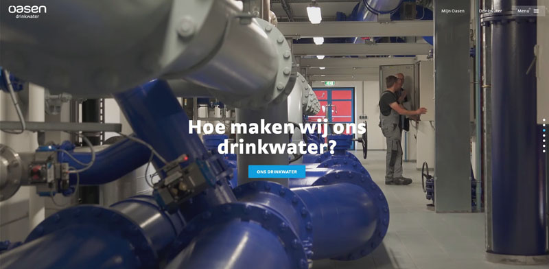
High-Definition Visuals
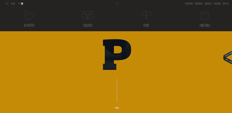
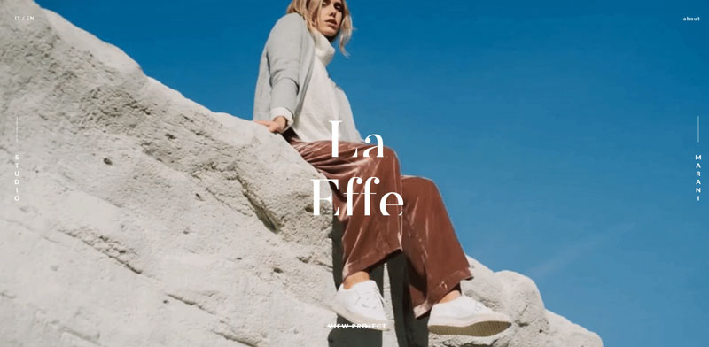
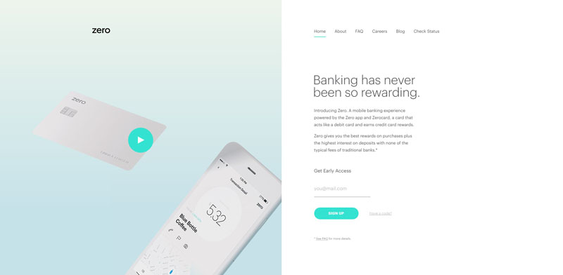
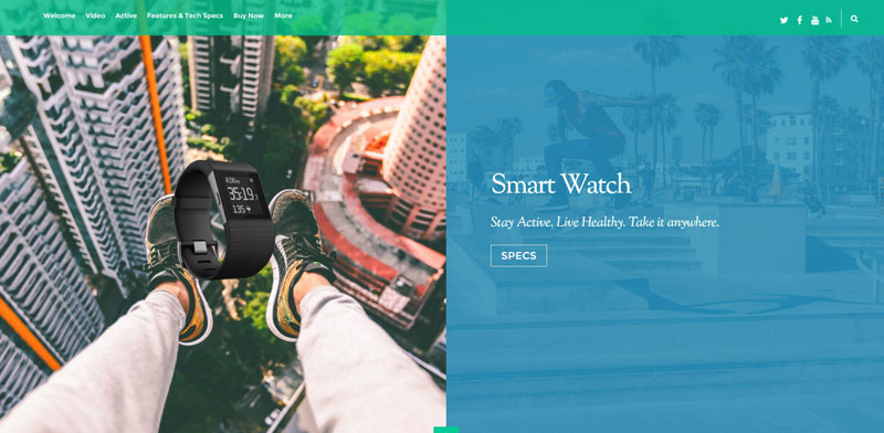
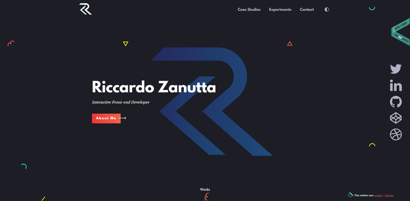
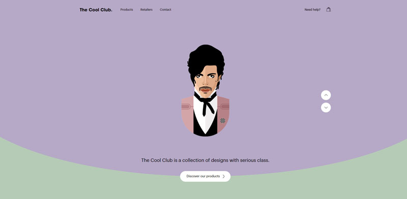
The hero image and full-screen intro trend is likely to last a long time as it accommodates everything about where design is headed – visual statement, full motion, high resolution and photographic. Using bold imagery is not just for portfolios – it was used on a variety of websites ranging from eCommerce to travel. Full-screen intros offer an instant burst of brand recognition and mood to set off an interactive experience, portfolio or long-scrolling page. This year saw a de-cluttering of the UI in these cases – some websites offering no navigation elements or call to action at all, letting the imagery speak for itself.
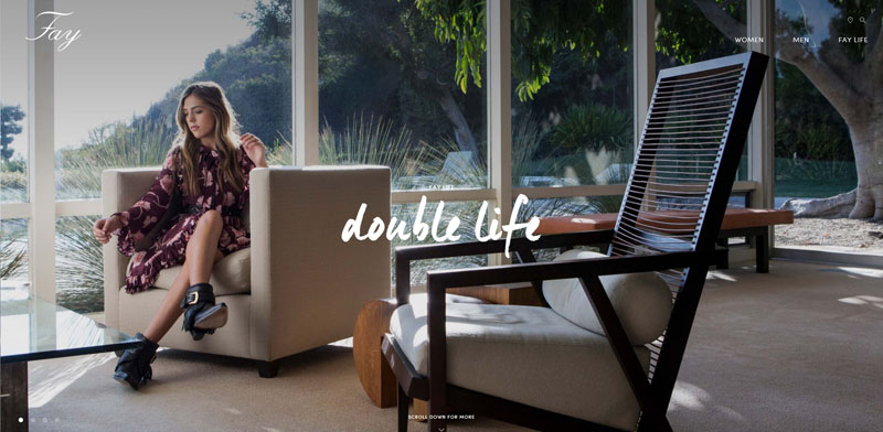
The full screen hero image or header trend has been made more interesting through the use of cinemagraphs, subtle animations and background video…
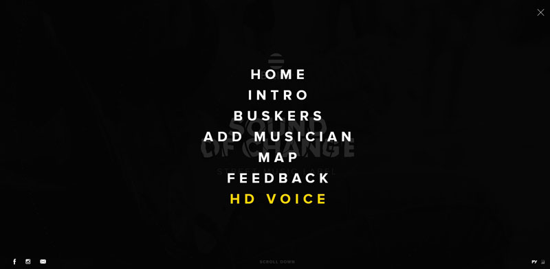
Interactive Navigation
The move towards more minimal user interfaces became hugely popular in 2016 thanks to an overall shift to mobile-first design. The hamburger menu became a staple, and while some UX designers hate it and thought for sure it would be gone by now, it is sure to stick around. However, this year we saw more and more sites offering other answers to minimal navigation, using vertical text in the site borders, moving sticky menus to the bottom, or driving navigation interactively rather than through classic menus.

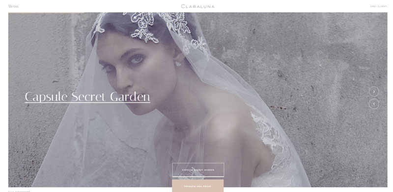
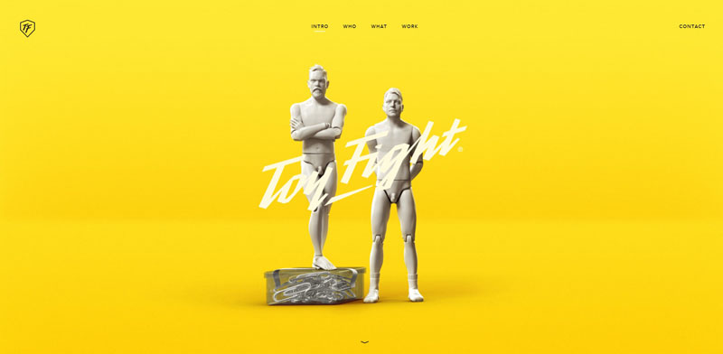
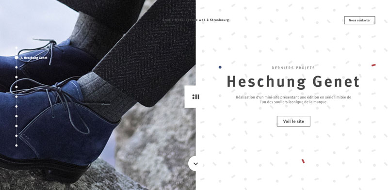
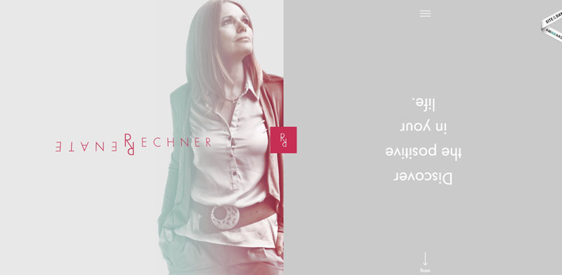
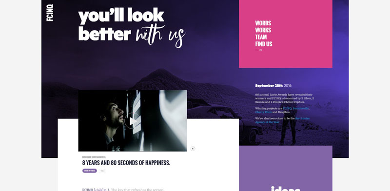
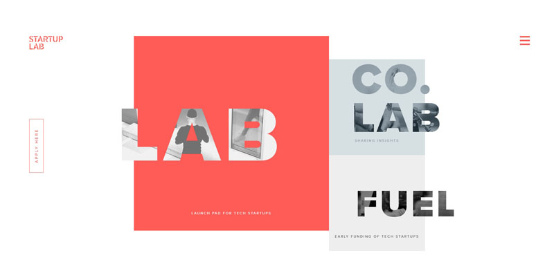
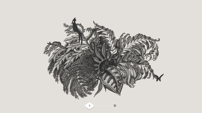
Split Screen Layout
In the last few years, cards have become more and more popular, with masonry portfolios and blog layouts becoming a familiar pattern. This year we saw a new twist on the full screen landing page interface with the typical giant visual and call to action – the duo layout. These split layouts offer the visitor a choice and provide an interesting twist to the jumbo slider or hero header.
Split-screen components work best in minimalist web designs where negative space is combined with bold color or typography.

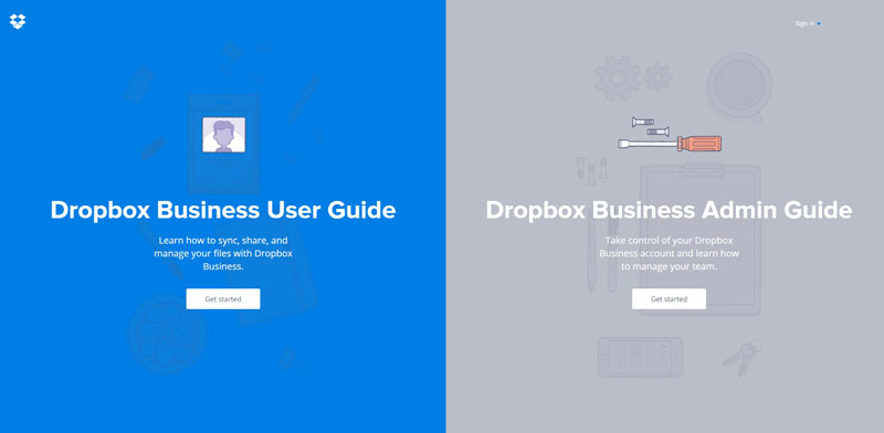
You can create something like this easily in WordPress using Themify Split.
Retro
In past years we had a flair for the vintage and rustic but have moved on to favor the flash and sparkle of the 70s and 80s. Duo-tones, geometric shapes and bright colors combine with careful font selection to pull off these looks convincingly.


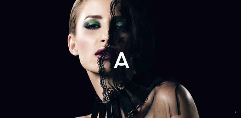
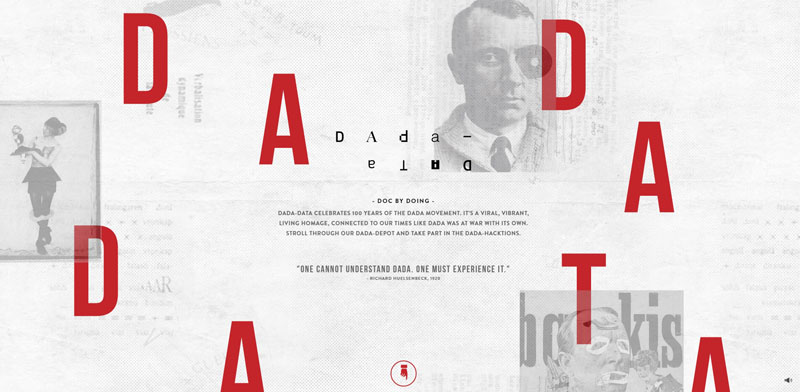
Abstraction
CSS grid promises to give us a powerful new tool for creating page structures, but if you think it means design will go back to boxy, think again! Web design is more flexible now than ever before, and designers this year took a cue from print design to experiment with boundaries. This produced artful and interesting layouts and typographic effects where alignment and borders are becoming less important than presentation and parallax.


Animation & Microinteractions
While much of the most stunning web designs in 2016 combined more than one of these trends, all of them incorporate a measure of animation or interaction. This attention to detail is as subtle as a graceful hover effect, or as central as drag-and-pull navigation, but each enhances the user experience and appeals to our curiosity. Animation is nothing new in itself, but designers are learning to implement it in more meaningful and purposeful ways, allowing for better performance and less distraction from the content.


What We Can Expect
To sum things up, web design isn’t focusing so much on detailed content and information delivery as much as it is focusing on delivering efficient visual cues and stories. The long scroll is here to stay for awhile, as it compliments mobile browsing and compositions using high impact typography, negative space and bright color.
Gifs, cinemagraphs and video provide added flair and communication value, where SVG will take off to reshape the web in more widespread ways. Gradients and large type are back, and we can expect more duotones and candid photography to provide the foundations of next year’s visual style. Don’t be surprised if grunge starts to make a comeback with a twist, but don’t miss the Brutalism trend, hopefully disappearing quietly back into the obscurity from which it came.
In the front-end development world, 2017 will see an increase in novel AI-powered website builders, a leap to CSS variables and hopefully a push for better webp support to get even more speed.
If all of this seems a bit over your head or outside of your skillset, see how you can create beautiful websites with modern micro-interactions, parallax, abstract layouts using Themify Float for WordPress to get a jump start on your next visual storytelling project.
Joy Peter
These design trends are superb which web designers can use in 2017. My cousin is a web designer at Client Hub as she designs fabulous sites for real estate business. I will share it with her. She will happy to know about these trends.
Peesen
Greate Collection. Thanks
Wayne Wilson
Nice job guides I love a lot these designs and I wish all best for you guys in this new year !
ecommerceimagesolution
I think design trends can be an arcane thing. In 2017, color, fonts, design, branding, and photography convey visual design trends. Thank your for this upcoming designing ideas.
Danny S.
Thanks for sharing these trends with us. Please keep up the good work!
Roy Glas
Great info, thanks :)
Salvatore
Great post! Im already familiar with a few of these blogs but looking forward to discover the rest.
Antek
Very informative article. I’m especially looking forward to the split screen layout! I also think that Flexbox, PWAs, and custom typography might make some waves in 2017.
Anonymous
Excellent post! very useful for new projects!