For several years now the 960px grid system (960.gs) has been designers’ favorite pick to help structure and design web layouts. As screens and resolutions have gotten bigger, I’ve found that the 960 grid system does not always fit my needs. 20px gutters and only a 940px content area is a bit too small for the modern web. While designing Themify, I found a new grid layout that works quite well for designing in this day and age. If you’ve never heard of 960 I’ve detailed both it and this newer gird system below.
Follow up post: The Simpler Grid
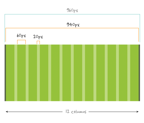
About The 960px Grid System
The 960gs is structured as follows:
- Total width 960px
- 12 columns @ 60px each
- Each column has 10px left & right margin which forms 20px of gutter space
- Total content area is 940px
The 960 gs is no doubt a very good grid system because of its flexiblility. It helps designers to quickly prototype the layout in any number of columns: 9 x 3, 3 x 3 x 3, 4 x 4 x 4 x 4, 10 x 2 col and so on. 960gs is probably the most popular grid system now and it has been used on many sites and design templates.
The Problem
The problem with 960gs is the gutter space and content width. Minus the margin space, the actual content area is only 940px. It worked well back then because most designs are set at 12px font size. These days most designs are set at 13px font size or higher. Since the font size has increased, don’t you think we should increase the content area as well as the gutter space?
978 Grid
The grid that I use on Themify: 978px, 12 column @ 54px with 30px gutter space. I find it works quite well. It is still optimized for the 1024 x 768 display. I took out the left and right margins to maximize the content width. I increased the gutter width to 30px, so your content has more room to breath. The result below:

What Do You Think?
Darcy and I are considering the 978 grid as our standard grid for designing WordPress themes over at Themify. Do you think the 960gs is getting old and should we strive to come up with a better system? What do you think of the 978 grid? Post your thoughts.
Tips: this grid generator is very useful for generating variable grids.
[poll=21]
268 Comments
Comments are closed.
Michael Caputo
I’ve been using an Adobe AIR application called BOKS to build my grids lately: http://toki-woki.net/p/Boks/ – it lets you specify a width, gutter size, column size, number of columns, etc etc. You might want to check it out!
Pete Lacey
But 960 is such a pretty number :(
Ryan
I think the font size is not a problem, It depends on the current design.
Milk
Yep… 960 is an astounishing magic number.
I would rather consider a flexible approach to grids in terms of sizes… just convert 960px to ems… the great font-size: 62.5% allows to set the containing div to 96ems making it even easy to implement.
Colin Scroggins
While I definitely believe the width must fit the project, I have recently been annoyed when trying to surf websites using a grid just a little larger than 960px on an iPad or netbook with 1024×600 resolution. The site is just a tad too wide and forces you to scroll left and right to see the content.
I do not see the point of designing just wide enough to be annoying to those at 1024 width and not wide enough to take advantage of the next full screen resolution (ie: 1280 wide).
Alex Tran
When 1280 becomes the new 1024, I think it would be appropriate to increase the 960 default. But because 1024×768 is still a common resolution, I don’t think 960 should be retired just yet.
Chris Hart
I’ve have no trouble using a grid based on the 960 one for the majority of projects. Its mentioned above about that annoying size that hits scrollbars far to frequently on tighter screens.
I’m a big fan of pushing graphics and such just beyond this size though, so that those on larger displays get a much more comfortable layout but those on tighter ones don’t see any horizontal scrollbars.
Dave Merwin
To clarify,
960 has 3 column width options.
12, 16, 24
So there is more that just the 12 col mentioned.
4ll4n
Check out fluid 960, it’s excellent.
http://www.designinfluences.com/fluid960gs/
creativereason
Although I just used 980 on a site, I think 960 is still the preferred setting.
Also don’t forget about the growing percentage of people who are going to be using iPads and other tablets with a resolution at 1024 (or less).
Emanuel Felipe
That is a nice thought, the web does change very fast and 960 will get old sometime. But luckly it will be painless, since we can easily create new grid systems based on 960.
Neal G
The lowest common denominator is 1003px in IE while other browsers allow for a bit wider widths – http://www.nealgrosskopf.com/tech/thread.php?pid=43
Phil
I think the best layout I’ve found so far is the 960 grid, 3 column at 300px with 20px gutter, combined with css media queries. Scales down to 640px 2 column grid (for ipads for example) and 320px 1 column grid (for iphones for example). You could extend this to 4 column 1280px width too for those lucky people with large monitors. Everyone wins.
Also standard 6×4 photos scale nicely in pro to 300px x 200px so they fit the grid too.
Brett
The current version of 960.gs allows you to customize all of the settings. I really see no need for this post other than it’s lead into a poll of if we believe 960px is a good size width for a website…
Kris
For me, I primarily use 960gs for blogs and simple business sites that I do for clients then rarely ever touch again. At my full time job, I use the Eric Meyer CSS Reset and go custom from there. So, it depends on the task at hand for me. I do like the 24 column layout though.
Mario
I just finished a theme using 960 and yes, it was a pain because I use a PSD design wich was exactly 960px wide, I had to do several corrections to make it fit on 960.gs
I also tried other grid systems but nothing better than 960 :(
Tyron Bache
960gs is still the best by far!
Vladimir Carrer
I’m the author of the The Golden Grid who is using 970px(960px + 10px first margin) default size and 10px gutter size. The beauty of the 960 number is that you can have hundreds of grid combination and that number is dividable with 1,2,3,4,6..12,16,24…
Erik Bruinsma
I think it’s a shame people would only use 960px of a screen while most screens are 1280 width plus. My idea, keep the default 960 for cranky old people and use a bit dynamic width up to 1280 to give users with a bigger screen an advantage.
Stefan
I dont really use 960gs. You want to abandon 960 grid for a 978 grid? You gain only 18px (slightly more if you dont count the margins). What’s the whole point in doing that? Makes no sense.
If you want to expand the size, go well above 1000px.
Mike
What a lot of people are forgetting is that there are built-in classes to alleviate half the problems you described in this article or some of the complaints in the comments.
.alpha and .omega will reduce the margins on the front and back respectively of whatever column it’s attached to (e.g., class=”grid_6 alpha omega”).
Also, .push_n and .pull_n will extend your columns on the front and back respectively however many columns n you specify.
If you want a larger width, just go into 960 and find and replace the number 960 with 978 or 60 with 54.
Adam
People tend to forget that 960.gs has some varations:
– 12cols (as described)
– 16cols
– 24 cols.
Author of this post also forgot to mention that.
For me 24 columns grid from 960.gs is still the best one.
Rob Dean
Not sure what you are comparing? Themify is a theme for WordPress? 960.gs is grid system to be used for any platform.
dffd
I use 1140px
Jesse Orndorff
960 is still the best, once we notice an upswing in larger screens hitting our site, then I might think about changing, but for now, still the best.
Erick S.
I don’t get the whole situation?! Whenever would someone use 12 columns? Or 16 or 24 for that matter? ’24 column layout’? Can someone maybe post a URL to a 24 column layout?
Red Letter
Interesting article. However, the 978 grid actually gives you LESS usable space for type when you factor in those 30px gutters in a 12-column configuration.
978px – (11 x 30px) = 648px
960px – (11 x 20px) = 740px
I’m sticking with 960gs.
Pusparaj
960 may be get old but not the system.
Steven Vu
Once you’ve decided what you want, you can use compass with blueprint and assign how large your margins are, how many columns you use and how large the grid is.
I find it pretty useful.
not an issue
I think 960.gs has updated his grid with additional new one similar to u please check, both are nice to deal with .
Web Design Dispatch
I think I like the 978 better. In general this size will keep getting bigger as monitor sizes keep getting bigger and cheaper. Though laptops may continue to remain pretty small, that’s always something to factor in.
Ovanes
In most projects you need to include a standard sized banner in the sidebar. In most cases this is 300×250. I think the 960 grid system is more suitable for that.
Marcell Purham | Webdevtuts
I also think the 960px thing is a waste because what if you would like to add something to your site in the future and want to make it wider. Exactly you would have to start all over again. I prefer to use my own framework :)
ospop
I think I like the 978 better.
Paz0r
For 2 last years I came up with my own grid.
It’s 980px 12 column with 10px gutter.
Benefits: Wider, for more content. Standard width of all three columns 300px each so not only right banner is ok but all visual patterns you use as well. Pretty comfortable to shift from standard 8+4 to 7+5 columns. Like yahoo homepage or linkedin.com did for different reasons.
Especially good for large scale ia.
If you’re interested just find me on Twitter or Skype and I will send you psd
Kat Skinner
One issue I have with fixed width designs is how they appear on different monitor resolutions.
To be more exact, a 900px width might appear fine on a 1024 monitor, but there are a very high number of users who go to my website with larger than 1440 resolutions. I even use a 2000px monitor (thus some designs look horrible if not planned correctly).
Backwards compatibility is important, however some theme designs just don’t work well for users with the larger resolutions. To resolve this, I do encourage use of effective background images (appropriate alignment), and so forth.
vinay
really it is good thing to think of… but I feel 960 grid work very well…
Thanks for share..
Tom
I think saying the 960gs is old is slightly misleading. I think what this post should allude to, but doesn’t, is the fact that 960gs has become so successful, and that’s what makes it ‘old’. A lot of people use it as it’s quick and easy to develop against.Afterall the developer of the layout didn’t have to share it and no one forces you to use it. What you’re really getting at, is that it doesn’t fit every need, and as a designer it’s up to us to recognise when something will and won’t work on each project.
@Marcell – calling it a waste is a bit harsh. Someone’s made this and opened it up to others. If it doesn’t suit you it’s fine, use your own framework. That’s precisely what you should be doing, taking each project on its own merit.
Ronnie Morales
Sounds interesting. I’ve been using the 960 grid system for awhile and I did found out that it doesn’t work with some projects but it never crossed my mind to use other grid system or even come up with a new one.
Quevin
It depends on the project, and sometimes I use only parts of the 960.gs framework. But what really matters is designing a visual design that actually fits any grid in a way that doesn’t limit creativity, but releases it to be built faster, without missing subtle elements that would have destroyed the overall design without them.
Anandasama
problem with 960gs is that its not fluid.
in todays era when everyone have 1080p monitors as well as a smartphone you need to make adaptive layouts.
Dan Sajin
I use 960.gs for a while. I tried also blueprint, yui and a object oriented css grid which has only 14 lines!!! of css code. Each of these grid systems has his own pros and cons and it depends on the project you have.
– Do you need to have borders or shadows on your boxes.
– Should the layout be flexible for different screen width especially for mobile.
– What about system font size. With larger screens with higher resolution users might use bigger font sizes on their system.
Just to name some of the things I have to consider…
I select always one system and use it unchanged to get the benefits of easy updates. Then I add to a custom css file the classes i need to change. E.g. grid_24 width 980px (+20px of the original) and grid_12 width 480px (+10).
Thats it.
Andy
Please tell me if i am being a little naive but will increasing the width by a mere 18px make that much of a difference.
However in an almost contradictive manner I do find the outside margins of the 960.gs a little annoying (only giving you a true 940px workspace).
Interesting post anyway. Always enjoy your work.
Kamil
I am using 1000px layout fully visible on 1024×768 monitor. Extra 24px are enough for vertical scroll bar and with the browser window maximized there is no horizontal scroll bar. Example: http://www.evestyle.com.pl
Mark Roberts
Erick S. You’re missing the point with grids, if you have a 16 column grid you might not necessarily use a single column, but the more columns have the more flexibility you have to use combinations of these columns to create layouts, so you might have one page using a 4 col sidebar, 8 col main content & 4 col another sidebar and then another page using 4 x 4 text columns, etc etc all using a base 16 col grid.
Ivana Setiawan
960grid is not necessarily old…
I think it always depends on the project -some designs are seem to be ‘in-your-face’ when the width is (too) wide.
I work with mac (most of designers too I bet) & because of that we might wanna design a wide, full-width, etc layout – problem is, majority of people are using pc/windows..
oh well, I am just saying..
Ross
I never used a grid-system when designing a website, but it seems to me that the grid system really depends on the site that is being built.
Mariusz
Can’t you just use customized 960? They offer a tool that lets you set your own column widths and gutters. Also @Anandasama (#41) – you can get 960GS Fluid version somewhere around internets, just Google it.
Mor
I use 960 as well, and always found it a good basic start. While working with it, I twick it from time to time as the needs change. You can also try using http://www.spry-soft.com/grids/. You can change grid and gutter width.
Brett
I’ve always felt that the 960 grid is small. I prefer to use 980px as my max width. Content will still fit in your usual 1024px wide browser without a horizontal scroll bar. I never really understood why 960 was the magic number for everyone, you mustn’t be afraid to dream a little bigger.
Lisa
I think we’re going to be seeing the opposite problem: with so much content being read on mobile phones and now on the iPad (and even paying consideration to the crappy view offered by most netbooks), I think we’re going to be seeing more and more single-column layouts. The outer portions of the “page” may be decorated or filled with imagery, but the main content needs to be able to flow into these smaller viewports.
John Sullivan
I love the 960 grid… been using the 24 grid for some time now, and I love it. I would love to see a 24 grid that is fluid.
adikahorvath
I have never used grid system :)
Erin
Is grid always a necessary thing when you design a site?
What’s the main purpose using a grid system?
Thanks
Grade A Websites
I approach each project as it’s own thing, so I don’t use a grid system.
Thorsten
I don’t use the grid system but I would say it depends on the project.
vaughan
While i agree that the 960 is somewhat constraining at times, what I hate more is un-rounded numbers, especially when designing for a CMS. The beauty of 960 is that all the columns are even and if you practice pixel perfection that is important.
Like Brett said above, you can always go to 980.
Thomas
960 px may be it’s not old
John
The 960 grid is a great starting point for rapid developement and even better for creating fast mockups without having to put too much thought into the mechanic. As designers howver, we need to consider that it is content and purpose of a site that ultimately determines layout.
shodo
Another solution
Fluid grid system
http://fluid.newgoldleaf.com/
Joydip Hazra
I really use 960gs. You want to use 960 abandon and i am working in website template design company it should be very professional in next few year
sweetl80
I have to ask, am i the only one who has ever used the configuration available at 960.gs? It suggests 940/20, sure… but lots more is possible!
Mark
Nice idea but what about mobile? I know that iOS devices display at bang on 960px width (not sure about Android) so won’t this mean we are clipping off bits of content on these devices?
Martin
1998: fixed grids
2004: fluid grids
2008: flexible grids
Cai
960gs isn’t only 12 columns.. the 960.gs has templates for 12 24 or 16 column grids. But the whole point of the system is that 960 is..
“divisible by 2, 3, 4, 5, 6, 8, 10, 12, 15, 16, 20, 24, 30, 32, 40, 48, 60, 64, 80, 96, 120, 160, 192, 240, 320 and 480. This makes it a highly flexible base number to work with.”
Which means you can easily have a 24 column grid, 6 column grid, 8 column grid, 32 column grid or whatever. Although i agree that 940px content area is sometimes a bit small, due to its flexibility i dont think the 978px grid will be taking over anytime soon.
Leon
I think your logic is wrong: The 960 system is based on the fact that a 960px wide canvas means you’ll fit on most (desktop) monitors in this day and age, rather than font size. There’s no reason you can’t use 13px+ font sizes at, say, 760px.
I think that what will date 960 is the move to more flexible layouts that cater for a wider ranger of devices (especially mobile). Adding another 38px to the canvas doesn’t make much difference.
Jib - UpShot
We’re in the middle of a redesign on our app UpShot and we decided to use BaselineCss (simple, html5, light).
The base width is 960 and instead of changing the grid width we are changing the visual sugar place. Basically it means that we really use 960px for content and moved our sheet design outside.
Our users are mainly webdesigners so it’s okay on their big screens and users under 1024 might be under ie6 too so they don’t have sugar anyway ;)
Taimar
@Nick You can still use the columns, gutters and widths of 960gs and make it wider or narrower (depending on the project) just by adding extra columns or by removing existing ones.
For example (optimized for 1280):
960 + 80 = 1040
960 + 2*80 = 1120
960 + 3*80 = 1200
David Ferguson
Fine, I’ll say it. Stupid post based purely on personal preference, with an exaggerated title, just to get traffic. This article sucks.
Sammy Sumer
Div within Div within Div within Div within Div
What happend to the separation of content from structure (presentation)?
It makes a mockery of those who wants to avoid Tables at all costs. If you don’t like tables, use CSS Tables instead.
Pop up a box if the user is using IE7 or less and instruct them to upgrade to a better browser.
By the way I use table less layouts on 90% of websites I build. Just to shut every one mouth who start complaining.
I think YUI grid is a God send for me. I will have a look at 960grid and see what the fuss is all about.
Chris Day
Not sure the extra 18 pixels is worth blogging about IMHO. Especially when (as mentioned) flexible grids are available anyway.
Personally, I do not use grids at all but as the survey suggests it depends on the project :)
Josh
Not sure if these has been posted already, but http://lessframework.com/ looks pretty neat (hint: try resizing your browser)
Marius
Blueprint (via the BOKS application) works best for me. Width can be set at will, number of columns can be any number starting from 1 to …, and it has multiple combination for width+gutter.
Lucas
I’m personally sick of everyone using the grid system – it is making all of the websites stale and common. It’s time for everyone to break free of the grid system and come up with original ideas and design.
Cai
@Lucas That logic doesn’t really work. How can a grid system make websites stale and common? Are all print magazine layouts using say a 24 column grid on A4, stale and common because they use the same number of columns in the same width?
Carl - Web Courses Bangkok
It depends on the project and I find that doing my own CSS is always been the way. I do however always make my own grid system and then just apply that.
Randy
I have considered using a framework but most of my work is converting designers psd’s to html for wordpress. Many[I mean, many] designers have no idea what the 960 system is, or they create more free-form designs that do not follow any “structure”, therefore, most frameworks are useless for these projects.
I also think frameworks limit creativity for designs other than a magazine layout perhaps.
There is nothing as flexible as understanding raw CSS that YOU write IMO. Too many new coders relying on frameworks before they even understand what float:right does.
Gold Jel
great info. thx
Shawn Johnston
I’ve always been a bit reluctant to formally work with the 960. Partly because wireframing programs don’t have any sort of overlay for them and partly because I rarely work on anything outside the one column & sidebar or one column and 2 sidebar fields. But great post and a great rethink, there’s definitely some teeth to your concept.
Paromita
Didn’t find it interesting and didn’t understand the subject.
iMenn
Love the 13px font size and 30px spacing. Better reading :)
Matt
Taking out the left and right margins is a bad idea. If the user is browsing in a window that isn’t big enough, content can get shoved against the edge of the browser window/chrome, which makes copy really hard to read.
Allen
I’ve used the 960 frame for awhile. Lately I’ve been using a 24 column layout, but wouldn’t mind trying something new. I’ll look into the 978 grid you present for future projects.
John F. Miller
Yes I think it’s too small, I also thing that 12 is the wrong number of columns. I have had good luck with golden ration columns and so prefer 13(5 | 8) or 25 (8 | 13).
Nick
So the solution is to add 18 pixels? Aren’t we splitting hairs here? I don’t see how it addresses the problem, unless the problem of the 960 gs not being big enough wasn’t a very serious problem to begin with.
Ryan Carson
What are we talking about here? A little over 1 favicons width.
Pick what suits the design, design how you want to design, it’s all fine.
Sure, design for a width that allows for most if not all of your viewers. Probably still a big number of 1024 x 768 ers out there so test in that, if 960 works fine, great if you want to stretch out a few more pixels or lose some for nicer borders and spacing at lower resoluions go for it!
At the end of the day you should allow yourself variation in widthsdependnat on the project and target audience.
kailash
I agree, rather underwhelming. I think such rigid adherence to one specific grid system isn’t a good idea.
anon
I just take what I think is best, but I always make sure I keep the same width between the different items everywhere and I’m using a max width of 1024px more often.
Aleks
I keep it to 960 or less… there are so many PC users unfortunately that have the resolutions set to 1024px that using the 960 gird makes website look best.
ospop shoes shop
It’s great actually.
chinese new year
Taking out the left and right margins is a bad idea.
gr8pixel
I personally think 960.gs is still doing a good job. But when you look at the screen resolution statics, 76% of users are using a screen resolution of 1024×768 pixels or higher and out of that 65% of users have 1280 pixels or higher.. so I think it’s better to move on designing with large fonts and fluid layouts… of course lots of whitespace! :D
http://www.w3schools.com/browsers/browsers_display.asp
Gio Borje
I like magic numbers: 54px/30px = 1.8. I’ve seen that ratio often when whipping open Firebug on magazine sites. If I’m correct, default paragraph indenting is 1.8em.
negativeboy
Maybe in high design projects, the 960 grid lacks of “freedom”, but it’s still a ver good option for proyects that needs more control on small columns.
oliver
960 pix is fine for now i think.
Top 50 Online Design Magazines – http://www.cruzine.com/2010/09/13/top-online-design-magazines/
Imóveis Sorocaba
We use 980px for most of our works. But I think it really depends on the project. Nice topic.
Tomas
Good post, I agre with you we need to start using 978 grid.
Jung
I don’t think 978 is significant enough to move away from the 960 (940) system. I would be interested to see what the next golden-grid system is once 1024-wide screens become obsolete because I still believe in static grids as opposed to fluid. Regarding the statistics of screen resolutions from W3Schools, I believe it’s based on the visitors that they have on W3Schools — who are more “savvy”, but I may be wrong.
Francis
I believe its a good idea, making it wider makes a good sense..This is similar to the PC screens today – they are all getting wider.. Though 978 is close to 960, this little difference might have big effect/use on the design.. Well, lets just see in the future if what size will be adapted as the new designers favorite :-)
Iris Chamberlain
I agree with Chinese New Year – I appreciate the added gutter width (especially compared with Blueprint CSS’s 10px – eugh!) – but I think losing the margins on either side is problematic for some designs. For smaller screens, the content will bump up against the side of the window – ew.
Otherwise, love to see brains working on this problem!
Walter Ian Kaye
That poll is unanswerable like “Have you stopped beating your wife?”
I am liquid layout only. I believe it is arrogant to take over a user’s entire screen, so I never do. Plus small screens of mobile devices are trying to view those very same pages more and more. And remember TimBL invented HTML to be device independent — that is not a bug, it is a feature.
The Freelance Geek
I think we should stick with 960.
jeremy
Less Framework looks interesting, but is that working only for blog sites or does it work for any kind of sites? I’d be curious to see websites done with it.
Cosmin Negoita
Well, I love the 960 grid system. I don’t think it’s getting old to be honest. You’re very right saying that the resolutions are getting bigger, but to be honest, 960px width is best for all. I think that there are a lot of people that still uses 1024px resolution. I think that the 960 GS is ideal for blog design. Anyway, personally, I appreciate your and Darcy’s work :)
Mick
Damn, this site died almost a year ago. What happened to frequent posts and good articles?
Pavel Mocan
I’ve been using linux for some years now. Since I started university though I started using win 7 on a 23″ monitor, HD resolution. What I started doing is have my browser window on the right half side of the screen and something else on the left side, usually an IDE. Now because of the window borders there is always a h scroll bar at the bottom of the browser. Because of this I’m considering creating sites at 920px wide. Even if we have larger monitors that doesn’t mean we will use the browser in full size because we love multitasking :-)
That’s my plan, any thoughts on that?
Johny
i still prefer cssMechano
http://www.cssMechano.com
Mural Locator
You have a typo error (works quit well) Should be (works quite well) .
However, thanks for posting this I found this article really helpful.
2experts
A small point: the reason 960px is often used as the standard for “fixed” designs is not just because it fits on 1024×768 screens. It’s because 960px is easily divisible by 2, 3, 4, 5, 6, 8, etc., which makes it a very useful width, especially when you’re dealing with grids.
Alexander
996px as an option ;)
Crew at Illume
In most cases the people that contact us do not have high-dollar screen displays or even moderate displays. Most of the people that view our website with fancy crap are other designers trying to snake us for leads. I could care less how their system references our sites, in fact I hope their legs grow together. In my experience most clients still have a large contingent of staff that have ie6 installed and a big fat monitor that takes up half their desk (including the post-it notes and family pictures tacked to the frame). It doesn’t really do us any good to keep up with the cool kids when are clients don’t have that equipment.
Crew at Illume
*our*
Tulsa Web Design
Thanks for the find boss… I never heard of 960 :-)
-Daniel
Nick La
Appreciated all the comments. I’m writing a follow up article on this topic.
kahtrina
hi.. i’m using the 960gs. and as i read your article i got curious to work with your 978gs. where can i find a link for the grid sys?
major_tom
hiho,
id like tom mention that also a grid of 987px would be a very nice thing because of the Fibonacci numbers of wich one is 987 and to work with the golden ratio in grid layouts as described at http://www.markboulton.co.uk/journal/comments/five-simple-steps-to-designing-grid-systems-part-2 makes it an consistant line over all
greets
tom
Timtam
I might try it, but I think I will probably stick to 960 for now for the most, the extra few pixels don’t seem worth it for content to be butted up to the edges on 1024. I’ll wait for the next big jump. Ultimately it depends on the project and target audience though for the grid we use or don’t use if the case may be.
Jung
2experts,
The reason why 960 is a popular system is because IT IS considering the majority of the screen size that is out there, which is 1024 wide.
“All modern monitors support at least 1024 × 768 pixel resolution. 960 is divisible by 2, 3, 4, 5, 6, 8, 10, 12, 15, 16, 20, 24, 30, 32, 40, 48, 60, 64, 80, 96, 120, 160, 192, 240, 320 and 480. This makes it a highly flexible base number to work with.” -960.gs
I am assuming if all modern monitors support at least… 1280, this system will also adapt to the new standards.
Jay
Some of these comments seem pretty heated. If 978 doesn’t appeal to you, then use whatever you feel is best. I, however, think the idea is clever enough that I decided to start a fan following.
Here’s the site: http://978.gs/
Adrian Bulger
Learn to use grids.
kahtrina
thanks for the link… surely i’ll gonna try to use it. and compare both.
iainspad
Hmm…..Now this is debatable. I’ve only really managed to start using 960 the last few months, and it is kinda tricky to get to grips with it yet it makes for cleaner layout. I would like to break from it a bit and make something slightly different ie a 920px or 980px grid system, or similar, could be interesting ;)
MoShO
Me eiather! Thx alot for bringing this up!
/MoShO
chinese new year
Thanks for the find boss
fabian
Great idea. I think the layout really depends on the type of project you are working on. Keep in mind that there is still a big area of sites that still don’t even use grids yet. So to me, to think about modifying the 960 grid to something different can be considered a sense of fringe design. A cool idea but dependent on the project you are working on…
Craig Pennings
I use the 960 in all of my designs… I have just found that it works. Sometimes I feel limited by width, but it doesn’t stop me from expanding my design. Just because the red columns stop, it doesn’t mean my design is restricted. Interesting post however, If i have time this week I will check out the 978.
Heath
I think Stefan (comment #20) nailed it – I fail to see why 18px makes a difference. Especially if you have a larger screen resolution – all the more insignificant 18px will be.
Heath
18px difference? That’s it?
Samuel Larsson
My biggest concerns with fixed grids are that they are… fixed :)
For me, I don´t know what is hardest – make a tight frontend ready for all screensolutions, textsizes etc etc in a fixed layout or learn liquid-layouts with custom designelement that is hard to stretch… anyhow – a bigger grid is needed. Thank you!
James
Check out this cool grid system:
http://thesquaregrid.com
It’s pretty new and clever. I will definitely try it out.
Lisa Powers
Why would you need so much space for your gutter (30 px)? Doesn’t that eat into your content space? A range of 16-20px gutter seems fine to me and a lot better than 10 px.
Thiago
This is nescessário, never used and I see no advantage grid ….. show me a site that uses this technique ….. vlws
Office chairs chennai
Its great posting about this grid system..Its very useful to us..Thanks for share
paslanmaz çelik boru
woowww perfect thanks admin
valery
I think this is very much dependent on the project. But clearly evident, add padding to the container is more correct than the columns.
Megha Kinger
I feel it absolutely depends on the project. Cant restrict ourselves to 960 grid system. good post though!
lono
i like the 960px grid :-/
Fritz Conroy
975 was my guess back in the beginning of this year. This is before I knew what a “grid system” was. I guess I was pretty close! Here’s the article: http://teknekwebservices.com/blog/informative/what-is-the-best-size-to-make-a-website/
selina
Me and my friend were arguing about an issue similar to this! Now I know that I was right. lol! Thanks for the information you post.
Ross
Looking at the markup generated by that 12 column generator appalls me as a developer and designer. There’s literally no need for the almost 20 empty div containers it creaters. You can remove every one of those and add an “overflow:hidden;” style to the container and it will render exactly the same, load faster due to less markup, and makes it way easier to read. This works in every browser going back to IE6.
Vitor Melo
Overflow Hidden in .container
slotpro
recommend Square Grid full width 980px try it http://thesquaregrid.com
Curtis Scott
Great write up! I just could never really wrap around using these on my projects. I should take a closer look at what you’ve come up with a try to use it on my next project.
Ricardo Zea
overflow:hidden; doesn’t work in IE6, you need to add zoom:1; like it or not.
Is there any more detailed/documented information about your 978px grid idea?
As of right now, 960px grid system beats 978px because of its documentation.
And yes, I think it depends on the project as well.
Jan Lodey
I love the grid…. its definitely got a strong place next to the 960 that I have used for some time now…. BUT
The 960 grid has a setting where every block has a 20px left margin…. you stack them all together and you end up with a 940 effective width – but you need to use 980px to accomodate the margins. This is nice because everything is plug and play. Move your left hand block to the right and the margin stays the same.
In order to have this option with the 978px grid you need the 15px margin to stay even for the far left and right – this then ends up hitting 1008px used space…. meaning you break out of the 996px limit we should still be considering. (1024 x 768 minus the scrollbar). This might be suitable for some people – but I can’t help but feel its just a few pixels too wide.
I wonder if the maths allows a few pixels to come off this – perhaps I’m over thinking it?
Chris
I think it depends the project (service, product). But it looks like new designs support 978 – 980 px with main content 960px. I bit confused I guess
Evan Skuthorpe web designer
i think it depends on the project too. Im working on a site now and it’s about right for the content and scope of the site but generally, i feel 940 is a bit small..
Andy Pickup
We use a 985px content width for all of our site. This is based on the screen resolution analytical data we got from over 100,000 hits a day on several high street retail ecommerce sites. Works for us.
Chris
interesting post, I’m keen to try the 978gs
Crimeadesign
Square Grid is cool. Check it.
Anthony Alexander
Well since centered layouts are more evil than web 2.0 & tables combined, 960 is outdated. But I think “web designers” just have too much time doing the easiest thing in computing.
James Beardmore
Lets start designing sites that look good relative to the actual screen theyre being displayed on. Responsive design, people!
Michael
Interesting input! I think i’ll give the 978 a try.
Tech2connect
thanks a lot of sharing with us
malaysia web design
i think it is actually depending on the project…but new ideal will brings improvement…i support…thanks for sharing…..
意美
greet! you are right!
Web Design Brisbane
Grid system’s are great if you design them from scratch using one of the psd or png files you can download from the website.
If you do not use them from the get go they are far more frustrating to use than writing css from scratch. One of our designers LOVES grids and will use it NO MATTER WHAT. I personally feel this is a really bad attitude and have had many an argument with him over it. Everything has it’s place.
When 960 first came up I gave it a go and did a few websites with it, but I have shy’d away from it now. Nowadays it’s either CSS from scratch (well.. using the template I’ve made of course), or it’s a 980px with 16 to 20 columns so I have far more versatility.
Tom Elliott
Maximising space on web designs is important. I wonder when 1024×768 goes the way of 800×600 and we start designing sites to 1280 screens..
Flemming
Is 978 a safe width to use? I’ve always heard that 960 was the maximum witdth to avoid horizontal scrollbars across all browsers and OS.
ben
Dangers of grids is that they may create a gridlock.
Elliot Birch
@Anthony Alexander – Wow. Are you really trolling a web design site?
egiova
By instinct, I dont’t trust very much all about “systems”. I mean systems are not for everybody, ones will enjoyed it, others will suffered it. Standarts are easier to follow. I don’t like “grid systems” for css building, result isn’t as semantic as we need it (what I mean is our users need to understand how their product works), however I use it for mockups. It’s a reminder about decisions made on a project. It helps efficiently to keep the original idea intact for everybody involved on a same project.
Conclusion: useful on preparation phase, useless on production process.
P shah
I am re-desinging my website soon, I will try out the 978 format.
livvyme
Should the horizontal line spacing be 30px too? Or is it recommended to keep the 20px spacing?
Filip
I’m really sick with the 960px grid. I have tried some layouts on my most resent site. 960px is too small. So I decided to go for 1280 screens.. and made my grid 1150px wide. I have some amazing results, but still it is a very very brave move. There is a data available about screen resolutions and you should go and search for it before making the decision.
For the author: you will always find people unwilling to understand change. There will always be someone to complain when change arrive. On the other hand, we – the designers, always seeks new ways to express our ideas. So I don’t really understand what is the core problem with your, should I say, proposal for new layout. You build it and you can monitor it. So at sometime in the future show us the results.
Özcan
tnk you..
premier pixels
You solve my problem.Thanks for sharing with us
Kris
Hi there : )
About the idea of the grid system – As a web designer I’m not comfortable with that kind of grid systems at all … especially when the task is to create complex and flexible website. You just need to follow your visual grid …
About the minimum width – 990px is still safe for 1024 : ) Even 998 is safe : )
Greetings
Kris
Terry Prothero
My websites don’t have a specific “grid system” exactly. For a resolution of 1024 X 768 I find that a total width of 960px works pretty well. I create a page div of exactly this width and center it within the body. Everything goes right to the edges of this container.
My page header is 960px, for example. I came up with this width early on because it worked well with a variety of browsers even with differences in how they displayed the page. I actually had no idea that there was a 960px standard of any kind.
At a 1024 X 768 resolution I recommend going with this. At higher resolutions (which are now becoming more popular), I would adjust accordingly. The real question here is, who is your audience? What kind of resolution will they be running their computers at?
My customers tend to be people with really old computers. 1024 X 768 is likely to be their screen resolution. If your site visitors are people with wide screen monitors (gamers, people dealing with a lot of graphics, multimedia, etc.) You might want a site that is geared towards their needs instead. Pick your optimum screen resolution and figure out the maximum width that can be safely displayed on a variety of browsers. Everything else follows from there.
Colorgenerator
I am still using 960 standar, couse it is still most stable!
Debashish
Company Web Design Solution is a Canadian company that specializes in design and development of custom web solutions. Swift Marketing Inc is an Internet marketing company providing several on-line services. including, web-traffic analysis and consultation, SEO (search engine optimization), search engine adverting (i.e. Google pay per click ads), ad-words management, e-mail campaigns, monthly newsletters, managed social networking solutions, corporate blogs, on-line multimedia & interactive video presentation, web- hosting and website maintenance.
Read more: http://www.companywebdesign.ca
Avenyet
well since based loosely on stats we can say about 20% of people still use 1024 by 768
most net books still use 1024 by xxx
on that note we can also say 14% of people still use IE6… So if your site has IE6 as a requirement you should damn well be sticking to the 960px since 978 is really pushing it that only allow 46px for the chrome (IE chrome default theme is 32px) and if a user is using a browser with a side bar on a netbook then game over
this is the classic 800 vs 1024 debate and I think the answer is still the same wait until its less than 10% of people using 1024 width and evaluate who will be using your site.
but they stop selling netbooks with resolutions of 1024 or below (width) you shouldn’t even be considering it
also what on earth do you need more than 960px for? that 100% cant solve
Prakash
Thanks for your find. It wil be helpful for our upcoming projects to make them more expressive & impressive. Thx again for sharing this post.
http://www.freecssshowcase.com/
Consider the above link for your reference of more design inspiration & for the free CSS templates.
uggs
When you do article marketing, your intention is to increase the number of visitors to your website. It is not our abilities that show what we truly are, it is our choices. I have look for such a article for a long time, thanks a lot. http://www.uggsclassicboot.com/
Timothy
Why not use the css generator that the 960gs website supplies? With it, you can create any number of columns, any width, any gutter width. Why relearn a whole new css gridding system when you could symply adjust the current one with a supplied online tool?
themisfit
nice post, food for thought about page size. I think the safe bet right now is to stay with 960.
The Digital Art Factory
I didn’t even realise this 960 grid system existed until recently, but I’ve seen an awful lot about it for one reason or another over the past few days. Has it come to the fore for any particular reason?
I designed our site using a centralised 990px wide format. I used this because I thought this was somewhat standard, I’ve seen it about a lot, it works well with my 1024 monitor, even the BBC use it, I believe… and I love the BBC. Are people swayed towards the 960gs purely because of it’s compatability with the Golden Ratio?
jerich
maybe you want to get famous by starting your own grid system instead of embracing or using someone else’ 960gs.
that’s the right step for you and your gs. using it “wisely”.
cheers. :)
Ed Nailor
I never liked the 960 grid myself. Since I do both design and coding, trying to keep up with all the different grid classes seemed too much.
Personally, I keep all designs at 1000px or smaller, and keep elements within the design divisible by 10. This way I don’t have a 3px padding on the right, and a 8 px pad to the left and have to keep up with all of those.
At least with everything divisible by 10, I can keep pads even, gutters even, etc. If I really need room, then I can cut back to divisible by 5 or 2 when needed, but I try to keep it more simpler.
mirko cianca
I used 960.gs for my site: http://www.mirkocianca.com and actually the space between columns is too little.
Henry Peise
Great news! White iphone 4 Conversion Kit is now avaible! With hottest White color outlook can certainly catch your eyes and heart!
Juno Mindoes
The Christmas time is comming, and the most desire present i want to get, is the latest white iphone 4, can i get one? Tell you after Xmas.
Ram
Nice blog with the great news. Now i’m clear with this stuff over the 960 grid system. Some informatives here are new to me.
Thank you for share this sweet stuff & make me clear with it.
Web Design
Defiantly need to try out the new 978 Grid. thanks for sharing Nick.
Adam Weitz
Great, tips. I been doing a lot of SEO/SEM in the past and I was pretty sure I know everything about this field but with your article I realized you can still teach new tricks to old dogs. I’ll be reading your other posts.
Daniel
Thanks, you just explained me why i hate 960 grid system :)..
Ralph
A new way to improve the usability of website with the help of a new concept of sreendesign. Interesting. Thank you.
Gustavo
I am starting to feel the same way. I wrote a post specific to extending the width and working with more/less columns on my blog as well, check it out. Nice post. Thanks
diş beyazlatma kalemi
All whitening formulation is applied by dentists with quality features, powerful, secure, and very reasonable prices, as well as the missing handbag is a unique product design, fashion styling you will not ..
edson francisco bonfim
muito bom gostei bom
Manzurul Haque
I think you didnt find the way to increase the width of the 960.gs grid system. Go to the site and look there is way to make it more width as you wish, also gutter can be reduced as we wish.
Thanks
Manzu
Mossawir
hi,
well their is an custom css Option is 960.gs website.
here is the link, make you own custom css, and gutter size :).
http://www.spry-soft.com/grids/
Hasan
To Support 960gs –> WebDesignerWall.com uses 960 grid system :D
antohny
I think you didnt find the way to increase the width of the 960.gs grid system. Go to the site and look there is way to make it more width as you wish, also gutter can be reduced as we wish.
Thanks
Pandora UK
Bright idea, hope there can be more useful articles about。
sumomax
is not easy to put on weight
Erik
Grid systems are totally overrated, to declare ones better than the other over 30 pixels is pretty silly.
Nuno
I totally agree with you Erik!!! We won´t see any diference just because of 30 px´s!!! Even if we used a resolution of 1024 i guess we won´t see big diference… but it´s just my opinion!!! I think 960 grid system will dominate the world of the grid systems for more one/two years…
Aravind
I think 960.gs cool.
John
I found the Best 978 grid based wordpress free theme framework. Thorough framework we can create the 978 grid based wordpress theme. check following article.
http://wordpressapi.com/2011/04/17/how-to-develop-wordpress-theme-with-978-grid-system/
dexx
Recent surveys, children of depressed mothers’ negative patterns of activity occurring in different brain reveals. This is for children of mothers who take more risks in the future is going to have depression.
Cherif
Nice review, as you montioned the font size constrait and the gutter space must incrase , i think i this case the content area and the the gutter space depends on the font size and the content sapce desired in each project so if we have a project with 12px font or less we can use 960 gs and the the 20px gutter space if is 13px or more the 978 gs is good choice. Thank you for sharing your toughts. ;)
marvin
dear sir,
a gutter can become too wide.
the charm of a gutter is it’s neath ballance between white and text.
to widen the gutter so far will decrease esthetics.
i like the thought of designing for wider screens, but a 18px wider grid is not fullfilling that enough
lukewarm
I think the gutter is too wide. I prefer 988px width 12 columns of 64px and 20px gutters. And it fits 1024×768 res monitors like a glove.
jatin ahuja
i think 960 very nice
چاپ
is not easy to put on weight
complex41
And then he handed you the thirty-five 45
Mont Blanc Pen
What is friendship?Mont Blanc PenWhy do we call a person our friend? When do we call someone a very good friend?
Mortadelo
I personally think this is a nonsense. The ideal grid is the one which fits on your needs. There is no a standard column or gutter width to apply, just think what you need for the design you are doing and full stop. I’ve been using Blueprint for a quite long time and I believe I didn’t use the same measures twice.
Jenny
I never understood the whole GRID system, so whatever you guys think is awesome :P
bad credit loans online
Hi just thought we would show you something.. This is twice now i’ve landed in your blog in the last 15 days looking for totally unrelated things. Spooky or what?
click here for payday loans
Easily i am not against what we saying but i must exclude that you’re not valid within this issue. Why on the planet individual convertd much in course of time? Can’t we simply coincide on all causes? There were comparable condition in our business.Decoding the issue want some concentrated analysis
mslevantine
Thank you for sharing superb informations. Your websiteis so cool.I’m astounded by the important points that you’ve within this blog. It reveals how nicely someone perceives this subject. Bookmarked this web page, will happen backfor extra articles. You, my pal, ROCK! I stumbled upon simply the info I already searched all around us and couldn?t find. Such a ideal website. I love this web site along with your website is without question certainly one of my new favorite ones.I like this amazing site given and possesses given me some kind of dedication to achieve success for a few purpose, so thanks
پمپ انتقال بتن
I think 960 very nice . its best
orhanbt
This is verry good.
lucho
960 grid has a custom CSS generator, why shouldn’t we use that one?
http://grids.heroku.com/
Thanks
Carli Lepre
I was wondering if you ever considered changing the page layout of your website? Its very well written; I love what youve got to say. But maybe you could a little more in the way of content so people could connect with it better. Youve got an awful lot of text for only having one or 2 images. Maybe you could space it out better?
طراحی وب سایت
960 px Best width!
Gavin | Design .za.com
Its all what works for you, 960 Grid works for us.
Lori
We design in both 988 primarily. Maximize the space, yet keep the information on the page.
jehzlau
Just found out about the 960 grid system today. O_O And it’s now old. Tsk tsk tsk… I’m very behind in the web news. O_O
Karim Maassen
Our view: don’t use a css framwork at all.
Luis London
I use 960 Grid, but wonder if it will soon change, since the avarage screen resolution is now 1280 x 1024 pixels and higher.
Should we start a 1240 Grid?
Carlos
This is the very question I am struggling with now. For 960 or 978 work well with the more predominant 1024 resolution of the public web. However, internally (at my company), we’re all on machines with at least 1280. Feels like we DO in fact need a higher grid system.
Richard Bland
There is a responsive 1140px grid system out there, highly recommend people check it out. http://cssgrid.net/ “Fluid down to mobile” – Ideal for many projects and with a bit of tweaking you can create your own column widths.
Luis London
Thanks Richard,
I am building a new website using 978 and 1140.
Fidelity
I don’t get it… I mean; if it’s too tight, why not add a few pixels (i.e 20 -> 24) INTO the 960gs gutters? Do we really have to fill every pixel on the available (screens) area?
I thought the whole point of wide-screens stuff is to gain more white space so we can be more comfortable in reading & digesting the contents. Not to treat it as “Empty Lot – FOR SALE” or sort of. Then again, this is just my thought ;-)
francisco
I agree. Just because there’s more real estate doesn’t mean we need to fill it up. Personally I enjoy a wider screen so I can have multiple programs up and have them side by side. or maybe 2 browser windows I feel like the extra space is for the user to do with what they want. Not for the website to utilize (unless it’s going to be absolutely cool!)
Juan
I agree with Fidelity. But I think it depends on the project. There are certain kinds of projects that benefit from more space available.
However, I believe the best approach for interface design right now is to be concerned with less, and not more stuff. Less space, less content, smaller screens.
Design now must be neat, straight foward. We must be good at taking the right stuff off, and not at occupying the pixels on the screen.
Carles Barrobés
According to web browsing statistics – http://gs.statcounter.com/#resolution-ww-monthly-200807-201109 – only about 20% of the web users use 1024px width displays, and this is fast declining, and 1366 will quickly become the most used width. And still so many web pages are designed around fix-width layouts of 960px.
I believe designers should seriously start considering adapting to the real sizes of their users’ screens. Be creative. Think of web pages as something horizontal rather than vertical. Think adaptive layouts. Think. Do not copy what is already old and doesn’t suit most of us.
Barry
960 still rules for me. If you use grid system generator, you can input desired gutter width and download the template.
http://www.gridsystemgenerator.com/gs01.php
aninfid
Well, 960.gs is great (yet), but it hasn’t got enough space. The problem is that the 1024×768 monitors are still used widely (14% of all users use this resolution).
Our hope should be in the future predictions. Probably in about 2 years only 3% will use 1024×768. So it won’t be so problematic for us to use a grid system optimized for 1280×1024 or something like this.
jive
I believe it depends on how much content you have. Many sites don’t need to use 960px or 978px for the width.
Attila Fulop
I think the main reason why 960gs is getting outdated is not the bigger displays but the smaller ones, the tablets and smartphones.
Margaux
Can you please explain this remark? I would think the reason to keep the 960gs is because of the smaller mobile devices. That’s why I’m downsizing my original design for 1024 monitors.
john
I think he means the size should be smaller, due to the fact so many people are using smaller devices to access the internet.
Cm27
I feel this grid system is so out dated not even funny.. I have used my css files to move all my content around .This is a poor mans way of design! I vote dump this old crap and move on to new ideas.
Kevin Maschke
I’m currently designing a theme for my website and I’m using 960gs with 12 columns. It works great and looks good. But I also think it’s getting out of space.
So I’m thinking of changing to a modded 960gs created using the Grid System Generator. This new grid would be:
1008px ~ 24 columns ~ margin left: 4px ~ margin right: 4px
This way a full grid_24 will be 1000px width, the side margins are just 4px (for me more than enough) and in between grids I’ll have 8px of space (which I think is enough too).
And about creating a new grid system. I’ve been noticing that most of the new monitors that come out, including 19″ monitors and higher, are 1080p. So I think that if a new grid must be created, it should be adapted to that resolution.
Greetings!
Attorney
Great article. I really appreciated it tremendously. Having a very difficult time deciding on revising the width of our website which was apparently using a 960GS which I was unaware of at the time. I was disappointed to see that others seemed to have just a little more real estate regarding width. I was about to do a redesign to get me towards 990 until I read this article and even hesitate on the 978GS.
I use a 7″ reader, which is becoming a very popular standard. Many netbooks have 10″ screens and have 1024×768 resolution. Now you can increase the resolution to 2048×1536 in a year or two but for a portable device, the physical dimensions really need to stay around 9-11″ max. While the text will be crisper, the viewing area really cannot be much larger than what 960 provides at the standard DPI. 978 is just a bit too small on my 7″ screen, even if the pixel density becomes greater. The 960GS is about as small as it can go until trying to click on text links just doesn’t work well.
If you’re curious, this is my legal advice website that I’ve had up for quite a while. You can compare the others. Our leading competitor is sticking with 960GS while the other uses the 978GS that looks nice on my big monitor but not so great on the 7″ reader and not great on the netbook which we place the taskbar on the side to maximize the vertical viewing area. Just some thoughts on compatibility. Perhaps the 960GS is still optimal for all purposes even if it is a tad tighter.
Corfu Web Design
i Steel prefer 960……px
Tino Mclaren
14% of users who have 1024×768 screens (Jan 2012), by choice or not, will have to scroll horizontally.
The Web evolves and you need to use it, Intel provided speed in their CPU’s & MS & others used the speed.
I design for the current overwhelming 85% of browsers that are higher than 1024×768.
Its how we make it better! Those stuck in the past will wonder why the sites looks rubbish, and realise that they have a cac browser. Its not rocket science!
Those who don’t have a choice (company etc..) can pester their boss.. Simple.
jperamas
e creado una extensión para google chrome, es una buena herramienta pata medir grid de 960px http://goo.gl/N4rkv
Kahn O'Leary
The 960 grid system works great for us at the moment but that is because a lot of our clients are still using 17″ CRT monitors. Now they are still using that because A)Small Rural Communities B)Farmers C)Just don’t know what they are missing.
Because of this the 960 grid works great especially with how easy it is to maneuver blocks around when you do shrink a website for mobile devices. Mobile is the new web, people are wanting all their content delivered on their iPad’s, Xoom’s, etc.
Justin Cates
I recently developed my own solution that has worked pretty well on several projects. Now, I am in the process of redeveloping some older projects with the new 1080 basis.
Justin Cates
Woops, forgot the website. 1080.gs. Enjoy!
GlobalSpex
We use the 960 grid for development reasons but are learning that the 960 grid might not be best for mobile devices. Also, I agree with the author, it might be getting a bit old.
Jan Waldeck
This grid system is also great and generates PSD files: http://gridcalculator.dk/#/978/12/30/0.
I also agree that 960 is getting small, but also think that small (or “responsive” is the new trend nowadays. If it was hard thinking of websites for a variable width in the past, now we have to get used to creating websites for all kinds of widths now, with more and more conditionals depending on screen size.
Hope it helps!
Cheers,
jw
Joshua Miller
Ok found this page by mistake but felt i needed to comment, 960 isn’t the only choice with that system. 960 comes with some other screen sizes if you explore a bit since there’s grids built for 1560, 700 and some others that I saw when i downloaded the system for a whirl at using it in wp :P so grid960 isn’t that bad especially if you do use their adapt js to resize it when needed
Kenny Scott
For me the big issue is having clients that don;t fully understand the importance of content and write it off as something useless…god knows why, but, using a larger width for me means WAY to much whitespace half of the time so 960 is perfect. On the other hand, for personal things, i prefer 978, i find it is a little more asthetically pleasing (to me) with a little more space between multiple elements…So i suppose, the proper answer for me is it is dependent on the project…
Kenny Scott
Having said that…with the introduction of better support for CSS3 and a growing popularity of responsive design, one could argue that the system of choice will soon be just a matter of preference as more and more designers and clients catch the responsive wave, along with the rapid amount of users purchasing various types of devices for browsing, from smart phones to big screen TV’s…
sakhsen
The 960GS is still the best. Though today websites come with higher fonts or people use higher resolutions, this 960 system will fit into any kind of client browsers. It is good for web designer as well as browsers.
Tim Nicholson
I found this 1140px grid that looks like it would work great. Obviously its wider, but is also fluid so it adapts for smaller screens. http://cssgrid.net/
There are a couple of things that I don’t like about any of the grid systems. Its practically impossible to use any horizontal lines. I also don’t understand why they aren’t built with equal left and right margins on the columns, which would help in this respect and also help if you had a column that was colored and you wanted to split the margin in two.
Wes
You’re asking the wrong question. Ask for yourself, does a regular computer user have a monitor as big as ours for higher resolutions or not. That’s really the only thing you are addressing about 960gs.
Ali Reid
While 960 is a good benchmark for safe-width, I think that its too wide for most uses. For the same reason that people advocating 16pt type on websites are mostly wrong.
Remembering that line length should be around 50-60 characters for readability, if you are using 13pt type, your body column will barely fill half the width. That encourages people to go for 3 columns. I think this is bad. You could use bigger type, but this means a) more scrolling, and b) wider images in that column, if you want to use full width images, as most do.
The problem with wide images is that, aspect ratio being fixed, they are also taller. That means even more scrolling. A wide column with a portrait image in it wont even be visible all at once on a netbook, or a landscape tablet.
Given these issues, what arguments are there for going wider? so the logo can be bigger?
I think that the site width should be a function of content. So generally, two columns, in a third: 2-thirds ratio, should give you a width of about, oh…768. Which magically enough, is the width of a portrait iPad.
Boom.
768 is the new 960.
Simon
16pt on website is not wrong, its noted for a reason, readability. 16pt font means your line lengths will be shorter by character (same actual width). Shorter is not an issue, its longer line lengths that are hard to read because the eye has farther to trace back one the eye has reach the end of a line.
So yes, line length should not stretch the entire length of a 960 grid. That doesn’t make the 960 grid invalid. Any respectable designer would present the content with appropriate line lengths.
You argue that scrolling is an issue, yet you also argue for a 768 grid which forces all content into a more narrow space. Leading to more scrolling with the same amount of content.
A portrait iPad is NOT the screen size for the majority of users. Most users are using either 1024×768 or 1366×768. Where width is the dominant value. Therefore a wider grid makes better use of screen resolution than a narrow one. You can always make the primary content of a 960 fit into 768. But to limit the layout to 768 is counter productive.
justintime
LOL 768 is from old days of 800×600 as a safe mark. Stop trying to find The Meaning of Life in iProducts.
Steven Kropp
As a graphic designer turned web designer/ developer over the last 3 years… it seems to me there are too many –“standard rules”– when it comes to the layout… this is in response to many of the comments I’ve read on here (everyone seems extremely old-school)… Basically, the way I look at it, as long as the width is less than 1000px and more than 950px… who cares! this whole talk about standard column width and 12 column, 16 column is garbage. My #content and #sidebars are measured by the old eyeball, and what looks good to me, depending on the type of literal content I’m working with… I don’t know, maybe I’m just weird ;)
oscarcho
Yeah, 18px width really makes the difference in a 1920×1080 monitor.
Luke
Guys, there is NO standard, period. It’s up to each developer making a decision based on the clients need to set what width, font-size, text spacing, line-spacing, etc., that needs to be used. If a developer wants to use a fixed width, that is his standard. Personally, I am using the 960 grid system and will continue until the worldwide stats on browser display resolutions gives me the feedback that I need to move to a larger grid system. The one thing I have learned in my years on the internet, since the beginning, is that nothing stays the same for very long. :)
lenx
well 940px width is good for content…. but theres is a framework called skeleon now some designers use it. i dont like it . its too amateour. my fav still 960 gs. im wondering, is it possible to design full background template with 960gs? how?
Laurence
Why is 990 not mentioned? I think its best to try to make the most of a 1024px width, the wider the better, with a small gap either side, so 990px fits nicely leaving enough room for the vertical scrollbars without the horizontal ones appearing.
Patrick
While I do think it’s important to keep to a grid system for aesthetics, it’s becoming less important to worry about the overall width. 960, 978, 1140 – whatever. What should really be embraced is responsive design. While it’s common now to find 1080p monitors on desktop computers, and laptops 1280px or wider, a bigger grid does make a lot of sense. However, more and more people are browsing the web on portable devices these days. Smartphones and tablets are where web designers need to focus the most, meanwhile keeping an attractive look for bigger displays. in 2012, there should be no reason why I can’t choose a 24 column 1860 grid and make it responsive for smartphones and old 800×600 CRT’s alike. Why not?
amik
responsive design solves everything. grids are still useful but the really great sites just shift infinitely no matter how big or small.
Ruffo
I people, I’m from the future, and 960gs it still being used.
jeff
Looking to downloaded the 960gs template to retro-fit a micro site into a pre-existing 960px site I came across this thread and thought I’d chime in. I feel that 960 sites tend to look a bit dated in today’s webspace and bumping them up to 978 isn’t going to change that (though we must acknowledge that this is an old post). That being said, to the comments above which herald the end of grids, grid based design has been around long before websites and, thankfully, will be around long into the responsive future.
Afzal
Thanks for sharing this awesome giveaway sir,its really helpful for all of us.
Dymo Labels
hello sir
i really like this post
Thanks for sharing this awesome giveaway
thanks