Themify has come a long way since its launch 3 years ago, and I thought it was finally time to redesign the Themify website. The goal of Themify is to make it easy for anyone to build a beautiful, responsive website using WordPress and Themify themes. This means that we need to stay ahead of web design trends, and I thought that the redesign should reflect our desire to incorporate the latest and greatest practices found in the design world right into our website. This post will take you behind the scenes around our planning and decision making process, as well as some of the work that didn’t make the final cut for the Themify website.
First Version of the Redesign
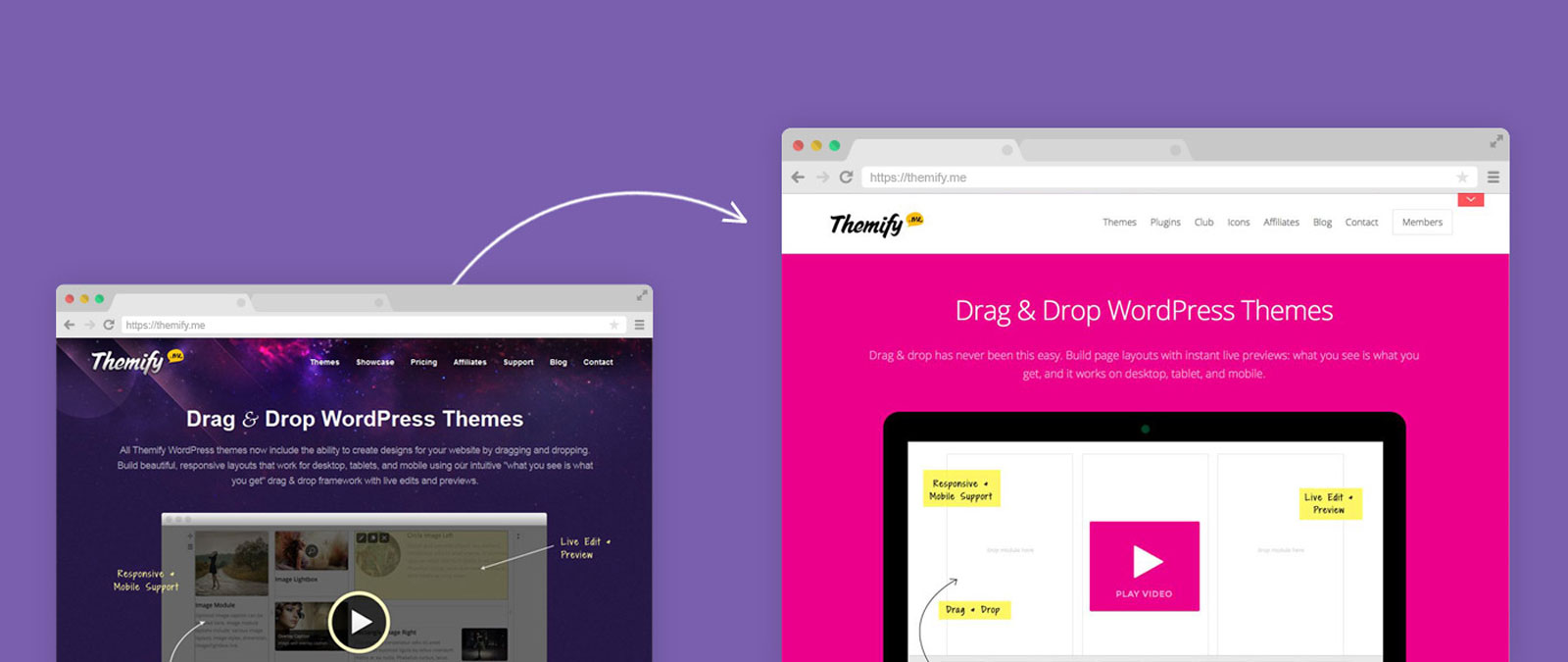
The redesign process started about a year ago, and below is the first version of the redesign. I tried to update the style from the existing designs, but after a few mockups, the project had to be put on hold due to the overwhelming work load at Themify.

Second Version: Flat & Colorful
After several months, I decided that the redesign should take priority and pushed for completion. I felt the first version was not really what I envisioned for Themify, so I scrapped the idea and started toying around with the idea of a flat design style.
Flat design was completely new to me, as I was so used to illustrative design, working with a very high level of detail.
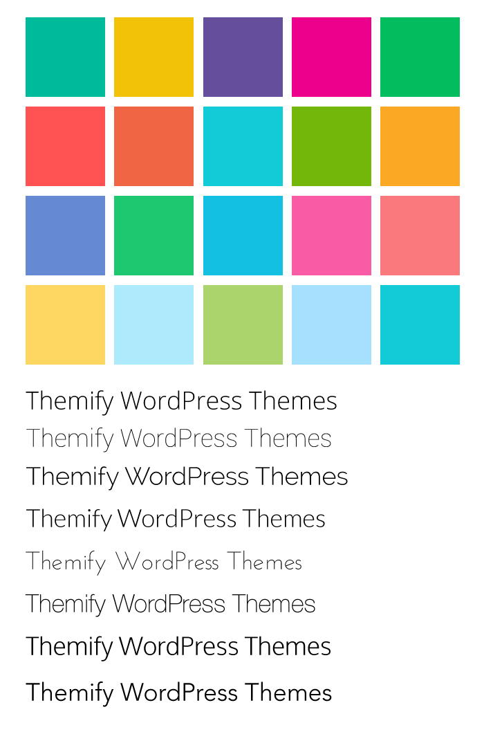
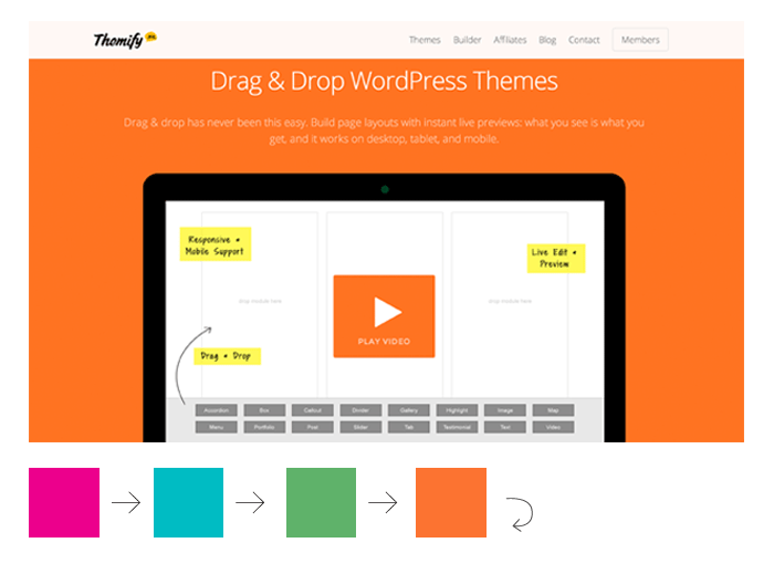
I started the mood board by collecting the fonts and colors that were suitable for flat design. Below is the home mockup of the second version.

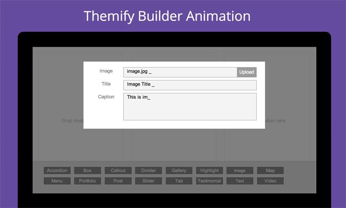
Abandoned Splash Animation
Intially, I wanted to show an animation, made entirely in CSS3 and Javascript, to advertise the functionality of the Drag & Drop Builder on the homepage, but I decided that the animation generated too much unnecessary overhead with respect to markup. Below link is a prototype of that animation.
Final Touches
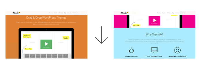
After completing the static design, I added transition effects to spice up the presentation of our beautiful imagery, emphasize the marketing copy, and really catch the user’s attention.
Shrinking Fixed Header
The header is a great way for our users to quickly navigate around the Themify website, but I didn’t want it taking up so much screen real estate. The end result was creating a fixed announcement and menu bar that shrink smoothly as you scroll down.

Parallax Scrolling
The nifty parallax scrolling section at the top was accomplished using CSS3 transform.
Fade-in and Fly-in Animation
As you scroll down the Themify homepage, images and text fade-in or fly-in to the content area. This animation was made completely reusable by simply entering its class name. (For example: .fly-in, or .slide-up, etc)
Color Morphing Background
With Flat design, color plays a vital role in the look and feel of the overall design, so I thought it would be a nice touch to create a color morphing background by animating a set of pre-set colors from one to the other. The end result turned out to be very nice, and I have received quite a bit of positive feedback for it.
ben
Can you share some javascript plugins you’ve used to spruce up your site?
Nick La
Sure, perhaps next tutorial. :)
Dafian
Yes, please share the techniques you use for new design. JQuery, CSS3 and other you use to built that new design.
That’s cool I like the new design!
Sorry if my english is bad. Thanks so mush before…
R G
The design is very eye catchy.. Hope you will share the core techniques (if possible) so we could also get a good knowledge..
Tim
Unfortunately, by using a flat theme, the site looks like every other site out there today. Nothing sets the design apart from any other theme site. Maybe that was the idea behind it?
ben
Yes, but thats the nature of web design apposed to any other kind of design. Web design is tech driven therefore particular trends are easily spotted in this kind of design. I’d like to think of web design as kind of being like a new car. The new car always looks and functions better than the old. The question is, is it bad to adhere to trends in web design? I suspect not, since all sites get redesigned every 6 years or so as the new ways and methods of building sites emerge and set the standard and raise the bar.
I don’t know of any awesome/cool site that was designed 6 years ago to which I always point and say “that’s the way all sites should be designed.” Because all six- year-old sites look outdated, clumsy, and unfashionable. And even if you look at all the latest shiny websites designed today, flat or not, its hard to pick one out and say, “this site does not follow the trend, because it looks so different from anything out there” And the reason is, because it’s not the flatness that makes all sites kind of look the same, but the responsive/adaptive nature of all sites. Responsive layouts, that are carefully crafted on grid, is what gives the sites the look they are getting. Usability trumps everything else at the moment. Your site has to work on multiple screens and be usable, and we do not have too many flexibility to work with when it comes to responsive site design. Maybe in the future we’ll have something better, but in the mean time, lets enjoy all sites looking the same.
On the plus side, web trends = job security. Every agency wants to redesign their site after six years, lets sell the trendy and shiny stuff to them.
Tim
“The new car always looks and functions better than the old.”
Highly disagree with this statement. It depends on the model of car, and I’m not going to get into that discussion here.
“Your site has to work on multiple screens and be usable”
That is true, but that doesn’t mean it has to be responsive. Websites can function just as well on a phone or tablet whether they are responsive or not. In fact, there are many sites (particularly portfolio type sites) that never function well on mobil devices as responsive sites, because images are meant to be viewed large. You cannot get a sense of details or the full image on a phone.
A theming site typically shows thumbnails of themes, which you cannot confidently view on a phone to get a feel for the theme. There is no way I would purchase a theme for my website without viewing the theme on a desktop computer.
Websites don’t need to be trendy to be popular. MacInTouch.com has had the same site design since the late 90’s and is one of the most popular Mac sites on the internet. Content is more important than looks and it should drive how you design (and develop) the site.
ben
Sure, sites don’t have to be trendy to be popular, but being trendy is sure the fastest way to getting there. You either follow the trend, or you set the trend. Pick one.
I never heard of MacinTouch.com, but I can name you couple of more, even more popular sites, namely: craigslist.com and drudgereport.com. Both sites look aesthetically from the 90’s. These sites are popular only on the virtue of popularity. Their aesthetic has been branded and frozen in time. These kind of designs will not work if designed today. If you try to design something similar to those sites, in terms of aesthetics and functionality, you’re not going to propel to success.
Tim
Well, I can tell you that Themify won’t be getting more popular because of their design. It will only be because of online advertising.
Sue
I agree with Tim. It’s a beautiful theme, but it’s not that different from the other flat themes out there. The animations and color changing features are nice though. The site feels lighter too and loads faster I believe. Props to taking into account the performance in terms of page loads.
Gary
The new design is absolutely beautiful. Love what you’ve done with the animated background and text colors.
Kiraz Fidanı
I definetly liked new design but can we add some additional animations ?
Kelco
It looks amazing, the colors are brilliant!
Amit Singh
The Themes are beautiful , but it’s not that different from the other flat themes out there , its flat but more vibrant themes are needed.but still i love these designs nice work..
Humayun Hashmi
I don’t know why but i liked the first version. This might be because i am not a technical person so i don’t know the technicalities, but as for a reader or audience i will prefer to give first version 8 out of 10 and rest of the redesigns would be.. ah… let say just 6 :) Hey, you are not using the first version anymore? Will you please write a tutorial to design it? I know i seemed to be an Alien among you all dev folks, but i liked it. :) BTW i liked your blog too.
Theo
Great job!!!
gamis ifah
responsive flat and metro style.., but the color is annoying for me.., but overall is great..
Saji John
I love the new design and its appearance is beautiful. Animations and color features are excellent and you have used it wisely. I believe, this site would load faster in browser.
ijja
The new themify website is well done, good choice of fonts and well spaced, the only problem i have with the new version is the use of color, i think you are using so many colors, i prefer to keep it minimal and clean, with only two or three color choices maximum, otherwise good job.
Website Design Calgary
A creative new design, I agree with others that sharing the techniques used would be beneficial. Great redesign.
Bailey
themify themes are very nice, animation and colors are very good.
Tom
Looks awesome. Great job!
Benjamin Marc
Love the new layout, looks supper easy and fun.
Suri
Great design. colors are beautiful. designs are simple and professional.
Danny
I like the animated background and text colors. Something that can be added to simply to designs.
S Roy
Yeah!! amazing. Thanks for sharing such animations.
Joydeep Banerjee
That was very nice.