After three and half years, I finally redesigned Web Designer Wall. I launched Web Designer Wall in August 2007 and haven’t made any changes since then. Today, I think it is about time to put the previous design in retirement. It is sad to let it go, but I think a redesign is a must because technology is different now (ie. HTML5, CSS3, media queries). So I’m going to highlight some of the features about this new design. I hope you will like this new design as you did in the previous version.
Media Queries
Before I started on the wireframe/design, I took a look at the visitor stats on my site. Below are top 10 display sizes:
- 1280 x 800
- 1440 x 900
- 1680 x 1050
- 1280 x 1024
- 1920 x 1080
- 1920 x 1200
- 1366 x 768
- 1024 x 768
- 2560 x 1440
- 1600 x 900
… and of course iPhone 320 x 480 (#15)
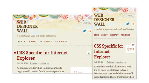
It ranges from 320px to 2560px (width-wise). To target all different displays, the typical fixed width layout won’t work. I use media queries to make a liquid and responsive column layout. The layout flows automatically based on your viewport width. I made it work from 320px to 1280px and higher. Viewers now never need to scroll horizontally. To see this in action, resize your browser window on this site and watch as the layout toggles through various layouts.
3 Column (large display)
If the viewport is wider than 1000px, it will show a 3-column layout: fixed left navigation column, fixed width sidebar and liquid content column.
2 Column (medium display)
If the viewport is narrow than 1000px, the fixed left navigation will flow to the top and turns into a 2-column layout. The content column remains liquid.
1 Column (small display)
Once the viewport gets smaller than 760px, it switches from 2 columns to a single column layout. Note the sidebar drops below the content column.
Mobile
The layout doesn’t breaks even viewing on mobile devices such as iPhone and Blackberry.
HTML5 & CSS3
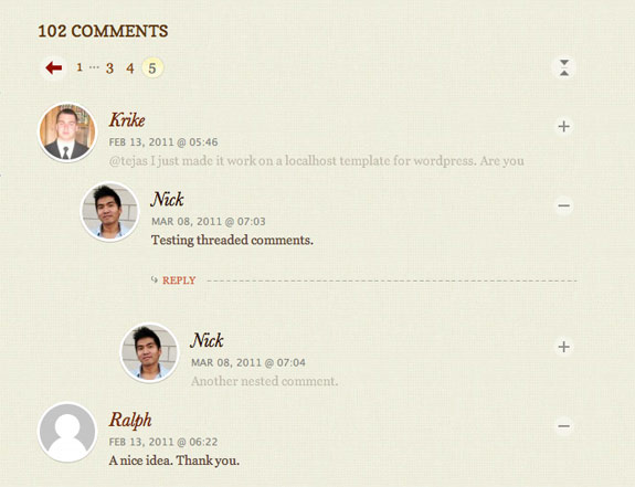
This theme is coded with HTML5 and CSS3. I also upgraded the site to the latest version of WordPress. Finally now you can reply to threaded comments.

Featured Posts
I added a new Featured section which is indiciated by a star graphic (beside the post title). You can also find all the Featured Posts under the Archives page.

Some Fancy Effects
Scroll to Top
When the page scrolls down more than 100px, the back to top will slowly fade in.

Collapsible Comments
Have fun with the collapsible comments. You can toggle the visibility of each comment. The circle avatars are done with this jQuery trick.
CSS Transition
Some CSS transition effects are implemented on the navigation buttons (fading background color) and the search form field (animate width). It is currently only supported on Webkit browsers such as Safari and Chrome.
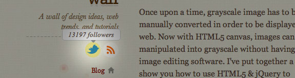
Share
Don’t forget to share my posts if you find them useful. You can find the share bar below the post content.

Comments & Bug Reports
What do you think of the new design? Share your comments in this post. If you find any bugs, please take a minute and report them. Thank you!
329 Comments
Comments are closed.
Jermayn
Looks good!! Like the css3 media rules and the “Back to Top” link as well as the neat design
Ahmad
Testig treaded comment
Ben
Testing the double thread…
test
It’s beginning to look like a triple thread
Nick La
Please stop testing threaded comments.
Milos Milikic
Looks great! Just check twitter link, shows “0 followers” and goes to wrong url. RSS link shows 0 subscribers also.
Sander
I Like the new design. It has some neat features. Love the back to top button and the fixed menu on the left.
Damjan Mozetic
Loving the new design, especially how nicely it tansforms on narrower browser widths.
Nice touch on the comment images as well.
SAiNT
it’s very cool and stuff, but always a pain in one’s ass to design for different resolutions, especially if the design is only based on floats :((
ahh..
Dan
Looks gr8 in chrome/FF. In IE8 I got this two:
Webpage error details
User Agent: Mozilla/4.0 (compatible; MSIE 8.0; Windows NT 6.1; WOW64; Trident/4.0; SLCC2; .NET CLR 2.0.50727; .NET CLR 3.5.30729; .NET CLR 3.0.30729; Media Center PC 6.0)
Timestamp: Tue, 8 Mar 2011 08:26:07 UTC
Message: ‘body’ is null or not an object
Line: 16
Char: 84607
Code: 0
URI: https://webdesignerwall.mystagingwebsite.com/wp-content/themes/wall/js/jquery.js
Message: Syntax error
Line: 1
Char: 1
Code: 0
URI: http://twitter.com/statuses/user_timeline/nickla.json?callback=twitterCallback2&count=5
Paolo
Compliments. I follow your site from years and i like much new look.
Greetings from Italy!
Paolo
DPolyakov
Good, but one mistake: “Tiwtter @nickla” in right sidebar, may be twitter? :)
Luca Rosaldi
As always, true skill is in the details, and this site is a clear example.
Just awesome.
Antti
Nice re-design, it’s better than the old, and I like how you write about your thinking behind the design.
I’m not sure about the fixed menu though, I personally want to leave all that navigation in the top when I scroll down to read more because it distracts me from actual text paragraphs. And those links are not that important to show them all the time fixed on the left.
But just my opinion though. :) Otherwise it’s a great design.
rob
i like it, however i would prefer to be able to see the categories. you have to search for everything….
congrats on the design looks better!
Pothi
Awesome redesign. Was just talking to a friend about the advantages of responsive (liquid) layouts. Now I have one more reason to convert him from fixed layouts. ;-)
TED©
Good work, but I liked more the older decorations.
Why in search don’t you use the html5 placeholder attribute instead of js solution?
Pat
Wow, really good work!
Blaze
Awesome work!
RedGlow
Terse and to-the-point explanation of the highlight points for this design. Which, by the way, is very simple and also very effective. Compliments.
Marco
Chrome/OSX.
Focusing the “Search…” text field does not clear it.
BTW great design!!!
Stijntjhe
Same problem here.
David
Yup, here too. Chrome 11.0.686.3 Dev. Mac.
Eric
Splendid job Nick, the new design looks wonderful. However, I recommend you use the HTML5 placeholder attribute with the search input field, and make it browser compatible with this handy plugin https://github.com/mathiasbynens/Placeholder-jQuery-Plugin. This way you make your design just a bit more user friendly ;)
Nick La
Thanks for the suggestion. Sounds like exactly what I need.
Anders
Very nice website.. I will have a go with CSS3 Media Queries now that I have seen your site.. works in Dolphin browser – Android..
Cheers!
moabi
wow, you did an awesome job…the liquid layout is really amazing !
Congrats
Nathan
Very nice work Nick, the media queries stuff is very clever, will have to try that on my next site.
I notice you’ve got a bit of the avatar image showing through at the edges of the round corners – I’ve found that a subtle drop shadow with no offset can help to minimise this effect.
How do you get the images to scale down with the resize?
Nick La
I use this jQuery trick to wrap the avatar as background image and background-size to resize the image:
https://webdesignerwall.mystagingwebsite.com/tutorials/css3-rounded-image-with-jquery
Pulupulu
Great job here ;
just one point : I find the font used in the titles too pixelated, it doesn’t fit the smooth design
Nick La
I’m thinking to switch to Georgia because XP doesn’t render fonts smoothly.
Josua Pedersen
It’s looking really nice! I’m becoming a big fan of the way the navigation staying in the same place as everything else scrolls. Feels like that is the way we should have always scrolled websites.
Good headline as well! When I first clicked the link in my RSS reader for a few seconds my imagination went around crazy. Great work Nick!
idraki
Man, awesome redesign. I love it. You inspire me to create something new too!
Nindya
Redesigned, and still awesome as ever :D I envy you for having awesome talent in design like this. Good job!
pratik
Brillant work!
The site is looking crisp and neat…. liked the work u have done on the search box too ;)
Pragmatic Design
Stunning job (as always)!
Matthew Ellis
Schweet! Loving the media querie shizzle.
Marek | Webcentric
Really great HTML5 and WP work. Well done. Hope to see some articles on complete website re-designs, effects on SEO, Link backs, and overall successes or pit-falls of complete re-designs. BTW, back to the top rocks!
pratik
I second that… an article covering aspects of a website / blog re-designing would be really helpful.
Nick La
I will write the design process of the redesign soon.
Benjamin Reid
The re-design is perfect. Congrat’s. The media queries is something that all new sites should be employing. Very nicely done.
fStrange
Firefox 4.013beta (Win XP)
Focusing the “Search” text field does not clear it.
p.s. design likely
John Robinson
Lovely work. Some really subtle animation effects. I particularly like the way the search box gets activated. Really, top notch stuff.
Taimur Asghar
Excellent redesign. Specially I like the static column on left. Marvelous job.
StevenBullen
I love the 3 different layouts depending on screen size, but the static column on the biggest layout (which most people will see) is definitely the best.
apricum
perfect as always
Geo
Wonderful work and very inspiring. Congratulations!
Mudassir
I need to look into this liquid design thing. Very very cool.
abdusfauzi
they are cool and nice like before. well done!
im yet to move on for html5 and css3 codes.
maybe, i should start very soon.
congrats!
Jonotespere
Cool!
There’s, in my opinion, a problem in the menu: on Windows XP + Google Chrome 9, “#main-nav a” has got a 13px font-size which is not displaying nicely (it’s too sharp), maybe for the font-family you’ve chosen, Copse… The problem is also present on the H2 tag.
I really like the styling of the artcle’s titles and the main title! CSS3 rocks!
Kevin Oh!
Great work on the redesign! Love how the main nav auto scrolls on the left column at larger browser sizes.
Agreed on the crispy/overly sharp looking text though, it doesn’t render well in Chrome, Safari, Firefox or IE on Win.
Reddy Rk
I Always…Fans Nick La :)
Ncus
Very nice! Thank you for the insight of the making of the site.
Andrea D
Looking awesome! Nice work
Jack
Nice redesign and like the use of media queries – only thing I really don’t like is the floating navigation in the 3 column layout – I find it really distracting when scrolling the page and the nav stays there pulling my vision to the left . Think I’m going to have to shrink the browser window when visiting the site or even use readabilty…
Ivan Minic
Very well done ;) Looks great on 1680×1050 in Opera 11 ;)
Ethan Hackett
I like the redesign. You stayed true to the style before so if anyone hasn’t been to the site in a while they wont think they are in the wrong place. I really like the fluid design that shrinks from 3 to 2 to 1 column. I appreciate your attention to detail.
The only thing that doesn’t thrill me is the pixel blob in the bottom left of the site (behind the back to the top). It looks like a mess of pixels compared to the rest of the illustrations which are these very ornate and color detailed drawings.
Nick La
I added those “pixel blob” to create depth on top of the tiny jellyfish elements the side.
CuPliz
Another great and beautiful design by Nick La… Good job!
Yellow Themes
Love the new layout!
pdwalker
What a beautiful piece of work!
Jack
This is amazing. I’m just starting web design and development at uni and I get missed feelings when I see a site like this. Part of me is just held in rapture, while a tiny part of me gets almost depressed as I wonder how I could ever create something as beautiful as this from scratch.
Eva
I love it! Great job :)
Ginchen
Hmm, I’m not sure if I like it better now. But, well … that’s probably just because I liked your old design very, very much! ;)
In Firefox, there’s a little gap below the footer. Also, you wrote “I made it work from 320px to …”, but when I resize to 320px in Firefox, parts of the text are missing, and I would have to scroll horizontally, but I can’t (probably because of “overflow: hidden”?).
However, I can’t test it with a SmartPhone, because I don’t have one. ;)
Robert
Loving the liquid layout! It’s sweet how you got the left column to come to the top and the twitter box to come to the bottom when the page starts to get smaller.
How did you get the images to scale? That seems to always give me grief.
Fazreen
I have featured your blog few days ago and today web designer wall come out with new design..awesome work!
Trent Walton
Great work, Nick. I’m loving the new look— not a complete departure, but obviously a lot of well-planned updates.
Anthony
Very nice. I really like the “Demo” on the article summaries very nice user experience, thoughtful. The static menu is great to, I like the tag cloud on hover, another nice effect. i dont like to ahve to look at those confusing things. however, it is nice that I ahve the option to check it out. nailed it on the categories in the blog menu too.
At first I thought what a tiny search box, then I clicked on it. NICE dude.
I would like to see the comment box on the top of the comment list. hmmm, I wonder if a study has been done on this?
Over all, great job,
parvez
Another great work! really good design, well structure and clean.
Lex
My first look at the new re-design just happened to be on my iPhone.. And it’s just lovely. :) Finally, a “mobile version” of a site that stays true to the original. Very nice. Keep up the great work! :D
Matt Fairbrass
Very impressed with the new design. Love the user of media queries to determine screen sizes. Elegant and simple.
Roman Teslya
Really cool redisign. I like the idea with search input field. Great work.
arvee
i love the new look! ♥
Hidayat Sagita
Awesome redesign! For real!
Anyway, typo error on “retirment”.
Matthew Fowles
Wow i love the design always been an amazingly well designed site! I don’t know if it’s new but my favorite part is the text shadow’s on the post titles definitely.
kozeyar
Wow! I just wondered why you didn’t update your site for so long just last week. Now, you came out excellent.
Cheers
Zeyar
From Myanmar
Drew
Pretty baller. Nice work.
Chris Nager
You did an amazing job with this iteration of your site. I am so impressed. Responsive design FTW! Nice subtle touches here and there (i.e. search bar animation).
Vectorss
Lovely amazing redesign Nick! Great work.
Ahmed Bolica
Congratz Bro i like it keep going dear i love your blog
Saber
This is very nice! Love the design and your attention to details.
Tony Oravet
Very nice implementation! You have given me some great ideas for our mobile site with the switching of styles based on resolution.
Craig Coles
Definitely loving the new design and layout, as well as keeping some tiny aspects of the original design. Also loving the good use of the textures!
Good job!
C. Morales
Nice redesign and features.
I like the media queries implementation. However, your logo is different in the large display version than in the others (lowercase vs capital letters) and that causes a (tiny) inconsistency. How much did you take that into account and why did you choose to make that difference? (because I guess it’s something on purpose)
Thanks!
Nick La
I did it on purpose. I find it reads better to have lower case on the fixed position navigation.
Slimschraudi
just in case you didn’t notice – the linking of your twitter feed icon in the nav section misses the .com in the url. maybe somebody already commented on it. didn’t page through the comments. big up and cheers from frankfurt.
slim
Sisar
Love it! Amazing work!
Maziar Ahmadi
Great job! I love the new design. Totally agree that the old Web 2.0 design needed to be ditched.
Matthias Fänger
Good job, really nice redesign!
Steve Ottenad
Looking good. Media Queries are amazing! It looks like you have zero twitter followers though (refreshed 3-4 times).
Hannes Schurig
Looks great on my Desire Z, both normal and sideways. Just 1 thing that I noticed: back to top isn’t working on my DZ.
Just in case you wasn’t informed by now.
Jeremy
Design looks fantastic. But really, collapsable comments make totally no sence at all.
Alex
It’s really nice however when you resize and the nav bar goes to the top of the page, ‘web designer wall’ turns to inital caps instead of all lowercase…
Really nice design though.
STPo
Oooh, I LOVE your titles!
Pretty redesign, congrats (but ugly fonts in the #main-nav — WinXP Fx3.6)…
Min
Like always…. awesome job!
Ventura Web Designer
Have not been here in a while. I like the new design it looks great on my 1920X1280 monitor.
Brade
Nicely done! Only issue I noticed was the search box–when I click into it, it changes size and doesn’t clear the word “Search…”
Ernest Ojeh
Awesome job. Looks great. I really luv the collapse/expand all in the comment area. Overall neat job- As usual.
aurel
it looks really good – I like the sticky navigation, I have to admit that I am used to see the “reacent posts” near the top (near all blogs) – but now the desition is a lot better, much more white space and clean design
I always like when I see the use of icons (in your navigation: blog, about contact, archieves)
cool design
Mathieu - Deco Tendency
Thx ! Helps me !
Mark
Hi Nick!
I’m sorry, but I liked your previous design more. The new one looks to boring… Please bring back your old design!
Greetings Mark
Nick La
My honor that you still like the old design that I did 3.5 yrs ago. I might release it as a free WordPress theme.
Ned
It would be great if you do release the old theme. I thought it was well designed. I’m actually interested in it more as a template to learn from than in using it as a theme.
But, not to distract from the new theme, which is also great. It’s Clean, and uncluttered. I love it.
Dessign
Amazing design, looks nice and clean, and that’s what important. Good job,
Marios
Jeana
Graphics aside (which I love, but are very subjective), the layout is brilliant! It’s such an elegant solution to a pervasive problem. Great job!! I foresee a new trend…
Johan
Great technical solution, to bad WP still haven’t updated the form error page, maybe you should have a look at that? https://webdesignerwall.mystagingwebsite.com/wp-comments-post.php
Chris
Like the new design, and your variations for different sizes does well at balancing the weight of the page at different display sizes.
Damian
I prefer this simplified site to the old site. Easier to concentrate on the content.
Gonzo the Great
Hi Nick,
love what you’ve done, it just looks beautiful! Like the media queries, works fine when resizing by browser-window. Only have a problem with ‘Copse’ from the Google font Library, .. in smaller font-sizes its readability sucks majorly!
Maybe a better font-choice, or @font-face instead of Google Fonts? Otherwise the redesign looks slick and clean, love it! Great work ..
ouabe
Very nice template !
Charlotte
I gasped so much
(from shock, not disgust or euphoria)
I like it a lot, but you have much more to live up to.
The media queries are ace, but in the 3column version the left content gutter is smaller than the right (is there any reason for this?) and the background image under the nav will annoy the hell out of me (would be fine if the nav wasn’t fixed, but really contrasts with unattached background).
Apart from that it’s so beautiful and incredibly feature-rich.
Congratulations on still making it look simple with all that under the bonnet :)
Phil
Very nice Nick! Simple, clean and effective. That’s what I like! The previous design was good too but I like this one a little more.
Greg
Nice use of media queries and responsive design Nick. Recently wrote an article on the same topic, did your new design take a while to implement and test at all the different resolutions?
Like the new simpler design also.
Nick La
Overall process didn’t take long, but I spent quite a bit of extra time to make it work on IE7 and 8.
Raksaka Indra
Nice design, especially CSS3 Media Queries… :D
Eduardo
Great redesign, easy on the eyes and very nice looking, a definitive upgrade [not that the old site was bad =) ] .
Just one thing, the categories of [Tutorial] [Trend] [General] i dont think that should be buried under blog and appear only on hover (because theres no hint that blog would pop a small window with more sub links)
Maybe should appear just below it with a little margin right or a sub and to denote been child of Blog.
Nick La
You’ve made some good points, but I would like to keep fixed left navigation minimal.
Q.D Vuong
I love it! Simpler but still familiar and awesome use of media queries. I also like the dominant use of mainly serif fonts.
The only thing I am not crazy about are the main categories on the 2nd level of the navigation because I usually browse them first.
e11world
Nice use of the media queries. I have to say that I still like the older one better somewhat and many might agree, Simple is nice but I think the web designer wall site name can stand out a bit more. My personal opinion but still great job!
trs_one
nice work mate! looks good!
Rohan
Great improvement. Although I, personally, prefer the old background. Perhaps you should contemplate making a few background layout thumbnails that change onclick for users who perfer different backgrounds?
Zach Mathews
I have been wondering when you were going to post again. Now I see why it took so long.
Peter Yee
Nice one Nick! I have some humble suggestions for extra enhancement.
1. Change all text-transform to lowercase, except heading.
2. Collapsable button on :hover. (it pars with minimal concept)
Cheers.
MgShwe
It is pretty much enlightening post :) Impressive and great!!
Alexandre Souza (Brazil)
Cool, it is good to change… but I will miss some stuff from de old one.
Thanks u for all the good information and excellent posts.
Matt Marshall
It is said to see an old design go, however sometimes you gotta get out with the old and in with the new! I will check back on the site to see all the updates!
Web Design Giant
When you get a chance to check out my site please do. I will be incorporating a new video into my site and cant wait for the response!
Jorge Ruiz
Hi Nick, I like a lot the new design. Congratulations!
monica
awesome!!! love the mobile version..I get so excited when sites have a mobile version..it’s a must these days!!! you did a fantastic job! high five!
sam
it’s very nice Nick. I like a lot the design.
naro
it’s more clear, congrats!
ricksonchew
Cool! I’ve been lurking around your site and your new design is super cool! I love the auto column change (whatever its called) feature!
Chris
Just viewed this on an iPhone 4, brilliant. I have looked at mobile themes and they try to be apps. Web design for small screens is alot cleaner than mobile plugins etc.
Great new fresh look congrats! I am looking into mediaquery for my next redesign!
Chuot Lac
Nice web, nice tech. Congrats!
Sven
Very nice. I love the new design more than the old one. I think it’s cleaner and seems more tidier.
Well done!
Ajay Jagdeva
Finally its done.
I like the new design. I am myself a UX guy.
Great work.
:)
[email protected]
How i can use better css file while use html along with design perfect show off.
prisca
Lovely work on the new look ;)
I loved the old design and am somewhat sad to see it go… but saying that – the new design is lovely and wonderful to read the details on specifics ;) great work ;)
Wonderful :)
Thanks as always for all :)
Chris
Very nice. I liked the old site, but this is a nice update. Good use of CSS3 techniques.
Karyl
Very nice. A bit less flashy than the last one, but it seems very “current” and is a joy to use. Well done!
bob marteal
Great update. Especially like the treatment on the headings and the stripped-down command post on the left. It shows great restraint and gives me just what i want and nothing else, well done.
Shin
Ah..Ive been a big fan of this website….
Beautifully designed and good coding..
Whimsy Collective
Do you have a screenshot of the older web designer all theme?
Would be nice to see/have a comparison. ;-)
The redesign is awesome!
Jim
The featured archives section looks awesome! Great job!
3sur3
….dayum! great work!
Daniel
Great job! Might have to use some of these techniques on my own site. Bravo!
Elizabeth Kaylene
Ah, Nick, this is really nice! It’s updated, but it’s also still very much WDW. Great job!
Mark A.
I don’t know if any of the other 143+ comments mention this, but I hope that you are going to sort out your tabindex and focus styles. As a keyboard-only user, I found it annoying that my first tab took me to the comments form and subsequent tabs gave no indication of the element that was in focus. I expected to be able to tab through the sections of the article, having first tabbed through the main navigation. There is no ToC, either, which would be useful. My first experience of this site has put me off returning.
Nick La
I appreciate your inputs. I’ve got to admit that I didn’t put enough thought on the keyboard navigation while designing this site.
Ritchie
WOW! This is awesome. cool design concept, Nick.
amy
Hi, Nice, The Redesigned is great, I am a WUI designer form china, I am very gland to see the graphics of chinese elements .
Sameer Manandhar
This is one of the best designed sites that I’ve been following for few years now.
The re-design is quite good.
LED Lighting Lighting
Hi ,just found out about this site awesome really like the redesigned version hoping to see more :)
Web designer Lt
Nice Nice..
Faraz
These are very refreshing new avatar of web designer wall.It is providing more space to eye with new style.
Ayesha
I like this new design and layout here,it is making me to browse all categories again
Adam
Loving the new deisign, just wondered whats reason the capitalization of the title is it for aesthetics or for the UX, or both?
Nick La
Simply for aesthetics.
Kaare Roager
This is nice!
I love the use of HTML5, CSS3 and WordPress
I am fan of alle 3 of them.
I too like the use of 3 different display, so I had a look on your stylesheet.
Congratulation with a beatiful and functional design
//Kaare
Joel A Glovier
Great work on the new design – way to set the bar.
missinmedia
The combination of it all is a true piece of art, html5, css3, design, wordpress, very inspirational, thanx!
Alexander
I found this website being one of the most usefull and informative out there to be up in date with tips, tutorials, design and info bout web design,
!!!Keep up the awesome work!!!
I love the new design, so much details!!! :D, and I so much love your backgrounds, so complex so beautifull.
I just have one comment, the title headers which have a double text-shadow doesn’t render as you would expect on any browser running on windows and its hurtfull to the eye watching them on detail, based on the pics you showed i guess its a SO problem (blame windows :P ).
Brian Flores
Absolutely love the new redesign. HTML5 well excuted! Kudos Nick! Kudos!
Sawny
Sorry, the other design was much better >.<
But I like that u use css3 and html5.
Derrick Dedmon
Wonderful new look, gratz
Marcy
I love the new design as much as the old one. The old one was really beautiful and involved. This one is much lighter, and will load more quickly, especially on mobile devices. But you’ve kept enough of your beautiful and unique style to make it stand out from the crowd.
Heidi
Overall I like the new design, especially the textured background with the random do dads that roll by when I scroll and the fixed left navigation.
SolidApollo.com
i prefer the 2 column version.
Aj
The new desgin is really great. Everything is so easy to read and clean. Great work!
David
I think both sites are really great for its technology use. The fact that this is more robust in its own right and more modern for its environment makes it very easy to use and highly collapsible and open for more user preferences.
Great job on the HTML5/CSS3 usage! Love it!
Christian Rodero
Great job ;) I love new design (and new technologies)!
Gary Purdue
Love Love Love. Really like the resizing element too.
Alexander
Hello Nick,
thank you very much for this description of your redesign. I have to study the techniques of adaptation to various screen resolutions myself as early as possible. My own humble Site doesn´t offer this at all at the moment (shame on me!).
Quite the same technique you use is also used by simplebits.com (Dan Cederholm) i guess.
Last thing: When you write “viewpoint” I think you mean “viewport” – don´t mean to bother you, and surely everyone will have understood what you meant.
Warmly,
Alexander
Nick La
You are right. It should be viewport, not viewpoint. Just fixed it.
Dave
Nick, This is brilliant. really like the texture and clean new layout!
Aldric
Incredible… as usual :)
naran_ho
Very nice new year, new design… congrats.
billseymour
Beautiful (although a bit sad to see the original design retired). I am interested in exploring your browser width solution.
One question about handling of comments: are you comfortable with WordPress comments not “filling last page”, so that the page with most recent comments might have only 1 or 2 comments, while subsequent (earlier comments) pages are filled? I know that your original design specifically “filled last page” of comments.
Again, the new design is very clean, yet is still connected to the original.
Alexandre Minev
Beautiful site, I noticed you didn’t implement any PNG solution for IE6 users. I guess you are just dropping support entirely for the browser since IE9 is right around the corner. Another thing I want to mention is that you are using type in your javascript implementation but since you are using HTML 5 type is not needed anymore, right? Maybe you put it there anyways for different reasons. Anyhow, those are just two little observations of an otherwise beautiful website.
Lord Tinchen
Pretty awesome!
You are the man!
Banhurt
It’s beautiful
Mohammed
Just amazing!
Marvin Hagemeister
I love the new site! Looks really great! I found a bug though: Your mobile version does not work on Android phones. Some parts of the viewport tag is missing. For Android it should be:
Marvin Hagemeister
Oh wait! I just get the 3 Column Layout when zoomed out. When I zoom in the layout changes accordingly. Sorry for the false alarm ;)
Khalid Majid Ali
Cool design! Loved the old design and this one is even neater. Big Fan! :)
Mcgrady
Really great! Love this redesign! : )
David Calhoun
Love it!
wptidbits
Wow! The original design was great, now i call this design excellent! Even though previous design was more catchy and nice for eyes, this one provides more accessibility to all kind of users. It is good to know that you consider all those screen width including mobile. Such is a very future proof action you’ve taken. I have tried browsed this wall using my Dolphine browser on my android galaxy s, it worked flawlessly. Just so you know, IE9 is supporting search form field (animated width) and may support as well as many other things that previous IE8 did not support.
Algorithm
i like this design, but i don’t love it. previous design was stunning! it may not have some super, uber, fancy stuff it has now, but it was abstract and somekinda leaving being. now it’s more classic and casual, like many other sites. And I really don’t like that color transition (red-orange-yellow) on sidebar, it gets ugly when you hover more tags in small amount of time. Cheers!
mauricio
great design congratulations
Miikka Värri
Well done, great work that looks and works much better than the old one. Site doesen’t feel so large and heavy anymore.
fuzzimo
Redesign looks great!
Okky
woow.. so envy.. it’s really nice :)
admin
Dude I admire your work so much so that I always come back to get a few tips and ideas about my own work.
The previous design was just as good as the new one but oh boy oh boy…. you must have sacrificed a lot to get to this point.
Anyways I will be happy if you accept to be my mentor…. SIR!
HTML5 Awesome
Great redesign as always Nick! You’ve been featured here http://html5awesome.com/web-designer-wall/
Hassan Mehmood
Man this is just awesome!!! Always love your designs.
=) Great Work
Vladislavs Judins
Great work! I’m really in love with your new design and how it is working, especially thanks for thinking about different platforms! :)
Agata
That is great work. I loved the previous design, but the new is as great. I love the http://www.ndesign-studio.com/ design and can see you are in the flow of using a similar approach but each time creating something new… great work !
Aravind
Really really nice work….. :)
Gary
Beautiful Theme! It’s awesome that you have 3, 2 and 1 column displays according to display width (as well as mobile).
Stefano
Just awesome.
Edge
Just absolutely Stunning.
If possible, could you make a tutorial page on how you put this all together?
135design
Awesome job, no doubt.
You should add an iPhone custom favicon.
Here the code:
ihath
Love the new design
Brad
Great job. Love the new style and functions.
Peter / Stockfresh
Really slick! A beautiful example of great design.
Thorsten
Haven’t visited the site for about a week and was surprised to see the new design. Great job. :)
Cindy
I LOVE IT! Just when I thought your site couldn’t get any better. The new is you!
aribeo
Some sites just makes you feel like you wanna see everything on it, every single details and wonder, how the f*** he did this? how many nights he didn’t sleep just to keep the flow going, what you make with simple details is just amazing, I can´t remember any other website that shows so much passion for web-design like this one. I mean it, this just feels like an art object that I want to put in my wall, maybe I will do it ;)
Darfuria
Stop being such an inspiration! It’s hard to keep up!
(although I think the comment form fields could use a little padding)
Terry Reilly
Really like the new layout, keep up the good work and inspiration.
Spencer Thornock
Very impressive, seems like this design with the smaller background, while still very stylish would be more inline with the new Google page speed factors in their search placement algorithm. Large backgrounds, however beautiful, are difficult because of their great impact on site load time.
HTML5/CSS3 features are also quite impressive… hope you don’t mind if I see how you implemented them :)
adikahorvath
I’m lovin’ it ;d
ayrus
one word, awesome
Andrew Reed
Loving the new layout, the various format sizes is going to be great because I am not always on my office MAC so sometimes viewing on my IPhone is necessary. Great job!
Maria
Design looks beautiful and refreshing, althiugh you sort of stick to your style. Thanks for interesting posts!
Actually, my HTmL&Web-Design teacher asdvised to take a look at your page ;) well worth visiting and learning new things.
Keep it up ;)
alidg
fantastic design but doesn’t work properly on Opera 11.01, particularly search box and back to top button
Sergei F
great design! thanks for the write up!
Andrew
I dig it, per usual. My only qualm is the texture on the background… a little more visual vibration than I prefer. But otherwise, very nice.
Israel
Congratulations about this new re-design, very good work.
Shawn
awesome design….any plans on releasing the old design as a theme now?
Nat
Really nice design, and functionally it works without the user having too!
Gaurav Mishra
I really like how you guide the end user to see into details.. where designer spent lots of time in there.. and end user hardly notice in that detail.
I had first checked the video where you shown it to crazy crowd ; )
http://www.frontend2010.com/video/nick-la
Nicklas
dammit nick, you’re allways so innovative!
dadad
correct
dadad
df adsf
Owen
Wow – amazing new design! Site’s looking great.
Good job!
Ross
Great design! I like how you have taken all the resolutions into consideration including mobile
Impressive work!
Dave
It doesn’t get better than this!
Henning Nielsen
Pleasing to the eye, congrats. However, I have a few comments. Who wants to have fun with the comments – does anyone really spend time on collapsing comments? Have you considered placing ‘Scroll to top’ on the right side of the content? I think it would feel more natural. Just some thoughts. Anyway I love the redesign and the header is really delicious.
Vivek
Impressive works, Nick! How do you manage to stay always creative and innovative? Great design! I like how you have taken all the resolutions into consideration including mobile and palmtops.
vihal Shigavan
Once again nice work…!
you’re always so innovative!
http://www.prismicreflections.com
IOM Design
I think the new design is great! Really like the auto layout changes on window resize, very clever :)
Gustavo Macedo
Great! Congrats WDW team! :D
Matt
Wow this is amazing. A bit of a tutorial on that “Scroll to Top” feature would be awesome. Such a brilliant idea!
Vimal
Truly amazing bro…keep it up..
erwin prasetyo
great design… more efficient… ^^
Iva
I noticed a thing missing on the old layout, and you didn’t add it now, either…a “read more” link. I remember that the first time I was here in 2007, I had no idea if the posts were really as super-short as they initially appeared before I looked at one. Everything else is brilliant.
Impression affiches
Hi,
great job.
Especially because design is built to suit your visitors’ needs. To always keep in mind.
Daniel
Nickla,
you’re awesome,
I follow you sice 2008
and everyday you surprise me
with all your amazing content.
Thank You.
HTML5 anchor
Awesome new design!
It is great to see that you decided to support all kind of devices with this design. HTML5 and CSS3 are fantastic and you make very good use of them.
What a delight to see something different than the standard white background too!
Danny
Nice and clean!
I haven’t visited the website for a couple of months.
I am surprised about the new redesign. Good job!
Pat
Great redesign – nice attention to detail.
I have to say though that I would prefer a lighter background for readability’s sake.
dan
http://webdesignersbest.com
online project auction for clients and web designers
also purchase services online.
Fernanda
Very nice! Great redesign.
Jon
Your media queries are pretty brilliant. Most sites that even take display size into consideration do not degrade so gracefully. Most feel like an afterthought, but yours is very well thought out.
Garrett
Beautiful, love the responsive design.
One note, on mobile when switching to landscape view the page spills beyond the screen.
You can fix this by updating your viewport meta, from:
to:
And for BB I would also suggest forcing column view with:
Love what you’ve done., Cheers
Jatin Hariani
Amazing redesign. Totally in love with media queries. Searching your site for more on media queries now. :-P
Vita
Hi, great job in creating the most accessible, flexible and usable website I’ve seen in months!
eCarsBay
look versy pro!
web designer uk
It’s amazing post. It’s flexible and usable website.
ehhwhat.co.uk
Agree, great work, loved the look of the previous design and like this even more.
rod rodriguez
Nick you just keep getting super awesome every re-design, I was blown away with your previous n-design theme the one with the bird and flowers on a dark background, then you went vintage with Koi a fish, now this!? I mean the technology that went in this redesign is a work of art, I can’t keep myself from drooling here. Great Job!
Vlad
Pretty and eye-touching. Nice color combination and layout manipulation.
Much space and a CSS3 details make it nice, clean and useful. I love it!
Felicitări! (romanian for Congratulations!)
Junk Male
Love it! Really soft, organic graphics, gentle on the eye, but still leaves a powerful impression. You’ve inspired me to work a lot harder on my own projects. Thanks for sharing and keep up the good work.
chris l.
It’s a great redesign! But the one thing I immediately miss is the quick access to post categorized under ‘design trends’, ‘tutorials’, and (I can’t remember the other one.)
I especially liked being able to access the design trends immediately, now I feel like I have to dig and click on the category tag on a post.
Other than that, again, great looking site and as always thank you for this great resource.
Jared - Stealth Web Designs
I really like it. I’m curious how will degrade in older versions of IE.
Katarina
The design is great! I love the details.
But the font of the headers is a bit pixelated (on pc).
Curious Eyes @ Postcards Printing
I like the new design, it’s whimsical and fanciful in a 3-column layout, and i like what you did with the comments thread ^_^
billseymour
When I viewed and resized the site in IE8 (and 7), there was no display change (3 cols to 2, etc) as occurs in Firefox. Reading your Media Queries post, I saw that there are javascript and jquery methods that will work in IE8.
If in fact you decided not to implement display width targeting in IE8, I was wondering what your thought process was on this decision. It seems to me that, even though IE is simply a pain, a lot of folks use it. And even if IE9 winds up allowing media queries, there will still be large numbers of people using IE8/7 for a long time to come. (I won’t even mention IE6, which surely must be reaching the end of the road.) Thanks.
Nick La
The site has been tested on all major browsers. It should works on: IE7, IE8, IE9, Firefox, Safari, and Chrome (unless you have Javascript disabled).
Pothi
I can confirm it works just well on IE8 just like similar themes designed by Nick for Themify!
Couldn’t test it on IE7. I don’t remember using it for ages. :)
billseymour
Nick- I realize I was resizing in IE faster than the page could react. Yes, works just fine in IE 8/7 for me, too, looks great.
Pedro Gabriel Manrique
Wow!! I love your site and yours designs, how you do it? Could you publish a tutorial with the steps for get an amazing website?
Thank you master
ludwiczakpawel
nice!
Ashish
This is one of my favorites. New layout is really nice. Thanks
Vivian
I think this is really great~very useful.
alej
Cool!!
Wouter
Site looks very very great! Nice to see a great example of using media queries.
In FireFox4 are transitions supported, so you can use -moz-transition for the background transitions.
And I found a bug on the page:
If you go to the 2 column lay-out and you will click on the search, twitter or rss button you cann’t do that. Tested in Chrome Dev. and FireFox4
Mat James
I could totally relate to this post, thanks for your help.
Lloyd Lim
Hi Nick –
Nicely done especially on the functional side – really like the dynamic, fluid design of 3, 2, 1-column layout. Preserving the visual consistency for the mobile browsing was also eye-opening.
If I could play the devil’s advocate for a bit, I think the original design actually had stronger visual impact and impression than this new version. If I were to try to pick out the elements, I think it is due to smaller presence of the ‘Web Designer Wall’ blog logo and also relatively smaller real estate dedicated to the beautifully crafted visuals on the top area. I’m sure there are still a lot of first-time visitors and I’d argue that we still need to serve them well and leave the strongest first impression. (I’m assuming that you tried to get the logo and visuals out of the way a bit so that the content and the Ads on the right get more emphasis.)
With that all said, your blog is one of very few blogs that I follow. Thanks for all the inspiration! Keep them coming!
– Lloyd
Ninh
Another great design by Nick but I agree with Lloyd. I think the old version had a greater visual impact.
Alghero
Really, really nice website redesign! I browse it with my iPhone and it’s perfect!
Nice job!
Brandi
Hey Nick–wanted to commend you on a beautiful redesign and also a great bit of documentation for all of us following your lead and creating mobile-friendly sites that scale down with media queries. I viewed your CSS and followed your logic for my own project which was invaluable :)
Question now is, not sure I understand how to set everything up so that a website is specifically Blackberry-friendly. You mention above that “…the layout doesn’t break even viewing on mobile devices such as iPhone and Blackberry…” but using the techniques you have noted here, I still have a viewer saying my site breaks on their Blackberry. Am I missing something? Said site looks great on Droid and iPhone. Are there Blackberry-specific considerations you can can clarify? I feel a little lost.
Thanks! Please feel free to mail me directly if you are so inclined.
Deepak Shakya
Hey your website inspired many of us at college to look at the websites in a different manner alltogether. And 3 years down the line we feel it was the best thing that happened to us. The new one too is as wonderful and inspiring as previous one.
savvinovan
this is awesome redesign. There are too many sites ignoring mobile devices. Your site exclusion.
Thank you for making web more user friendly
Rachel
I came here yesterday after not visiting in a while. The way your design changes based on browser width is amazing. I thought it was so cool I had to visit on my iPod to see what it would look like. Excellent job, I hope other websites follow in your CSS.
Cross
Very very nice!
love your header art and footer too :)
simply and cool
admin
well done mate but you should include some animations or any other interactive home page features so that the website doesn’t just look at its visitors but also interact with them so they don’t get bored.
Jatin
New design looks really good.
I would suggest you to get WP 3.1.1 update.
Also, have backup for old browsers.
Anup
Seriously, your previous design was better.
ddsign
Congratulations! I love it!
cipro
Wow! Super stuff. I am very inspired. cipro
towry
yes , it’s great , i test it by small the Browser size, and as you have said , it will appear three kind of layout. it is a great design.
dexx
Recent surveys, children of depressed mothers’ negative patterns of activity occurring in different brain reveals. This is for children of mothers who take more risks in the future is going to have depression.
Martti Laine
You’ve certainly worked hard for this design! Totally made my day! Simply awesome.
dan
http://crab-tree.com is now a worldwide web design services website
John
I liked the new design and features of your site. Most liked part is HTML5 ready wordpress theme. I checked your site. You used article and footer tags and other HTML5 tags. Great work. People can found free HTML5 ready themes on my site. http://digcms.com/wordpress-themes/
Husien Adel
welldone guys ;) nice design , like the simplify touches here
heyang
您好
我计算机的IE版本是IE.6的,在浏览您的网站时布局显得零乱,您可以试试,
zara maxi james
Love this design. Its great when the side navigation doesn’t move when you scroll down, i think that is awesome. I dont think i’ve seen that on any other site yet, how did you do that.
Chuck Spidell
position: fixed;
Andrea Calderon
Please! Create wallpapers of this art to share with us. I think your wall is awesome and just love it!
Cross Country Home Services
Well I just stumbled upon your blog and wanted to say that I have really enjoyed reading your blog posts…
Aaron Zipagan
very nice!
Jaycee
I just noticed about the collapsible comment, when u pressed (-) it has a nice face scroll to top effect, but wen u pressed (+) again, it doesnt have any effects at all.
Comprar sapatos online
Great effects you used! You made a better site, but the old one was fine great too.
Congrats, Nick
Somename
Somename
Mike
Very nice design and choice of colours -I like the use of circles for icons and avatars and the collapsing comments.
Are you left-handed?.what would be really cool would be a @media- query to detect/ask if the reader was left or right handed so that the menu and back to top could be on the left for left handed people and on the right for righthanders ..as a righthander.On the desktop, I don’t like scrolling over the post to click the menu, …ha ha … great site Nick
Maddy
Looks Awesome!!!! Great WORK…,
Sale
I like this more now, but his old friend was very appealing to the eye. In any case, all the praise for a quality content and choice of topics and articles.
rhoit
Complaintagainst is a online Complaint Department. You can Submit your complaints Totally Free and get your voice heard!
Lauren
Like! Definitely going to use your site for some much-needed design inspiration (just the the concepts!)
Hugo Nascimento
Woowww x]
Nice post. Thank you to share these information for us… :D
bwainz
Awesome as usual. :D
I miss the tag cloud, though. It was helpful for viewing tutorials and others.
Pete
If you hover over the Blog icon the tag cloud will appear.
Very clever, Nick!
Jakob
I found that in two-column view, the search field, the Twitter- and Subscribe-buttons don’t work.
Popartgal
Awesome! I may be able to use these helpful tips for this project I am currently working on :) thanks a lot for this bright idea! Cheers!
vivienne
i liked the old theme more )-:
Umer
simple, neat, clean, awesome designs…
Mont Blanc Pen
What is friendship?Mont Blanc PenWhy do we call a person our friend? When do we call someone a very good friend?
alex
One of the best web design blog designs! I like the the cool effect on hover the links in the left menu. Great job!
London Car Rental
Very nice collection of some usefull icons. is there any limitation on using these icons?
Chuck Spidell
Completely insane redesign and your adaptive theme rocks. I’m using the BigFeature theme but has it’s limitations, especially for mobile devices. Great to have some options now.
UX Jobs Board
Amazing redesign :) We love the static left hand navigation.
Michelle Custodio
Thanks for the post. You’ve got a really attractive wall. Your level of web designing is that of the best web design company.
Website Design Australia
Your article is very informative. Thanks for posting this and if it is possible for you to share me more about it that would be great.
orhanbt
This is verry good.
Jiyue
Very Good!
Hope you can share your design!
You loyal fans.
duncan gatawa
I love the design because of the fact that its not too serious.its quite fun and playful with a touch of creativity.Good job
complex41
And then he handed you the thirty-five 45
mybookmart
i like the design good job
Cihan Aksu
CSS3 Media Queries is a great function. It rocks. Also love the new looking.
j_hatfield
Great article, and I love the new look. I found this site about redesigning a site thats pretty helpful as well and kind of funny:
http://www.back40design.com/news/m.blog/22/how-to-not-update-a-website-for-10-years
Aquaster webdesign
I see you made the website in HTML5? Can you post the a HTML5 article/tutorial. Nice to have is a xhtml > HTML5 webdesign tutorial. Please email me when you do.
magazin
The closing date is May 2012 right ?
Dymo L
The new wall is looking awesome buddy :)
Thanks