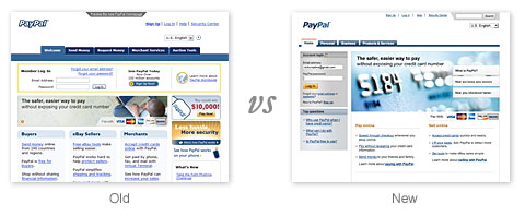
What do you think of the recent PayPal redesign and the new PayPal branding? In my opinion, I think the new design is very unprofessional and lack of consistency. My very first reaction to the new PayPal redesign was "What happened to PayPal? Got hacked!?" PayPal has made such a drastic change that it doesn’t even look or feel like PayPal (the PayPal that we used to). I think it will take us a while to adapt to the new design. Don’t get me wrong, I’m not saying change is bad. Changes are good if the results are positive. Here are my thoughts on the new PayPal design…
PayPal logo redesign
Visually, there isn’t much change in the new logo. You can read the details on the logo redesign from the PayPal blog. UnderConsideration – Brand New also has an interesting article on how the new PayPal is created in simple 7 steps.
I find the old PayPal logo works very well on various backgrounds, where as the new logo doesn’t provide good contrast on color background. Let’s take a look the new and old PayPal logo on various background colors.
![]()
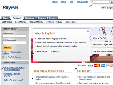
Why is this so important?
Don’t forget not all websites are using white background. What if the website’s backgound is the same color as the PayPal blue? Then, one of the words will be invisible (see image below).
![]()
Site Redesign
In general, I agree the new design look more cleaner. But, does it work? Not really…
Menu – CSS bug?
I’m not sure if it was intentional or a CSS bug. Take a closer look at the main menu, notice there is a 2px bottom margin?

On some internal pages, the 2px margin disappeared. Bug or inconsistency?

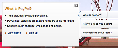
Gradient login box
The metallic gradient inside the login box is very dark which created low contrast between the text and the background. People with low contrast or dim monitor will have problem reading the small text.

Web 1.0 arrows
The glossy menu is very Web 2.0 contemporary, but the arrows and cut-corners are back to 1999?
Why Flash?
At first I thought it was Javascript, then later I realized it is Flash. Why use Flash for that simple animation/transition when it could be done the same with Javascript? Couldn’t they do better animation with Flash?
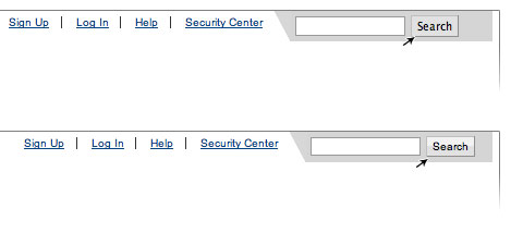
Inconsistent stylesheets
Just click around the top level navigation, you will find there are two different stylesheets (one stylesheet used Arial font, another one used Verdana font). For example, let’s take a look at the Financial Products and Request Money page:
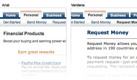
In term of frontend pages, the PayPal site is quite small, so I’m very disappointed that they can’t even manage the stylesheets properly. It seems like PayPal is still using the old stylesheet on some of the pages.
Again, inconsistent search form:
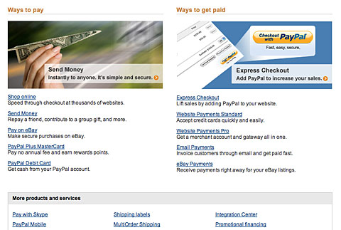
Spam page?
Take a look at the Products & Services page, doesn’t it look like those parked domains filled with spam links (the middle portion)?
What do you think?
Please cast your vote and share your comments on the new PayPal redesign.
[poll=6]
Jeff Croft
Just wondering:
“At first I thought it was Javascript, then later I realized it is Flash. Why use Flash for that simple animation/transition when it could be done the same with Javascript?”
Why not use Flash? What advantage does JavaScript have over Flash in this circumstance?
Nick
@Jeff Croft – As least it is SEO friendly.
Stavanger
wow, very detailed analysis, to bad they didn’t have you do the redesign.
Kevin
I liked the post, and agree with you on it.
One thing though, your poll is going to end up being extremely biased due to its placement after you point out all of the problems with the design.
Anthea
For such a popular and widely used service, I’m really surprised by this redesign. Isn’t the idea of a redesign to upgrade a website, to make usability better, to upgrade the style…
The redesign does appear to have less “stuff” cluttering it up, so in that respect it’s cleaner. But the old design had consistent colours and design, and a generally well planned placement of elements. The old design had a lot to manage but managed it well, and the new one in my opinion is just a bit of a mess.
I completely agree with your analysis of the logo too. Mind you, there are other companies that would have a logo disappearing act on certain colours. Fed Ex? (Though who wants a predominantly orange and/or purple site!)
I really would expect something much tidier and finished from a company such as Paypal.
Natalie
I find it helpful not to define Web 2.0 by how it looks, or its skin. As you’d know, trends change from year to year (sometimes even rapid cycling!)
Using bullets isn’t so much a sin, in fact, I find they help draw attention. They’re also appropriate as a “sub” level style to “Top Questions”.
The slashed bar is unstyled and probably an afterthought! Not Web 1.0, just rushed.
On the whole I’d have to agree that they’ve got inconsistencies. I work within a marketing & media company, and I find that many companies have unrealistic expectations about how long it takes to design, build and test a site (even my boss, but that’s another gripe!). Instead of pointing the finger at PayPal over design – I’d point the finger at whoever they hired. However I would heavily criticise whoever managed the project for overlooking an adequate testing phase.
Andrei Gonzales
I have to agree with Nick. The badly managed stylesheets is, frankly, a very poor show of professionalism from a site and company that is worth millions.
Umair Rahat
Nick, I agree with you. PayPal has really revolutionized to one of the ugliest designs on the planet. What were they thinking? Or perhaps a new philosophy. A terrible design equates to more customers.
By the way, I love the new design for BestWebGallery.
Nick
@Anthea – PayPal logo is different from FedEx. PayPal logo is probably being used on millions of websites. I think they didn’t put enough thought on how the new logo will work on various backgrounds or they expect everyone to add a white box behind the logo. In fact, the old logo worked very well for years. I’m not sure why they wanted to change their logo and now they have to update all the old logos/banners on the internet (probably millions of them).
They should release a white transparent logo in PNG or vector format.
Jeff Croft
Nick: I would suggest that PayPal probably made a business decision that SEO-friendliness wasn’t particularly important for their intro animation. If a thing can be built in an hour in Flash, but would take four hours in JavaScript (for example), and there are no downsides (since we’ve already established that SEO-friendliness isn’t important here), then it was probably a wise business decision to go with Flash.
It’s important that we passionate web standards purists realize that real companies have business goals. One of these goals is probably not to make web standards folks get all excited when they “view source.” In the real world, this sort of thing makes a lot more sense to do with Flash, even if in the wet dreams of web standards purists, it *could* be done with JavaScript.
Nick
@Jeff – you have made a very good point here. SEO and web standards don’t apply here. But surely they could do better with Flash.
Russell Heimlich
Nice critique. I agree with you about the logo redesign. The old one was so much better. What on earth were they thinking messing around with the colors? I bet they are trying to shed the old look and old, crappy mentality that many people have associated with PayPal back when they were growing their business.
If you are into the background of PayPal, I suggest picking up The PayPal Wars. Also, I found this link the other day comparing some recent logo redesigns. Cheers!
Mykal Cave
I agree with Jeff but still, web standards and consistancy within design translate into professionalism.
Its still a professional looking site but if a re-design was needed, I think it could have been better.
And most of all I dont understand why to change the logo. The white with the blue stroke at least creates a sense of contrast.
Jeff Croft
Oh, I generally agree with most of your design criticism. I just didn’t understand the criticism of the technology choice of Flash over JavaScript (which, obviously, is totally separate from the design considerations).
I personally don’t think “using web standards” translates into professionalism at all. What translates into professionalism is choosing the right tool for the job. Many times that will be web standards — but not always.
rokryan
Totally agree with all of this, I was beside myself when I first saw the re-design…
What the, indeed!
scart
I dont care how it looks like as long as it functioning. I think the new design of paypal is legible and about the new logo design? you can make your own if you dont like it.
scart
one more thing, why flash? because flash loads faster than javascript and works cleaner.
giz404
The new site is okay. sure there are some inconsistencies, but they could easily be corrected. (and I’m sure they will be).
The logo, on the other hand is quite bad. I liked the outline wey much. This new one not only doesn’t work at all on dark backgrounds, but it look “fragile” or “weak” to me. I think it should look stable and reassuring since it relates to a secure service.
(please excuse my english, I’m French)
Alex
I agree with the author, the redesign of PayPal is very poor. Firstly, this gray GRADIENT on the left is AUWFUL!!!!! It is terrible design!!!! Poor, poor webmaster… But PayPal is great. I use it.
Once again, thanks, Nick, for your tutorials, they are great!
Alex
George
I remember them announcing the “New Paypal Logo”. Why don’t you give it a go!
Open Illustrator
Write PayPal without the space(!)
Change the font to Verdana Bold Italic.
You are done! Collect $30,000 from Paypal.
Aaron
I disagree with your “Flash” point Nick! Flash loads a lot quicker, doesn’t require a million lines of code to create a frame of animation, and PayPal obviously can afford “Flash”.
Andreas Nielsen
At first I reacted the same way as you, and I must say, they dissapointed me with their new design, which is not even consistant.. I voted 2..
Christina
Does anyone know when the new design was launched??
I appreciate the comments about the logo, and I agree. However, I can understand as someone who has previously redesigned sites, that the previous designers may not have left the PayPal site in a state that makes it easy for redevelopment.
In this case I believe it is a work in progress and I’m sure that the web developers at Paypal will soon sort out the issues with the style sheets, etc.
Nathan
Oh my! A new new redesign on paypal. Thats different. I usually dont expect to see new designs on sites such as paypal, but when it does, its cool!
I dont really like the new design, thanks to your analysing.
Olivier
The redesign of the web site didn’t make me cry. However the new logo did ! I do completely agree with you when you wonder about color used.
Clemens
You’re right, when I first saw the new design I checked their SSL certificate to make sure I’m really at the paypal site…
The CSS bugs and inconsistencies don’t make the site look very professional.
roger Puig Piqué
i’m agree… the redesign is a bit poor…
Kamal
Hi,
First i really appreciate your effort on the redesign issue of paypal.So far i thought paypal has some killer design after they change to web 2.0 but i am not an expert designer like you to note those flaws.Yes i somewhat agree that the redesign in poor in many areas.The designer must read this blog and rectify.Let us wait and see what happens.
BTW your site is simply amazing
Keep it up!
steph
this.. this.. this has to be a joke??
Chris Bolton
I personally think their new logo is better. I do agree on the other points though.
Groovymarlin
Ugh. I think the new logo is butt-ugly and the illustration of how horrible it looks against colored backgrounds is a perfect example of how NOT to design a logo. I agree with your critique of their site design as well.
The mis-matched stylesheets I would classify as a bug, and it makes me think they don’t have any QA on staff (or maybe not enough QA), which is pretty disappointing. If I was testing their site redesign and let that get by me and into production, I’d be ashamed. Is it a high-severity bug? No. But it looks very unprofessional.
Overall, the whole site DOES look like it’s been hacked or something.
Dae
Just browsing for a moment i found two separate style sheets. One style sheet linked to about 7 other style sheets for different sections.
i agree that it’s a small site, it could be easily controlled with one style sheet.
Efrain
I guess they are trying to get the “bank look”. Not to long ago Wells Fargo had a face lift and the new PayPal homepage looks very similar to theirs.
andresa
como se coloca photoshop
Elliott
I actually liked the Paypal redesign. All your points made sense except your “Why Flash?” point. I find that it works great and it’s simple. It would have been a lot more time consuming and harder to do in javascript…so I think they went the right way when they chose to use flash.
Even though there are some things wrong with the redesign, I’m sure Paypal will fix all the little bugs and then it will look great (not that it doesn’t already…to me, anyways). I rated it a 4 because of some of the things you mentioned.
Thanks for the review,
Elliott
Soren
You need to time-manage yourself better. This is a waste of your time + you create a biased atmosphere for your audience when putting a like/no like poll after your criticism. Just my two cents…
Scott Marshall
Paypal never looks good except when my balance is moving up. I just realized how much I never paid much attention to their layout (except when trying to track down their phone number). Very nice job on the illustrative demonstration though.
eshark
Wow..!! You could even see a 2px margin different.. That is so precise, BTW good research and PayPal redesign to me is just simple and acceptable eventhough not that nice, just okay as long as we can make online transaction.
Jarand
I have not used PayPal more then 4-5 times, but I do remember the old site – and I think it was much better!
I did not like the design of the menu at all. It looked like it had been made from a tutorial or something. Also I dislike the stripe-pattern.
I also noticed the x-icon in the flash-thingy. What is the point of it? Did you ever click it?
The old PayPal looked more personal and friendly. The new one looked more corporate.
The last thing I want to point out is the use of white-space – I didn’t think it worked out very well.
TOTALFUNWORLD.COM
I must say that you have done a great review. They should keep an eye on the points covered by you above. I hope so that they will resolve all these issues as soon as possible and come up with consistent in the paypal.com
Matt
In this site i don’t like to surf…I refuse surfing on it! i’m quickly get off the page…
baaad baaad redesign..
(i’m sorry for the poor english. i’m a little student as well..LOL)
kik
It’s discuisting :(
Timothy Diokno
Have you informed PayPal about this? They could really use some feedback for this and I really think that you have a say on this issue since you’re a – *ahem* – a widely influential designer and it seems that very few people really think of it as an excellent work.
Adrian
Completely agree with you Nick! The cut-off corner looks funny! What a mess… :)
Ahmad Alfy
I aint gonna discuss the design , the colors .. etc you guys know these stuff more than me! heh!
The real bad thing is the Inconsistent stylesheets and the CSS bugs everywhere on the site. Its funny this is paypal! It shouldnt be that way!!
markus
nice review. you have an interesting analysis of their logo re-design, but missing from your argument is the ability for PayPal to enforce their own brand guidelines. so, anyone who wants to (legally) use their logo will probably have to do it according to Pay Pal’s marketing department. and you can bet the farm they’ll make you slap it in there with that white background.
Robert
Hey. I use PayPal quite a lot (at least twice a week) – and I agree that the current design is bad. But the truth is that the old design was even worse. Both current and previous sites were invalid accordingly to W3C – and that’s a real shame. It’s another argument in my opinion that you can’t create good site with ASP.
Cheers
Jermayn Parker
Very good detailed review but a few things I would like to raise.
1) Flash would be better to use than JavaScript. Easier and you can make Flash SEO capable. BUT I would have personally created a separate StyleSheet and used plain XHTML and CSS for alternative divs
2) In regards to the logo. Paypal is very picky about their logo and prefer the logo not to be modified at all and keep on the white background.
However in picking those things I enjoyed your review and you raised some good points about the different StyleSheets and some loose coding.
abhi
good review !
Sam
Nice detailed review. Whereas theres no justification for the inconsistencies in stylesheets, the logo isn’t so bad. Your choice of backgrounds would always be more favorable to the previous incarnation. No colored logo will look right on a very high contrast background, especially with clashing colors. As the design is very clean and has an abundance of whitespace, the new logo is visually more prominent. To me, the layout is also more appealing. I’m in total agreement with the rest of your analysis, though. Seems like it was somewhat rushed.
Con
Great review!
As a former PayPal design contractor (uninvolved with the logo redesign) I can shed light on the style inconsistencies.
There is a huge distinction within PayPal between business critical code and the visual style.
There is a necessarily high level of engineered complexity in the backend that protects the “product” (i.e. the safe processing of payments). That is always the primary concern of PayPal and even something so important as visual consistency of a major redesign would remain a lower priority than the safety of the site structure.
Pat
I hate to be picky but this is incorrect:
“In general, I agree the new design look more cleaner. But, does it work? Not really”
You are using a double comparitive for ‘clean’. It should be
“…the new design looks cleaner.”
Boris
hmmm, well, this looks like a big trend in the current business world. A lot of companies are going through re branding and trying to capture more clients, however they have a tendency to make much worst outcome with new brand then the old one. I was working for a company that did the same thing. As some mentioned this, the decision comes from higher ups who are not as concerned with visual, which is a big mistake because half a reason people use particular web sites because of the way that site looks like. We are visual people who prefer to see visually appealing things.
For that flash animation. They could have just used JavaScript and CSS really. Its more associability compliant and Section 508 compliant. When I get home I will test the site in all the browsers and see how they did with the web site.
I agree the web site looks more like web 1.0, ugly plain and boring. Perhaps its time to change to Google Checkout hehehe
John Covey
I have to respectfully disagree with you, Robert.
At my last job, we produced countless websites and web applications, either in classic ASP or ASP.NET, and each validated according to every measure of compliance, including W3C standards and Section 508. Ensuring this compliance required a little bit of effort and planning, but the steps we took to adhere to web standards were no different than the ones necessary to make a database-driven site with any other language or framework.
The truth about the new PayPal design is in Con’s comment: no attention was paid to the user interface.
kishore
this is really awesome! keep it up man:)
Peter
Let´s take a look from an other view. They have to do a great business named “save money everywhere!”. So, throw out the designer and get a cheap kid from the playground.
Search Scripts
I somewhat agree with you. Paypal’s recent redesign of their entire website was not exactly the best redesign ew can say. It has some good things and several bad like the logo design is not so consistent on various background colors as described above. Overall, I’d give them 5 out of 10 for this redesign.
darren
This is the most ridiculous/pompous design review I have ever read. You try to come off smart and articulate, but you fail miserably.
1. The logo obv has some branding guidelines associated with it, it is not intended to be placed on a blue bg. How can u possibly not realize this?
2. Flash element on homepage. Have you un-installed flash on your machine? How do you know the flash does not get replaced with JS, have you turned off JS, how do you know the JS does not get replaced by a static JPG? Come on man.
3. Menu – CSS bug? WHO THE FUCK CARES. Get a life dude. Hard to believe you spent that much time to critique a company’s website. I’d love to hear a paypal review of wdw.
grow up.
Enliven
darren,
it’s really sad to see someone uneducated like you surfing around the net and threw some uneducated thoughts around. I don’t think the community is welcome you here, you MORON (I bet you get this a lot).
Admin, please delete his post and block him out of this site.
Senshi
Enliven, I am sure everyone is entitled to their opinion…
lawton chiles
How do you do that rad poll? Can i get one for my site? :)
darren
I’m guessing Enliven is Nick’s mommy?
Steven
@lawton chiles: Um, have you heard of PHP? Effects like that can be easily created with PHP… I believe Nick uses WordPress, but you can just use the script seperately or write your own.
Richard
darren, he was just giving his point of view. plus paypals revamp does kinda suck compared to their old one.
Sam Kirton
Before you pointed out the issues with the redesign I would have voted “excellent” without a doubt. I have to say design wise; its pleasant on the eyes and easier to use. But for the leading online merchant to make that many technical mistakes is just disgraceful..
Efosa
I thought I was the only one who thought PayPal missed the mark with the new design. The new PayPal just lacks the brand authority of the old and seems more diffuse and scattered in thought and direction. I admire their drive to improve and do something different, but it just misses the mark. From the poll, it seems most of your readers agree!
Thanks for your great review.
GotFrap
Well, if I was asked on the spot if I liked the new re-design. I would give it a yes with a 3-4 out of a 5 scale. After what you just exposed, went down to a 2.
Excellent post. Should help people learn web design. Know what not to do, know what to watch out for, etc.
Groovy Mom
The design itself doesn’t bother me so much as adapting to new features, buttons, etc. Basically I use Paypal for ease and the familiar makes it easier to use. The design is “OK” — but I don’t see some amazing improvement that warrents it. Could have left well enough alone.
Beautiful site design, by the way. Love it.
Chris
You do make a very valid comment about the PayPal logo being invisible on the same colour background. Maybe a white border similar to the old logo (blue border) would make it stand out a bit more on different coloured background.
Like wise if you hadn’t pointed out the errors in the redesign I would too have voted higher.
Website Designer
I actually like the paypal redesign. You make some good points, but i think you’re splitting hairs. The main thing is that the overall functionality works and the site is easy to understand and navigate.
Chris Bolton
Firstly, the PayPal logo is exported with a white background, so it will never disappear if the user overrides the CSS with a blue background. Second, and most importantly, how many web users do you think have their backgrounds set at dark blue? If they do they are going to have trouble viewing 90% of the pages on the web.
Kelsey
personally I don’t like paypal’s current look, but then again I didn’t like their old look either.
Matt
Hi Nick..this redesign is very poor ahah..
well..in Italy, today, i’ve bougth two number (26 and 27) of WebDesigner magazine and in the latest page i’ve saw two issues with your illustration!! wow i ever see in ndesign-studio(dot)com, only..
on webdesignermag’s site i know there is about 135-140 issues!! here is a bimestral (an issue every two months) and we’ve some of the infinite review..grr :-@
bye, Matt
ps: sorry for the bad english, too..
idezmax
I don’t like login box. it’s like a beginner.
Johan
I agree with you on all point, great article. Especially about the logo. Before I saw this article I thought it was kinda “ok”, but after this… it sucks.
Btw, this website should be in some kind of “Webdesign Hall Of Fame” if there are any :P
One of the most beautiful designs I’ve ever seen tbh :)
– Johan
James Jefferson
To me this whole discussion is slightly missing the point. The fact of the matter is that the Paypal site is one of the most unfathomable usability disaster areas that exist on the internet. The service offered is inconsistent, impersonal and for all the strange security features, it never offers the user a sense of safety.
So they can restyle their menus as often as they like but they need to realise that the overall processes both interface and service need a complete overhaul.
Just a thought.
JJ
Matthew James Taylor
There are so many bad redesigns – it’s a shame. I guess people don’t know how good they’ve got it ’til it’s gone.
jake3_14
The new blue gradient in the menus is stark, bleak, and transitions betweens colors too crudely. The new logo looks soft and implies an over-friendliness, both bad for a financial institution. The use of a the left and right column of their 3-column grid for anything other than navigation cues leaves the site looking cluttered, causing users to screen them out entirely. The switch from wide-width Verdana to the narrow width Arial makes the site less readable, especially to their core demographic for the site.
The site functionality for consumers is primitive. Take, for example the send and request money functions. One must manually enter the e-mail address of every person from whom you want money or money recipient, every single time. It’s not rocket science to have a search-by-name function and an address book from which you can choose people, without having to remember their e-mail addresses. For a second example, the mass of links on the Merchant Services main page looks like the product of fifth-grader: it’s hard to scan, and combines non-parallel topics. The same can be said but on a larger scale for the Merchant’s profile page.
I could go on and on, but it would make me too sad. PayPal needs to either hire better talent, or reform it’s development processes and internal architecture so that the talented people it has can implement good designs and roll them out quickly.
sage
I agree to the fact that there are some inconsistencies as per the visual elements are concerned but why do we forget to see things in a more holistic manner, when I say holistic design this implies the user experience which focuses more no the interaction vs graphics. I have seen website graphically elegant with the worst user experience. One pixel error on CSS won’t make any difference to the interaction, so I would rather spend more time commenting on the interaction rather than neat pick things.
h.andrysek
Hello!
body {
background: #eeeeee;
}
Nevím, jestli tady na stránku chodí nějací češi, ale jestli jo tak je pozdravuju. Že to upe kutná stránka...
ps:IN ENGLISH: NICE SITE :)!!!
Matheus
it’s better now, stroke text is bad for branding
do any of you have stroked text on your logotypes? think about it
Lewis
I hate the new paypal, Like you, I though it was hacked. The logo stinks, and the design is inconsistent. The only thing I like about the new design is the new pay now buttons. Paypal needs to rethink.
Nubloo
@ Chris Bolton (#72)
The fact that the logo is provided with a white background isn’t really serving the users, as they might have their own CD. The thought is to emphaisze the PayPal logo, which is neglecting the user’s preferences. Not too nice, but understandable, marketing-wise.
“Users”, by the way, does not refer to people having their browser background set to dark blue, but to people maintaining a shop or other website who are using the PayPal service, and have dark blue as a background on their website.
Even if it was the users you mean: even if only 1% had their browser settings that way, they shouldn’t be neglected! You can’t just drop a “minority”. The goal is to serve everybody, no matter what weird settings their browser might use. And: 1% of 1 million is still ten thousand. Now – how many people have a computer?
sturdy
Yeah, they missed…
Lisa
The new design is acceptable to me. Im no designer though. The new color buttons does not go with my sites color scheme, so that will need to be changed.
I am with paypal for the security they offer. I have been very pleased with their service.
Thanks for all the great info!
ALIVEPAKISTAN.COM
The review is no doubt great and I must say paypal should consider this again.
TOTALFUNWORLD.COM
Very good review.
Fubiz
Impressive article!
Soldout
Well done analyzing it! I totally agree with most of it. Must say I didn’t really like the first one either, but it worked though. The new one is a disaster.
Elliott
No new updates? :(
Jello
>The glossy menu is very Web 2.0, but these arrows and cut-corners are back to 1.0?
The term “Web 2.0” has ABSOLUTELY NOTHING to do with aesthetics. In fact, the entire term “Web 2.0” has nothing to do with anything.
Soldout
Visited Veerle’s Blog today, there I found another approach to the PayPal logo. Don’t know if the version is something she’s made herself to fit her design better, but that just resembles how hard it is to make the new logo look good.
Take a look a bit down at the page, under ‘Want to say thank you’ on the right.
Paypal hacking trick old method
You spent much time to compare… Good review.. but it is not much important for business people. they look only on security,security and security & nothing else. if you found a security bug.. then it would be helpful :) keep rocking with your wall…
Jay
You are so right. It looks lame compared to last time. You would believe that change of layout would mean something even more professional than what was, no a downgrade…
Jessica
I’m very glad that you pointed these flaws out. It really helps to know that people notice these things (I am currently studying web design). Very useful review.
BloGrafik
i didn’t like the new design of paypal they really should consider it again.
kyle
I have 2 questions
1. How would you feel if they had the colors of the text the same but then had a white border then it would work on all colors even white
2. Why dont you make a new layout or fix their mistakes and present it to them maybe they are just trying some new things or they bought it from a “design” company
Great site i just found it through stumble
kyle
This was a quick job so its going to look little pixelized im guessing they would do a vector so they could make it small and bigger for like advertising but i didn’t feel like spending that much time. But would this be a better way to go than no border
simple
> What if the website’s backgound is the same color as the PayPal blue? Then, one of the words will be invisible.
Good review. but in my opinion, they will have a identity guide describing usage of various backgrounds. in dark background, the logo will be filled with white color. don’t worry about color of the logo. :)
guille
Me gustaba el diseño de antes, pero este me gusta más.
LeanneC.E.
Aside from how the new design functions, I found the design itself a little boring. A lot of grey, maybe a color that would have been a better match to the logo colors would be better. But that’s just my opinion of course.
zeux
So, if the new logo using a white stroke font, will be solve a PayPal logo problem?
that we do not know is Pay Pay trade mark logo using white stroke? if it does, I thinks theres any isue anymore, like this image base your proportion test another background color
http://img266.imageshack.us/img266/1721/paypallogorevqm3.gif
Sampurna
That was a great review of Paypal’s website and designs…. I really loved it .. thank you. But as paypal lacks designing concepts and is inconsistent, you have poor English..ps don’t mind. I would like to proof read and make corrections for your blog contents if you wish….
Thanks again.
Sean
I don’t know about PayPal, but I love all the stuff you design, I wish I was that talented!
Nick La
@zeux – No, putting a white stroke will not help. I think someone already made a comment on distributing a vector format or white/reversed color transparent PNG logo.
Nolawi
sure sure, anyone can pick on nit pick… but the fact remains it is a very functional site…
good design is functional design… not perfection…
Hyo
Great Nitpicking.
Good job with the Extremely narrow minded view on Web 2.0 trend.
(arrows? cut corners? wtf?)
You must have a low contrast monitor.
My reaction to the redesign was, it was cleaner, and more functional.
Web 2.0 is a loaded. For blogs, sure, but we would be in hell if you designed paypal’s website.
Oliver
@Hyo
Firstly if Nick La designed the new PayPal website it would look totally awesome, I mean just look at this websites creativity and exceptional image quality.
Secondly your site is white and boring so before you compare someone elses ability to design a website look at your own (p.s. I bet your website is a WP template, lol!).
Thirdly you claim to have a website that is XHTML 1.0 valid, yet it says it isn’t (that’s strange).
Ivan
Yes, I agree with your comments on the design aspect. However, I think the re-design might have been driven to improve loading performance, clean up distractions and such issues. I think it had more of a functional approach than aesthetic. It’s kind of getting into that political discussion on why google design suck.
Liza
It would’ve been a fantastic review if it weren’t for the “2.0” crap.
Nick La
@Hyo – of course I don’t have a low contrast monitor, but I know a lot of Paypal users are still using old CRT monitor (hence Paypal is designed for 800×600 resolution and the images are overly compressed).
Different sites have different purpose and audience, of course Web Designer Wall styles will not work for PayPal. But, there are many ways to make PayPal site more appealing (visually) without impacting the file load.
Felipe López
Hello, i don’t know what’s the problem with the non-web2.0 arrows… i think that they work well for me. Nice article!.
aydınlatma
this is good ,thanks
Esmy Park
I think the inconsistency in the redesign shows unprofessionalism, even if these are minor issues (for some). I am paypal user in both cases -regular user and merchant- I find the interface not user-friendly and apart from the design, lacks functionality.
From a marketing POV the logo needs to be redesign -yet again- since it does not compile to the characteristics a logo should have for a company that offers finances related services. Is not just aesthetics, functionality and design should go hand by hand for a website/company that profits with its services (as obvious as this may sound).
Very interesting article, for a company which is worth millions of dollars, attention to detail should be important.
Blomat
Very bad restyling…
Brendan
I would expect a company that large to spend the appropriate amount of time in pre-production in order to insure that there aren’t any inconsistencies/bugs with their code. I’m not a huge fan of the new site, however, the lack of beta testing bugs me more that the new design…
Nick Evans
Nice article! You should do a review on the redesign of Nintendo’s website.
nutkong
Great article, thank for sharing
Malte
I’ve found one more bug.. I clicked “Request Money” and then hovered “Send Money” and suddenly a scrollbar appears…
http://img85.imageshack.us/img85/1741/buguq6.png
Bob Stuart
Beware Paypal nearly destroy my business, I will never use again!!!
I have website payments pro account to process payments for my business with then for the last 5 months the put 4 limitations on my account which we are unable to do northing. If you depend on Paypal to receive payments for your business this will put you in bad situation trust me very bad situation. the phone customer services is worst ever we deal with they will not resolve the issues on your account, will ask you to send email which take long to get reply back. Please don’t do it the same mistake we did it, find another reliable company. They don’t want small business to grow alone special because they belongs to eBay which they want every business to sale thought eBay ending up paying fees to eBay and Paypal
I hope this will open eyes for the people who are interest to use Paypal. I will not recommend this to nobody.
Alvin
Wow the funniest thing on the paypal logo is that there is a fly (lol). Ops if my head touch the screen i see TM.
rybaxs
who QA’d the PayPal? (lol)
Lexu
thanks for sharing this article.
Technology News
yeah…really bug full !
Pay-Pal.biz
nice article. Thanx!
computer jobs
The old logo looks really better then new.
Emanuel
Great article. I always wondered how come that these huge, rich companies get stuck with bad designs. But then I remembered that most of the time, as a designer, you have to first save your client from his own bad taste.
JNDCG
interesting… I actually noticed some of those very same things. Thought I was being too particular; but that’s how I am with most everything :-\
Anush
I don;t like the picture they used on there home page at all. I feel useless to depict anything to me………Girls legs showing she is in relax mood nothing good for the professional site. As this site deal with millions of dollars only this image is not gives the home page professional looks
Dan
You have reviewed it well, and taken it to pieces, alot of the errs i never notice ;)
Dan
kitap özetleri
thanks for sharing this article
moellernr1
What a great page. Inspirational. But it would be great to see examples of interesting corporate/business homepages – if there are any…
Aziendealtop
Complimenti per l’alta qualità grafica del sito
Lucy
I was so confused about what to buy, but this makes it understabnadle.
riywlg
B8GjyV mebrdfemzgot
Tommy_Gun
Its useful. Thanks
Alanya
very good… Thanks you very much
kitap özetleri
interesting… I actually noticed some of those very same things. Thought I was being too particular; but that’s how I am with most everything :-\
Ay Isigi Dizisi
I don;t like the picture they used on there home page at all. I feel useless to depict anything to me………
max
I read the “logo” thing and just left the whole article. Your explanation why the new logo is worst then the old one is the most stupid think I’ve ever read! It is obvious you have no idea how a logo is designed and presented. You colour bkg variations are TOTALLY ridiculous and I can find a 100 of the BEST logos in the world that won’t “pass” your stupid test.
You don’t even deserve the time I’ve spent writing those words, not to mention your are so incompetent judging by your portfolio.
Matt
Max didn’t your mother ever tell you, “if you can’t say anything nice (or constructive in this case) don’t say anything at all…” You may disagree with some of the points raised in this article, but is there any need to flame the author and his work? I think not. That just goes to show how incompetent and arrogant you are.
On a brighter note I on the other hand thought your review was brilliant, and raised a lot of key points to bear in mind when doing a new design or a re-design. PayPal have forgotten their target audience, the site looks muddled and simple CSS mistakes have added up to a poor design.
Cam Gould
scart… “about the new logo design? you can make your own if you dont like it.” … NO YOU CAN’T… it is a protected brand. You need to study up mate.
Elizabeth K. Barone
I heard they don’t offer store front to their customers anymore. I’m disappointed, PayPal.
Elizabeth K. Barone
Their older logo definitely popped out more. The new one just seems dull and less noticeable, especially when presented against different colored backgrounds.
I used to use them as a shopping cart for clients but now they only offer checkout integration (I can’t find anything on their site about their old shopping cart services).
Is it safe to say that PayPal is fading out of the Internet tools spotlight?
Matt Hough
You woudl think that they would redesign all on another test site first. So much is wrong, not to mention half of it does not even work for me, example: no history what so ever in transactions (and yes I do have many that should show), and I am not even sure if the subscriptions are working properly now. The site looks cheap and tacky and completely unfinished, which obviously it is as they are redesigning on a LIVE site ??
I say fire the designer and hire a 3 year old to do a better job!
Matt Hough
Something else that is really irritating, they have set a max width that is so small now names of buyers on the Most recent activity do not fit, you have to have a 1 syllable first and last name to fit on it, so makes it confusing on the eye to see what is what. Then we have alerts that popup saying that they are doing maintenance between 7am and 9am BST, but that pops up at 11am, 2 hours after??
Then the text is so “Dim” it is the first site I have ever had to change my contrast on to read the text without hurting my eyes.
Then the best one of all.
As I cannot get any history, I thought maybe the CVS works, so I click on it and I get a page saying that they want to verify I am the owner of my account before I can perform that action, the number they offered me to select is one at my other house, so I selected “Other” (expecting to be able to enter or select my other number. What it offered me was to give them a reason why, so I selected “change of number” from the drop down box and it replied “OK” and let me carry on and download the CVS ?? what kind of security is that ?
It is all wrong!
cennetevi
Thank =)=)=) you http://www.cennet.gen.tr webdesignerwall Thanks
Aoobi
read the “logo” thing and just left the whole article. Your explanation why the new logo is worst then the old one is the most stupid think I’ve ever read! It is obvious you have no idea how a logo is designed and presented.
bagsin
The new one is more stable.
Cyrus
Great , Review: PayPal Redesign
Great article. CSS saved web design
Cyrus
Visit http://www.psdtoxhtmlcoder.com
Liza
These people that have nothing nice to say about the author are just jealous. You don’t like it, don’t bother visiting the website. I happen to think that he is one of the most talented graphic and web designers around. Keep up the good work and Thank You for the inspiration!
I totally agree with you about the new paypal logo redesign.
raj
PayPal has done it again. They have changed the design again. checkout the new design. It too bad… any comments.
banners and images have rounded corners and a straight line at left. a parallelogram rounded corner at the right side. What happened to the basic design principles. where is the consistency?..
paypal.com
Mike
I like the old paypal logo
vincentdresses
The designs showed here show what simple and tasteful design is all about. Another one to consider
Mar
I’m not sure of others’ experience but I thought the new design suits its purpose. The backend pages, are much more stabler, IMHO, and I suppose the new designs focus was more towards the backend of stuffs than frontend.
Btw, really in-depth analysis you’ve got of Paypal’s pages, of which I would never have noticed if I didn’t come across this page. Maybe the changes were too trivial for me to notice, and speaking from one of their users, I don’t really mind — although the logo contrasting issue on differing backgrounds is a serious issue which they’ve overlooked.
Web Design
i like the old one much better. pops out more
7/24 San Diego Notary
Like some of those that commented, I hadn’t noticed the difference on my own but after your article the differences really jump at me. I completely agree. I imagine these changes coincide with corporate changes of some sort, but nevertheless should have been considered differently.
Great analysis.
Kurt
7/24 San Diego Mobile Notary
Psibay
I totaly agree with this. I had this design and the paypal logo is kinda hard to be read in a blue background.
Henry Peise
It’s a great post. But i would like to know more about the iphone 4 white information.
Juno Mindoes
Is white iphone 4 available right now? Cuz my friend told me he just got the white iphone 4 panel. But i haven’s seen it sold in my area. What’s wrong?
Ben
Your position on it is diametrically contradicted to what I read earlier.
Ben
I’ve been around for quite a lot of time, but finally decided to show my appreciation of your work!
altın çilek
I like the old paypal logo
hcg damla
I totaly agree with this. I had this design and the paypal logo is kinda hard to be read in a blue background.
شات صوتي
thnks
goooooooooooooood
min:(
teeem
complex41
And then he handed you the thirty-five 45
Moliva
I like the old paypal logo
yemek tarifleri
Painting on the tablet is fun, but to do cool things need work.
Aaron Parker
I totaly agree with you. I hate the new logo it disgustes me to the max. Anyway i ant sit here complaining life goes on shit happens i suppose ? Allthough it disgustes me i will carry on using the service to buy fleshlights.
Alquiler yates en Ibiza
The redesign does appear to have less “stuff” cluttering it up, so in that respect it’s cleaner. But the old design had consistent colours and design, and a generally well planned placement of elements. The old design had a lot to manage but managed it well, and the new one in my opinion is just a bit of a mess.
I completely agree with your analysis of the logo too. Mind you, there are other companies that would have a logo disappearing act on certain colours. Fed Ex? (Though who wants a predominantly orange and/or purple site!)
I really would expect something much tidier and finished from a company such as Paypal.
Christopher Christensen
I don’t see any graphics. What’s up with that. Windows 10 ver 1803