Let’s face it, ask most designers what their dream project would be and I bet none would mention designing and coding HTML Email. Designing email has a special place in my heart and I am excited to communicate with people through this challenging medium. So here’s 5½ improvements you might consider making when you revamp or greenfield your next template.
Note: This article is a guest post by Josh Rubinstein.
Why should you care?
From the time we rise until the wee hours of the night our smart phones are never far from our opposable thumbs. Despite the proliferation of “umpteen” social networks, email still tops out as one of the most common tasks we perform while on the go or at our desks.
The Concept of “The One Web” represents a shift in thought towards “democratically” publishing online content to a range of devices. At Estately, whenever we talk to our customers, we hear that they read our Saved Search alert emails in the “fleeting moments” when a meeting hasn’t quite started or while scarfing down some fruity pebbles cereal in the morning. One of our users told us that in the morning the alarm goes off and, before he’s out of bed, he looks through new emails on his iPhone.
The statistics back this up: no matter what service your company provides, your HTML email needs to be optimized for mobile today – according to Campaign Monitor, the iPhone now accounts for almost 15% of their email subscribers. Heck world-wide Smart Phone activation is outpacing births by 3X!
One HTML template for them All
Part of the goal for the HTML Email template design was to only require the use of one template for both mobile, desktop and anything else the industry creates in the next 6 months for that matter! Approaching design and UX challenges with wearing the lens of Progressive Enhancement in mind makes the world a nicer place!
I didn’t want to depend on CSS3 media queries for content scaling. I wanted to provide as much support to various devices by using percentage widths and max-widths.
Like-wise when CSS3 is supported I figured the device would be responsive enough for advanced stying and design, as you will discover below with my work-in-progress for Retina display support in HTML email.
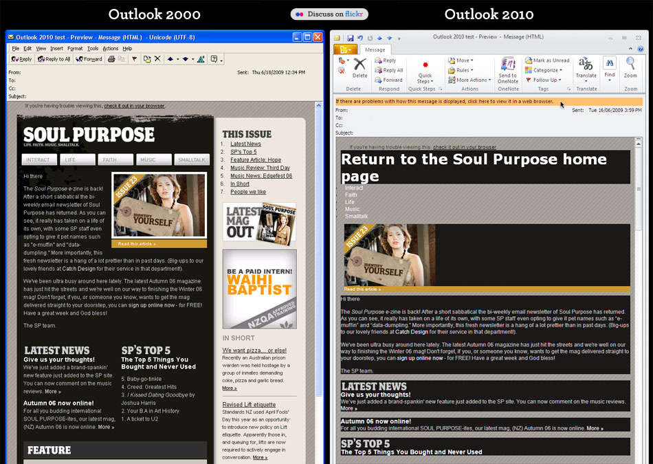
We all know that Microsoft Outlook 2010 and 2007 are crap for rendering HTML. WORD!
Exhibit A, Exhibit B There’s also a few other doosies out there too, checkout Campaign Monitor’s Guide to CSS Support in HTML Email Notice there’s a lot of those red “X’s”.
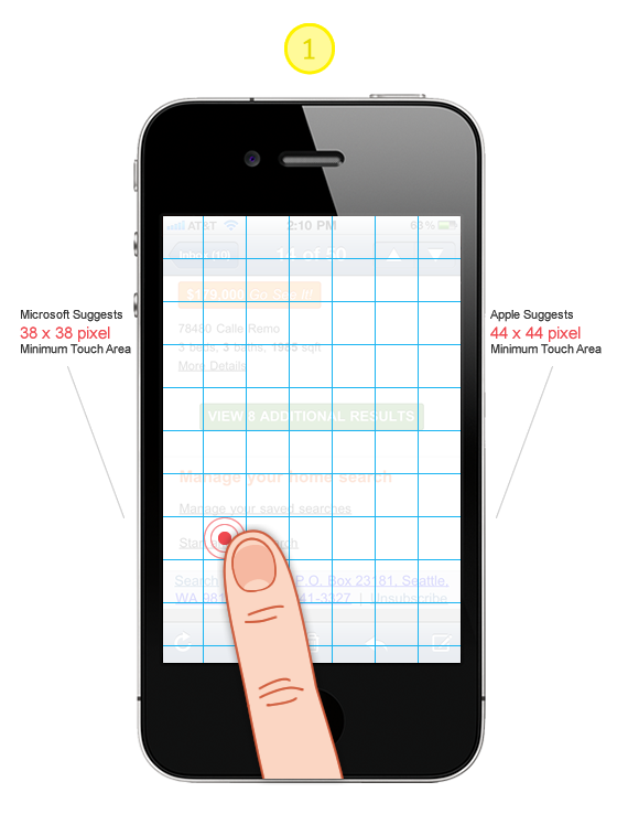
Tip #1: Design all “clicks” to be touch friendly!
Large “Touch Target Sizes” for images, links and buttons will ensure you are a humble champion. There is nothing more frustrating on a slow connection like having to wait for the wrong page to load! Touch Targe Sizes, Accessibility and Ergonomic Guidelines
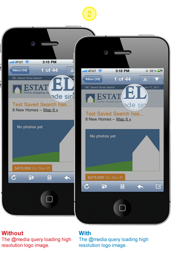
Tip #2: Stunning images on iPhone Retina Display
First impressions are worth taking seriously even if they are a bit more on the subtle side. Will your subscribers stop receiving your emails if your logo is a bit choppy? Don’t compromise if the solution is within reach. I like this approach for supporting the higher resolution displays because all subscribers will see the same content. I aspire to the mantra of Progressive Enhancement. All users will see the ALT text and with images on a logo. If they happen to be using a high resolution display such as the iPhone Retina display they will see a super crisp version of the logo.
HTML
<span style="position: relative; display: block; height: 41px;">
  <a href="#" class="logo-link" style="display: block; height: auto;
   color: #4C6A8B;font-weight: bold; text-decoration: none;
   text-align: left;">
    <b></b>
    <img style="font-size: 20px; text-align: left; border: none;
     font-size: 14px; height: 41px; outline: none; text-decoration: none;
     font-weight: bold;"  alt="text for image" height="41" width="200"
     src="#" />
  </a>
</span>
CSS
Note, you will have to update the image paths and dimensions to work with your content and design.
// Yahoo! Mail ignores any styles that use attribute selectors
// this helps override it loading @media queries which it give
// extreme precedence
@media only screen and (-webkit-min-device-pixel-ratio : 1.5),
only screen and (min-device-pixel-ratio : 1.5) {
a[class = logo-link] b {
background: url("http://logo.png") no-repeat 0 0;
width: 200px;
height: 41px;
background-size: 100%;
position: absolute;
z-index: 10;
display: block;
}
a.logo-link:after {
content: "Estately";
position: absolute;
top: 0;
text-align: left;
width: 200px;
height: 41px;
display: block;
}
span a[class=logo-link] img#estately {
display: none;
}
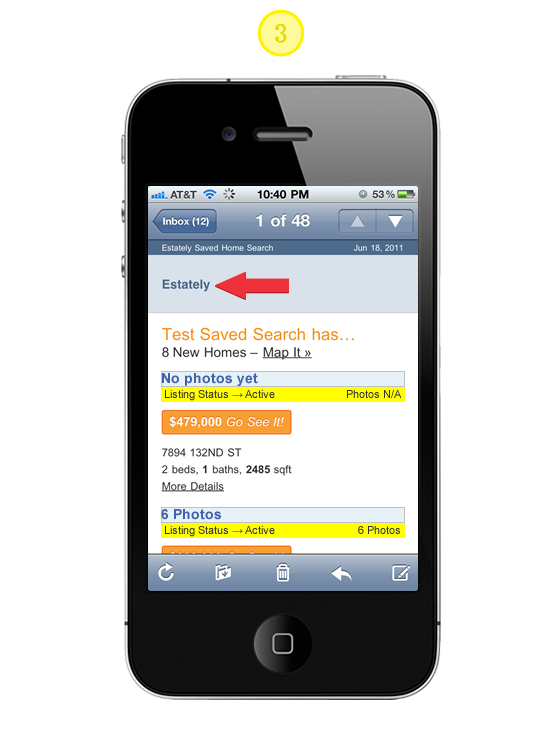
}Tip #3: Providing ALT text for background images
Simply add the CSS below to the media query outlined in Tip# 2. Here we are taking advantage of the CSS Pseudo Class :after and the CSS2 content property to add the ALT text for the high resolution imagery.
CSS
// Yahoo! Mail ignores any styles that use attribute selectors
// this helps override it loading @media queries which it give
// extreme precedence

@media only screen and (-webkit-min-device-pixel-ratio : 1.5),
only screen and (min-device-pixel-ratio : 1.5) {
  a.logo-link:after {
   content: "Alt text for Logo";
   position: absolute;
   top: 0;
   text-align: left;
   width: 200px;
   height: 41px;
   display: block;
  }
}
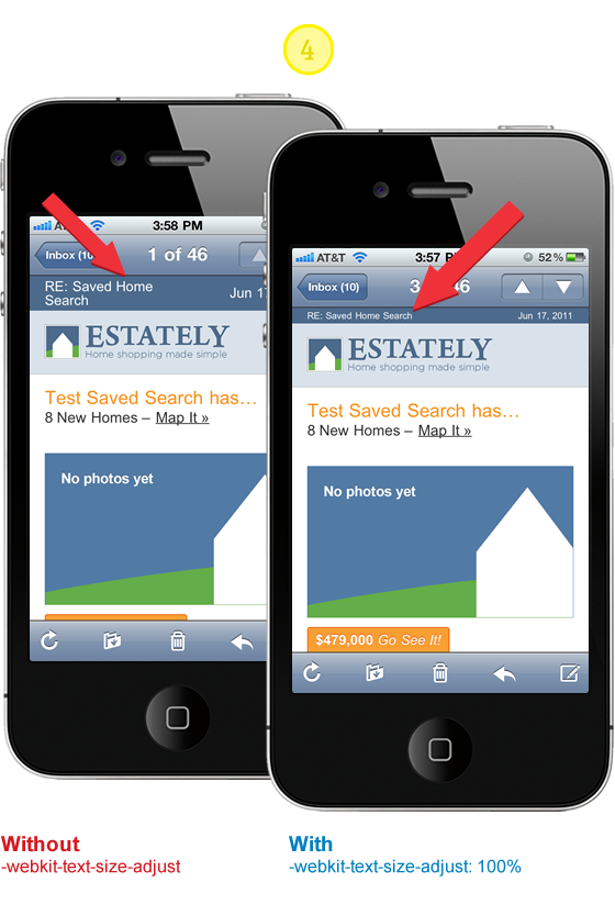
Tip #4: Prevent Webkit & Windows Mobile platforms from changing default font sizes
Mobile Safari has a default text size that’s greater than 100%, which can puff up your layout in ways you did not intend. There’s lots of advice out there that suggests by setting -webkit-text-size-adjust to none the problem is solved. There has been some good discussion around this topic and it’s worth reviewing so you don’t blindly implement the following suggestion. If you were to set the property to none desktop WebKit users would loose the capability to “zoom.”
CSS
// Corrects font-size on mobile/handheld devices w/o preventing zooming
// in WebKit browsers

@media only screen and (min-device-width : 320px) and (max-device-width : 480px) {
 body {
  -webkit-text-size-adjust:100%;
  -ms-text-size-adjust:100%;
 }
}
@media only screen and (min-device-width: 768px) and (max-device-width: 1024px) {
 body {
  -webkit-text-size-adjust:100%; -ms-text-size-adjust:100%;
 }
}
@media only screen and (-webkit-min-device-pixel-ratio : 1.5),
only screen and (min-device-pixel-ratio : 1.5) {
 body {
  -webkit-text-size-adjust:100%; -ms-text-size-adjust:100%;
 }
}
Tip #5: Scaling Images, Responsive Design Approach
Email clients vary in their design and implementation so much. Some are based on antiquated rendering engines and others have umpteen layout options and overloaded “tool belts.” It’s anyones best guess just how much screen area your actual message will be given. I have choosen to use a combination of percentage widths with max-width settings to achieve a layout where images can scale up to 600 pixels wide and down to 350 pixels. It’s not perfect in all clients such as Outlook 2007 and 2010 but the content and utility of the layout are not compromised, while providing a optimal experience for the majority of email clients.
HTML
<body style= "width:100% !important; max-width: 800px; background: #ffffff;
margin: 0 auto; padding: 0; color: #4c4c4c; text-align: center;">
  <table border= "0" cellpadding= "0" cellspacing= "0" align= "center"
   style= "width:100%; max-width:600px; background: #ffffff;
   font-family: Arial, Helvetica, Verdana;">
    <tr>
      <td>
        <a href="#" style="width: 100%; max-width:600px;">
          <img src="image.jpg" alt= 6 Photos border= "0"
           style= "border: none; font-weight: bold; height: auto;
           line-height: 100%; outline: none; text-decoration: none;
           text-transform: capitalize;
           -ms-interpolation-mode: bicubic; width:90%;
           text-align: center; background: #E6F1F8;
           font-family: Arial, Verdana; font-size: 16px;" />
        </a>
      <td>
    <tr>
  <table>
</body>
Tip #5.5: Make Internet Explorer Smooth
Internet Explorer’s default image scaling made your Pentium 266 work, but it today it just makes any scaled image look horrible. Make IE smoother and more sensual by setting image scaling for Internet Explorer to smooth: -ms-interpolation-mode: bicubic;
See CSS Tricks for image examples and further reading.
CSS
// If you use width or height tags to resize images in your markup,
// IE will ensure they look incredibly awful unless you use this.

   -ms-interpolation-mode: bicubic;
“You have mail” Demo
Hope the improvements and the code samples got you enthusiastic again about HTML Email. My goal is to help you communicate more effectively and provide the best experience possible for your design and subscribers. I certainly developed solutions for my design needs. You may find it necessary to adapt and explore tweaks and new solutions all together. If you come across any improvements or new solutions please let us know!
Guest Author Info
Josh works with the fine people of Estately, a comprehensive online real estate search for home buyers to shop and tour homes. Josh feeds upon the dynamic between design and development finding inspiration from both communities. When he’s not in front of the computer, you can find he and his wife working on their Seattle home.
113 Comments
Comments are closed.
Geeb
Well done! Great read. Makes me want to throw out the WPtouch plugin.
Translation
I like it too!
Norm
I have never come across such a thoughtful approach to HTML email. There is way too much compromising taking place in this department. Great post!
Scott Windsor
Great stuff! HTML email is the bane of most developers, I love the approach. Have you seen HTML5 boilerplate mobile? http://html5boilerplate.com/mobile/ I’d love to see the same thing for html email. :)
Pat
You’re in luck :-) http://htmlemailboilerplate.com/
Michael
great resource!
Craig F
http://htmlemailboilerplate.com/
Craig F
Doh! F5 before posting FAIL…
Andy
Useful post, thanks. There will be some who insist the answer is to just use plain text but there has to be a place for graphic and text rich email – you just have to put some thought in to it.
Mikko
Great article! Loved your writing style and the example illustrations. WORD! ;)
Bubba
HTML email is the wrong approach. Email should be plain text.
Hotep
Um, no? HTML emails are highly successful and well tested to be many times better than plain-text emails. Plain-text is valid for a fallback, yes, but your answer and assumption is definitely lacking of any real world metrics proving otherwise.
alex
Thanks for the useful tips and detailed code explaining. Very interesting!
Cyril Gupta
Hello,
I want to hire a pro designer for one of my websites. Someone who has UX ideas. I just can’t seem to find the right people on freelancing websites.
Can you recommend anybody? Please mail me at [email protected] if you can.
Jitender
Hi,
Link of this text is wrong “http://css-tricks.com/ie-fix-bicubic-scaling-for-https://webdesignerwall.mystagingwebsite.com/wp-content/uploads/2011/06/”
Thanks
Jitender
Jitender
Sorry for mistake.
Test is “See CSS Tricks for image examples and further reading.’
pokkisam
I am trying to implement for my website newsletter. The article really a good tips for me.
Marcus Dege
Well done! Great post!
Thanks…
Marcus
kangtanto
Great post!!!! I am learning to design web for mobile and I found your post… thanks
Surf Clothing Fan
The tips on individual mailboxes such as yahoo mail are really helpful. Been trying to send out surf clothing details to folk for ages now and since we stopped using paid 3rd party services a while ago we lost lots of subscribers straight away probably through result of our html table based emails would not showing properly. Media queries are the way forward for us too, we don’t need mobile sites, print.css or mobile apps, just one html5 template and some media query ready css, mobile friendly client side scripting to keep all visitors happy. We just need to work on making our whole site more responsive and cross device compatible now.
Sean Dooley
Great post about HTML emails for mobiles, considering the popularity of smart phones.
Werner Bihl
Found a great resource here: http://docs.sencha.com/io/src/ on how to automatically scale images based on devices.
So instead of using , you just prepend the src like so:
The API provides SEVERAL useful options including custom sizes, format conversion, percentage scaling, offset scaling, base64 encoding, callbacks etc. and it’s free!
Werner Bihl
Sorry my tags got stripped, just go check out the API :)
Josh
The Sencha.io image resizing resource looks really sharp. It’s in beta now http://www.sencha.com/products/io/. I would imagine that there will be some fee associated with the service.
My hope is that the W3C will introduce to HTML some way to trigger the download of source images based on the media query. Here’s one discussion about using a “prefixing” model, http://blog.yoav.ws/2011/05/My-take-on-adaptive-images
Denny
super Beitrag, danke.
Shawn
Email in general badly needs standardization similar to the rest of the web.
Great tips though.
rt-designs
Thanks for putting this together! Great tips with code samples; added to my personal must-do-optimizations for new projects.
Karim Cossutti
a little bit OT but did you know that by making
eg.
the phone numberA phones make call onclick :)
John williams
Bunch of thanks for sharing this interesting and informative post. Keep it up
Luca
Very interesting post! Be careful that “See CSS Tricks for image examples and further reading” link is broken…
Sean
Yes, really informative and visual post. And thanks Estately for a practical illustration material.
inspirationfeed
This is really helpful info, thank you!
MP Construtora
Great article. More and more we need to improve in mobile webdesign.
Bud Kraus
A very thoughtful and thought provoking article about some very complicated and challenging design issues. Thanks!!
Anthony
Wow, great post! Just in time for me. I’m about to launch a newsletter myself. I will use these tips, for sure. Thanks!
David
Awesome post, thanks :)
Newsletter Templates
Great article! I’ve found http://niceemails.com has some great newsletter templates that render well in mobile also.
Chris
Brilliant. Thanks Nick.
Joe
If it wasn’t for outlook I wouldn’t even remember how to build a table. Thanks for the tutorial. I was amased how much of this I was already doing. However, I still learned a few things. Thanks. bookmark’d
Dallas Web Designer
Great article. I always love the code that I can just copy and paste into my document. You guys make it so easy for me ;)
Luke
A nice list of options, but I would like to argue a counterpoint for Tip #1:
“Tip #1: Design all “clicks” to be touch friendly!
Large “Touch Target Sizes” for images, links and buttons will ensure you are a humble champion.”
Not so. The number of emails, especially newsletters, which I receive which have massive linked areas is astounding, and, I have to admit, when viewing these emails from my iPhone, 90% get deleted without reading.
Why? Because if I try and scroll down the page, the fact that the email is a veritable minefield of links (both obvious and not-so-obvious) means that touching the screen to move the viewport down the page triggers these links and opens them in new windows.
Not cool.
I would suggest that, if you are trying to formulate a clear and concise set of commandments for newsletter designers with a view to mobile viewability/usability, I would strongly suggest the following:
1) Do not have massive links. Certainly, use images to get your message across, but having a link/hotspot which is 800px wide is probably overkill.
2) Using Call To Action images is cool, but try and make them fairly moderate in size, and very clear in appearance – this way you don’t need to pick up clicks across the entirety of a 800px wide banner.
Really, until these points are considered, I, and I would suggest a good number of other, mobile email-readers will delete your message without even looking beyond the first image.
Josh
Luke I am definitely not suggesting a designer/developer make anything a minefield of links but rather to consider that touch-size needs to be considered.
Hand n’ hand, content and usability of the email are essential. I agree if the content and call to action are hollow the subscriber will use the delete button and eventually unsubscribe :)
John Faulds
Doesn’t your tip about including higher resolution images for retina displays mean that all devices will download two versions of the same image regardless of whether only one is shown?
Josh
John, since I use the media query for the high resolution device it means only the devices capable of understanding it will download the higher resolution image, but…
Your comment is a great catalyst for another solution (which would eliminate a HTTP request) to simply include the higher res image in the image tag but with adjusted width and height properties so that it’s 1/2 the resolution for typical screen sizes, while reserving the media query for higher res devices with a css rule to size the image back to the higher fidelity.
Thanks for the feedback…I think you just gave me another idea to test :)
Marks
Nice css styles explained using the example of iphone.
Sohail Amir
Some great techniques here, I would definitely keep this in mind when I start mobile development in the near future.
Gaurav Mishra
:pretty brilliant! ;- )
Zach Mathews
This post is very useful. I will keep this post in mind when I create my newsletter for my wp theme customers.
ben smithson
Ohhhhh good stuff here.
Something Sublime
Great Works!!! Thanks for Sharing.
Tucson Web Design
This post is very useful, I learned a few things. Thanks!
Tintas vernizes
Great stuff. The tip about the touch target size will be very useful. tks!
Nicky
Thanks for this post. It’s verry useful, i will definitely use it in my next webdesign and email projects.
Jay
Again, thanks for the post – useful and well written!
Jeff Adams
I found this article after I’ve posted 100+ Email templates on my site and an Email Validator from Fractal – but i have to ssay this went well above my expectations when reading the headline.
Your examples are much appreciated and I’ve not yet seen anyone discussing the images sizes for phones with touch screen – probably just me being ignorant – but this was a great read.
Thanks!
Mark Wong
Thanks for this article – always been a bit careful with CSS usage in html emails but might give this a shot :)
web design company in karachi
Thanks for such a useful article. Can some one also refer some good pre designed Email Template website.
crowd SPRING
This post is very well written! All the tips are very well explained! this post is very helpful and informative!
Gokkasten
Thanks! I will use this in my next mailing!
patrick
I hardly found a website discuss about HTML email. When I design email template, but I set it with fix width and limit the CSS usage. This articles must be spend lot of time for preparation. Good job!!
Mummy Ninja
great tips! I’m about to make my html email mobile friendly. :D
SEO from Creare
Great post,
We need one template for all for sure!
Also to take into account the displays of the new breed of iphones like the retina but also all of the HD android phones, Ipad alternatives etc.
Again great post,
Peace
Bournemouth Web Design
Yep, it’s becoming more and more important to get email (and web content in general) formatted nicely for mobile devices.
We’re a little way from the point where people will use their mobiles for ‘work’ type operations with the exception of communications –
Most folks are a lot more likely to check something like email / facebook / twitter, or work-related ‘status’ or ‘overview’ information on a mobile device.
The percentages are still very low for most website statistics I check – but will be growing fast with the explosion of mobile devices.
Great post – something we’ll all be paying more and more attention to.
Many Thanks,
Darren.
complex41
And then he handed you the thirty-five 45
Brisbane Osteo
Thanks for such a usefull post! Great info! :-)
sttq
llike
Wenatchee web design
I have always concentrated on keeping the html and page design simple. Do we still need a WAP friendly design or can the new browsers on the smart phones handle standard html now? A simple test on my wife’s new Google android based phone would indicate they can indeed do just fine if you keep it simple.
şişme bebek
beatifulllll
Mox
This is awesome! No more mobile plugins. Good reading. Thanks
steve
i dunno, i seem to get different results from different phones, despite OS, don’t know enough about the differences in mobile display, why can’t we get a standard, maybe one day…
Maria
Danke für die Infos !!!
Give Graphics
nice post! it is great pleasure to visit your site. thanks!!
Icondice
Really It is very nice & use full post for all web designer.
Thank you
alarm sistemleri
Thank you for such a fantastic blog. Where else could anyone get that kind of info written in such a perfect way? I have a presentation that I am presently working on, and I have been on the look out for such information
Regards
ldzintegratore
thx for this post!
So this is not working correctly on some mail clients like Outlook 2007, Outlook 2010 and some others but otherwise top!
Milwaukee Web Design
Thanks for the specs on Windows and iPhone buttons. I’ve never seen those before.
Danny
Wow, thats one I can use, thx.
iphone 4 case
Thank you for sharing of the article, I like it very much
M Francis
I guess design specifically for smart-phone and related applications is inevitable… I was hoping the “smart” phones would evolve to “read” and properly render standard website designs. So, it is time for designers (ME) to evolve, again!
Abstract Logos
Nice article, mobile becomes an increasingly important medium. As more and more Iphones flood the market. Crafting your e-mails so they are mobile friendly is a good way to stay connected with your customer on the go.
ห้องน้ำ
I was hoping the “smart” phones would evolve to “read” and properly render standard website designs.
shan
Thanks for such a nice post.Its is very useful for the web designers.
Thanks.
Free Magazine Wordpress theme
Great Post! it would make way easier for the web designer, thanks for this Nice posting:)
Seattle Real Estate Guy
Wow. This is amazing. Many people search everything on iPhone nowadays and this is a must!
Web Design Hull
Great post, some really useful information, must admit I sometimes neglect smartphone compatibility, thanks for posting.
mybookmart
nice post, it’s really useful
Web Design Malaysia
Good read. Really is helpful.
Web Design Automaton
webkit :none; to the rescue. thanks for the web design tips.
ben
There is a problem with media queries.
@media only screen and (-webkit-min-device-pixel-ratio : 1.5),only screen and (min-device-pixel-ratio : 1.5)
Should be
@media only screen and (min-device-width : 320px),only screen and (max-device-width : 480px)
Otherwise different resolution images do not load…at least they didn’t load for me.
Rahul
ghj
Mr Web Designer Sheffield
We’re just starting a mobile email campaign, so this piece is both topical and well timed. Many Thanks Joel
Ve3 Inc
having problem viewing my youtube video on my mobile phone.
Jasmine v. rowe
having problem viewing my youtube video on my mobile phone.
1500 loan
Today mobile is not needed just for communicaiton, it has evolved lot and is becoming a big uitility of life. This is a fantastic post and really will helpful for lots of people. Each information is in full detail. Thanks for investing so much time for such post.
web designer wall review
Interesting suggestions..Your tip made my internet explorer very smooth:-)..surely I’m making my email format more mobile friendly..Keep the good work going
kory_b
Interesting post! I still have a question
My problem is that i didn’t put retina images so on Iphone 4 mail images look a little bit blurry.
I saw your code about query but my question is it : can i use this query as an inline style? I don’t have a separate css for emils and all my styles are inline
JC
Great tips! For some reason, the hi-res version of my image does not show on my iPhone mail app. Any ideas?
Life Insurance for Diabetics
Really interesting post.. Thanks for this
Shane
David
900 Seattle St is my dream home
prayitno
thank you nice article, i will try it to code in html 5
magazin
This does look like a great theme.
victor
What’s a good idea or a good think!
Darren
What I don’t understand is when I’m making an email it only allows me to paste in what’s inside the body tag so it strips out what’s in the head so how are you to use @media? Do it inline somehow?
Nic Cohen
Extremely helpful tips, haven’t quite grasped it all as yet but getting there….
Thanks again!
Bickov
Thanks for tips, I found really useful small things for self
seo
This is great, thanks!
Phil Smeeton
Thanks for the article. It’s definitely time to consider how we format the emails we send. There are some great tips here. Thanks again!
dcpweb
This is a great tutorial, very useful information. Thanks for sharing.
Simo
Great stff! Whoahaaaa
6000 jackpot
My brother recommended I might like this web site. He
was entirely right. This post truly made my day.
You cann’t imagine simply how much time I had spent for this info! Thanks!
???? ???? ???????
This does look like a great theme.
John Smith
Extremely helpful.
Thanks again!
Abdul Haseeb
Thanks for tips, this is quite helpful since most of the people use a mobile phone to view emails.