Elliot Jay Stocks is Senior Designer at Carson Systems and well known on the web for his visually rich websites and intricate attention to detail. His work is regularly featured in online and offline publications, showcased on numerous design ‘inspiration’ websites, and used as an example of how accessible web design can still look beautiful.
URL: elliotjaystocks.com
Elliot writes regularly for several internationally published magazines and has recently turned his hand – or rather his voice – to public speaking. In his somewhat limited spare time he pretends to be a musician and would also love to start drawing again.


56 Comments
Comments are closed.
Darren
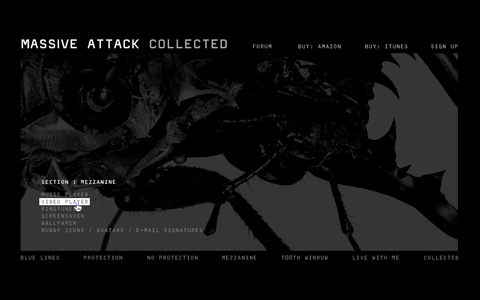
He likes his grunge effect lol. I really like the top two but in some examples his use of scrollbars is a turn off.
El Roboto
I like it! I feel like I don’t see enough grunge effect as everyones gone ‘apple’ and ‘clean’ and ‘contemporary’… Makes me nostalgic.
Reading the guys bio, it sounds like his route to webdesign was scarily similar to my own, which is err.. irrelevant but nice!
Particularly like his website – Good work fella!
Harry
Nice style, which is very hard to pull off. I like it :)
Timothy Diokno
All hail Elliot Jay Stocks, all hail grunge designers, all hail web designers! LOL!
Mykal
He doesn’t use the grunge effect as much and as obnoxiously as some people do. Some try but it just looks lame. He’s got it down pretty good.
I really appreciate this site for bringing to light some designers that take web design beyond the gloss and gradients and into an actual work of art. Thumbs up!
JeffreyG
he has a one specific style of using colours and the grunge knowone else can
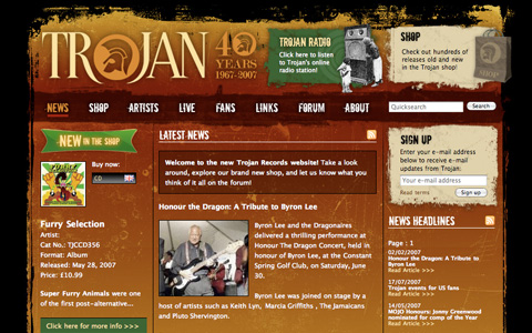
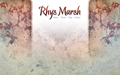
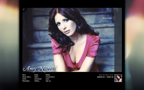
I like his Sourhaze, Rhys Marsh, Amy Nuttall and own portfolio project most
hope we’ll see much more works of him :)
sturdy
Really impressive!
I hope I can get there one day! hehe
Rosa
Looks like Jay’s ahead of the curve…Web 3.0 maybe?
Alexander Radsby
The scrollbars is a big turnoff.
The two first ones are the best.
Hate-Google
Very, very nice projects. Especially, I like such rusty layouts, with lots of details…. Have a look on my simple….
I hate Google. Under-google-ground.
http://www.hate-google.kgb.pl.
Sailesh Vaghela
i like his work. very varied – seems to approach each piece from a different angle.
cooooool :)
Benex
great work, and yeah scrollbars are really turnoffs.
Shortshire
Sites look beautiful. I hope I can design on that level someday. I am no where near that level. Each one of his designs has it’s own personality which is something we forget to put into many of our websites. Great job Elliot.
Kevin Underhill
Makes most of my designs look completely amateur… I hate it when that happens, but this guy is seriously good… very inspiring.
I’d kinda like to see these images linked so I could access the sites with a click.
Thorsten Meyer
Elliot Jay Stocks designs are astonishing. Great work Elliot.
Cheers,
Thorsten
http://www.StrongMocha.com
oyunlar
çok güzel referanslar.
ellerinize sağlık güzel paylaşım.
başarılarınızın devamını dilerim….
SuMac
Wooww, i like the grunge style very cool ;)
Jeremy Thomas
Am I the only one not being impressed by his work?
I’ve seen so much better grunge effects throughout the web.
And the flash sites are pretty simple.
I’m quite disappointed by this article.
Richard
I have to agree with the first poster – I’m not overwhelmed – Elliot may rant against web 2.0-type designs with stripes and shiny effects, but the grunge effect is also overdone now. Some nice ideas, nonetheless.
aodoe
I like it.
Frosty Web Designs
He does have an interesting design layout. But his attention to the fine details like
get_codeand PHP back ending in WordPress is sweet. An article on his blog helped me to change my navigation to stay in a state of hover when on the “current page.”Alanya
very good… Thanks you very much
ntas
Sites look beautiful. thank you
oyunzamani
woow very very nice thankss
bagsin
Great art works
Cyrus
Great , Elliot Jay Stocks
Great article. CSS saved web design
Cyrus
Visit http://www.psdtoxhtmlcoder.com
Mike
Great man.
Galatasaray
thank you good work
vincentdresses
The designs showed here show what simple and tasteful design is all about. Another one to consider
hitachi magic wand massager
These are some beautiful layouts. Thanks for posting them.
Web Design
amazing!Thanks for sharing!
delizade
still “awesome”? I really don’t understand that in 2010 still you guys say “amazing”.
eka
thank you so much for sharing. nice post. i like it :p
tütüne son
The designs showed here show what simple and tasteful design is all about. Another one to consider
Apex Breast
showed here show what simple and tasteful design is…
GainMax
“wOw” Thank you very too much…
Man XL
really, I do not know what to say. But thanks so much.
Hemorex
I will say a lot about this subject. you are an expert in this business.
Supratall
but do you nice.
Formula 21
Hi, How are you? Priority boarding priority effort to thank this site to friends I know in the past. You like your site is really excellent and successful. I wish you success in future work …
Best Regards …
Nicdur
Hi, How are you? Priority boarding priority effort to thank this site to friends I know in the past. You like your site is really excellent and successful. I wish you success in future work …
Best Regards …
Gastromid
I’ve gotten valuable freelance jobs that teetered on replying to an email less than an hour after getting the first. I’ve come up with ingenious ideas when a friend burst into my room to strike up a random conversation.
Devall Krem
“wOw” Thank you very too much…
Henry Peise
The white iphone 4 hardware design hasn’t changed from the one we already knew about. It uses the same materials as the prototype: Black glass and stainless steel rim.
Juno Mindoes
I just can’s believe how surprise when i receive my iphone 4. Its so charming and functional! But there’s one thing i don’t satisfy, i don’t like the color. Waiting for the coming white iphone 4 conversion kit.
Melvins
These are very nice samples of designs. Your designs are very neat, clean and attractive. Great job done.
Los Angeles Web Design
altın çilek
really, I do not know what to say. But thanks so much.
شات صوتي
thnks
goooooooooooooood
min:(
mmodf
Mark
Nice samples..
malabadi
woww thnk youu
Darin Hasty
You can definitely see your expertise in the paintings you write. The sector hopes for more passionate writers like you who are not afraid to say how they believe. Always go after your heart.
Moliva
Nice samples..
Tari
boleh dong bagi ilmunya…
Tari
it’s great design
zayıflama
These are very nice samples of designs. Your designs are very neat, clean and attractive. Great job done.
Alquiler yates en Ibiza
The sector hopes for more passionate writers like you who are not afraid to say how they believe. Always go after your heart.