
How to Create Spotify Colorizer Effects With CSS Blend Modes
When Spotify launched their colorful new brand identity, featuring hip duo-toned imagery, it went hand-in-hand with a new Colorizer tool that allows artists to apply a variety of filters to ...
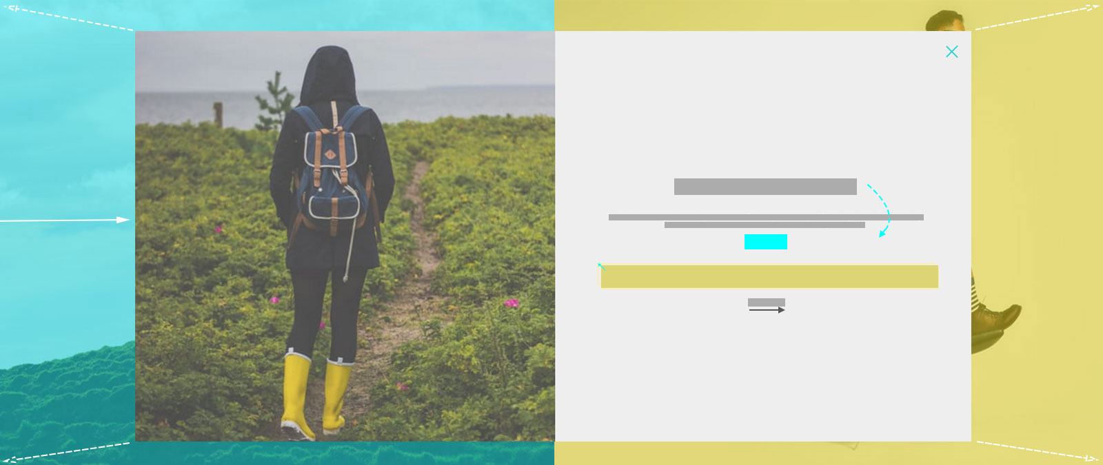
Tutorial: Duo Layout With CSS3 Animations & Transitions (Pt. 2)
Last week I demonstrated how to build a split-screen website layout using CSS flexbox and viewport units that offers an alternative way to present a brand’s featured content. Clicking on ...
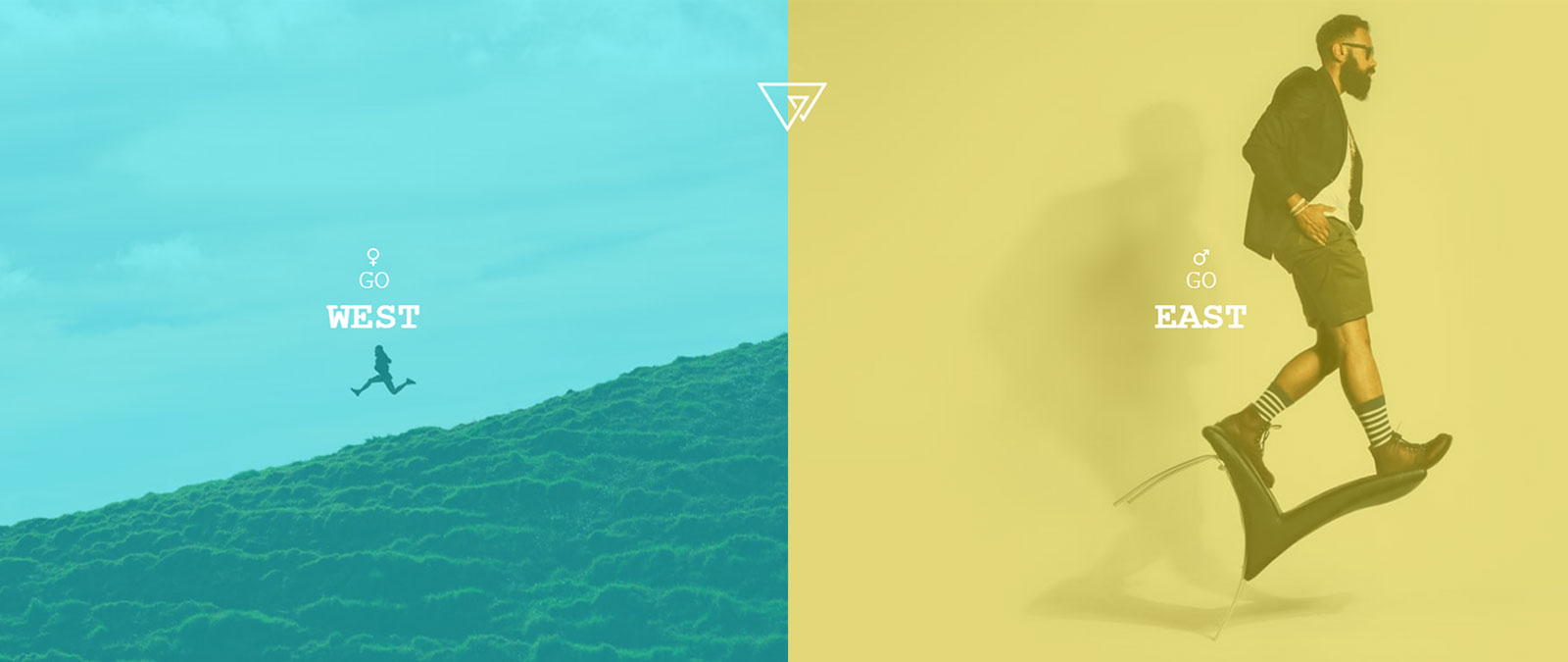
Tutorial: Trendy Splitscreen Layout With CSS3 Animations (Pt. 1)
There is no better time than the end of the year for some fresh inspiration! One of the most popular trends this year, features splitscreen layouts, lots of white space, ...
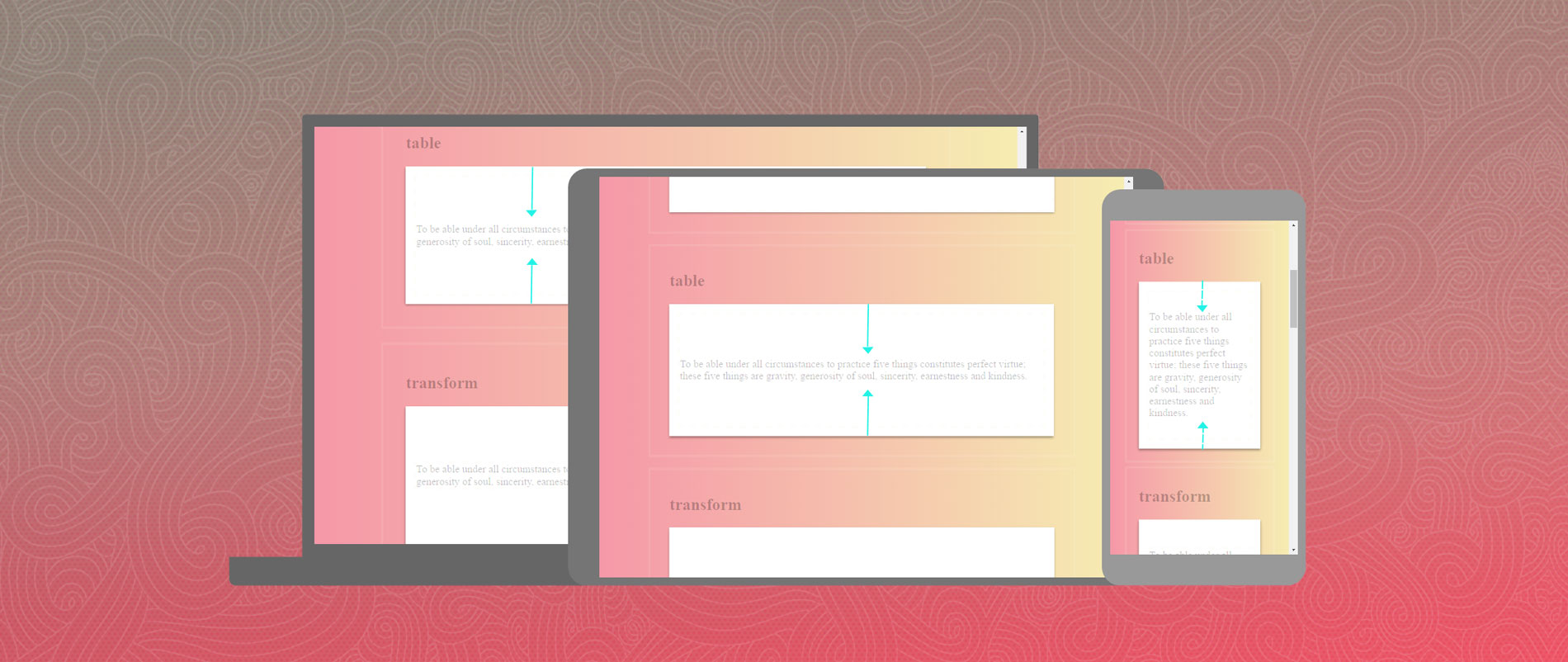
CSS Vertical Centering – Everything You Need To Know
Getting content to center perfectly within an element and then ensuring it responds properly at different screen sizes is one of the biggest challenges that still face front-end designers. It ...
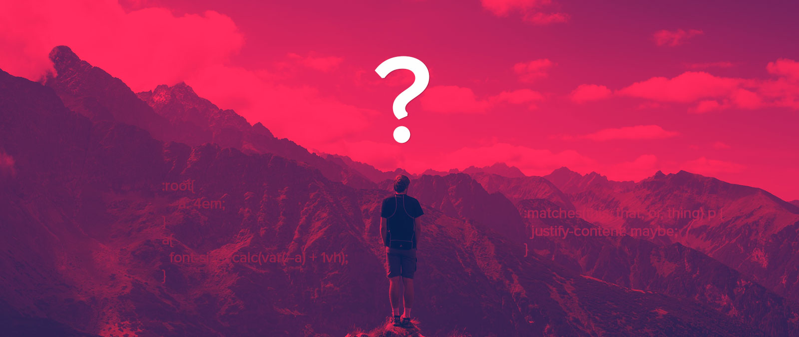
You Might Be Tempted to Use These CSS Tricks But Should You?
The temptation to dive right into new and exciting CSS tricks is strong – you might even do it without knowing it through learning by example or implementing that hot ...

The Power of CSS Selectors and How to Use Them
One of the challenges of coding premium WordPress themes is the unpredictable nature of how they will be used. Compared to coding a custom website, especially one using static HTML ...